Asher Kelman
OPF Owner/Editor-in-Chief
It's about time, let's celebrate our life that must seen in color!
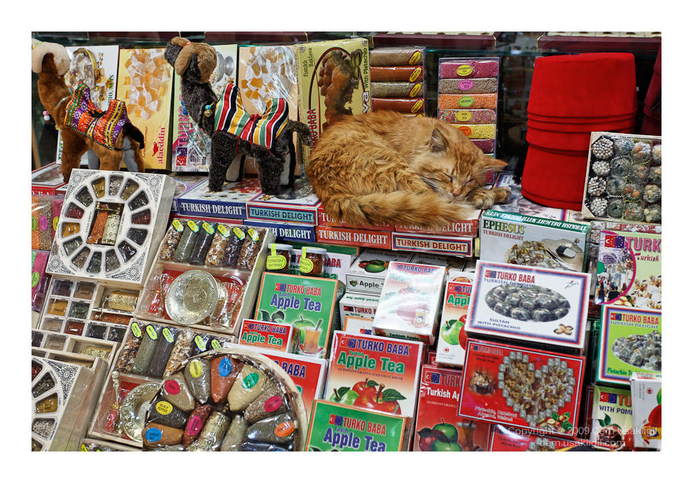
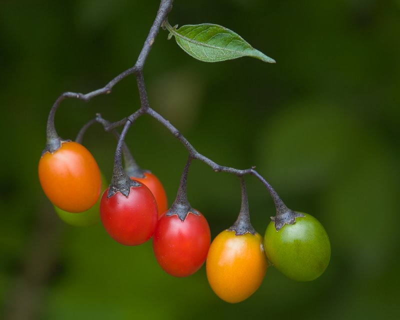
It's the codes for humans. The blush of shyness, the pallor of shock, the emerald green of seas off southern Turkey, the main of a lion, all are componants that can hardly ever be replaced by just tonalities.
Show your pictures that must be in color to have full effect and where going to B&W would indeed be, draining its life blood.
Asher
Anything that easily goes to B&W and even improves as a monotone giving more impact, doesn't belong here, so test it first.")
It's the codes for humans. The blush of shyness, the pallor of shock, the emerald green of seas off southern Turkey, the main of a lion, all are componants that can hardly ever be replaced by just tonalities.
Show your pictures that must be in color to have full effect and where going to B&W would indeed be, draining its life blood.
Asher
Anything that easily goes to B&W and even improves as a monotone giving more impact, doesn't belong here, so test it first.
Last edited: