Prateek Dubey
New member

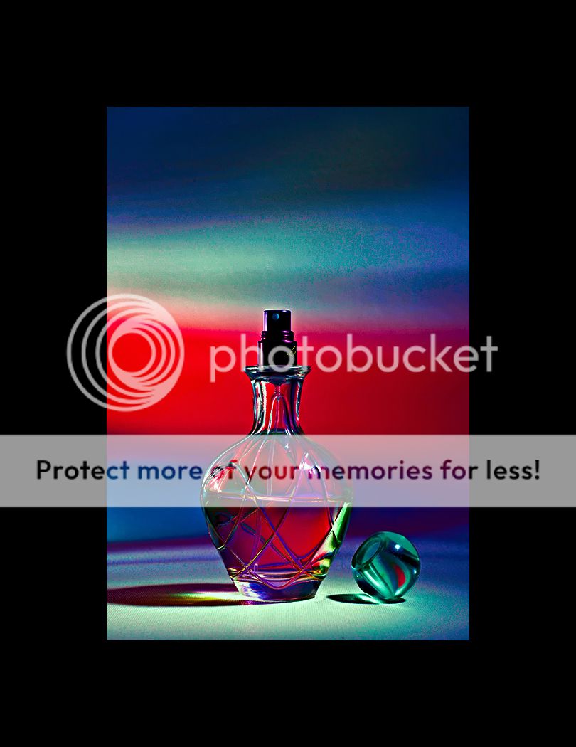
Perfume Bottle : Prateek Dubey
One of the continuous struggles to make an image. One of my wife's perfume bottle. Shot as is. No photoshopping whatsoever.


Perfume Bottle : Prateek Dubey
Prateek,
I, too, prefer this first image. Elegance! Unlike the second image, this photograph seems to be "genuine". It relies on the essence of the objects, not the added lighting which simply seems, well, "added"!
To the question of the level I'd like to add your decision to cut off the shadow on the left. Why make a great shadow and then not use it fully?
Asher

How do you like this one?
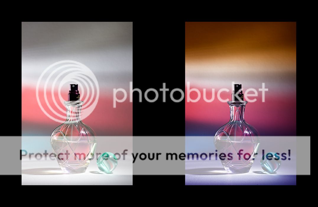
Perfume Bottle : Prateek Dubey
One of the continuous struggles to make an image. One of my wife's perfume bottle. Shot as is. No photoshopping whatsoever.
The image is a bit noisy, so you'll have to excuse the noise. With a higher resolution image, you might be able to eliminate the noise more readily.
I just threw some curves at your picture. It's not for everyone's taste.
Really Rachel? You wouldn't change a thing? That's a pretty definitive idea. It can't be improved or it can't be helped or it's perfect?I like the original two; good bokeh, nice lighting. Don't change a thing.
Prateek,
I think you got it right the first time.
However, I am a little distracted by the odd tilt of the perfume inside the bottle.
How do you like this one?
Joey,
Yours seems much bolder, better defined and dimensional. Yes, that's true. Still, isn't there there supposed to be magic and mystery about the ways of women. The softer focus seems to work best. Although sometimes the bottles are like crystal. Also one has to beware the colors further accentuating the already yellowish-brown hue, as that, IMHO, gets the glass to be more fitting with an old stlye lantern.
Asher
Asher,
My Guru, your interpretation is as usual very informative. I've done nothing to this picture, so that I get to know, what to do with it later. There are some challenges which need to be overcome on my part. For that I need a process of understanding from you.
1.) How does one establish a relationship with the object? Especially on a commercial job. Does one go about instinctively despite being guided by the rest of the art direction team.
The tilt is mystifying me. The bottom and top are aligned, yet the liquid is tending to fall on the right. I think the bottle is not horizontal and I composed according to the bottom level and that left the liquid tending to itself.
...the whole idea is to reach an image as close to desirable whilst shooting.
I respectfully disagree with your comment that the bottle becomes an extra, the least important part of the composition. It is the composition.You go for bold colors! Perhaps this is built into our genes as a lot of apes only get signals to mate when the females bottom gets colors like this in the ripe part of their estrous cycle. The picture's value is no longer not centered around the bottle, rather the bold color bands descending from left to right. Not the most "up" signal one could give the world! The stopper is a stationary object that has no indication to the eye that it would ever even dare to move. The lines do suggest movement and the stopper ends that nicely.
The bottle now becomes an extra, the least important part of the composition. Certainly your design is impactful, but it has nothing in common with the ethereal original. The latter suggests the mystery of a woman's delicate and yet alluring charm.
BTW, my wife did really admire your creation, and even the dark matt, so you have one fan at least, LOL!
How's this Asher? More to your liking?
I understand. Maybe to get this warm top-side effect while shooting, you coul put a light with a yellow filter in front, lower than your camera or about the same height, lighting it from the front a bit.
The colors you see ARE in the image already, they are just enhanced.
I'm just a hobbyist, but my 2 cents on your questions (if you care for them)
1.) How does one establish a relationship with the object? Especially on a commercial job. Does one go about instinctively despite being guided by the rest of the art direction team.
Maybe by keeping in mind the target group the product is for: For instance, is this perfume for older or younger women? Is it for women of a certain 'class' of people? I think you should try to make the picture as attractive as possible for this target group.
2) How the hell does one keep an object like this devoid of finger prints, lint and dust. I was extremely exsperated to see 100% pixel level.
good one... I suspect it begins with dustgloves and a blow-gun...
3) How does one achieve a commercially acceptable finish to a picture? Does it entail appropriate noise reduction and then sharpening.?
wouldn't know, my experience does not reach there. But you should keep in mind the final output medium. If you print postersize you need other methods than printing glossy magazines.
4) What about presentation?
see point 1.
5) How should one approach specular highlights. Are they considered distracting? Especially for a subject like this.
I think the big one you have is quite harsh now. Could work if you aim for a harsh look, but for a soft look you could maybe use another lighting setup like a softbox or an array of tubes. You could even try a filter that turns your highlights into stars, if you cared for that.
6) Lastly, must it look like a 'photograph' or just an impression of an object lying about in a perfect world.
Depends on what you want the world to see.

did a little more work on it, to make it a bit 'softer'. It's an edit of my former edit, so resaved JPG. If there's artefacting, we know why...