Prateek Dubey
New member

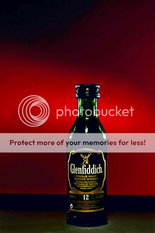
Glenfiddich : Prateek Dubey
A little photoshopped, as in some time spent with the clone stamp tool, a little darkening on the left bottom, the rest is as is.

Splendid! But is this a full size bottle or a miniature. We have no reference to scale!
Asher
Kevin,
Good job, but how about saying what you did and putting the b.g. back?
Asher
Thanks Kevin. Its an interesting perspective.
Putting the background back?
Did I answer your question or have I missed the mark? I am not sure the intent of your question or the precision you were seeking.
I like the original obscure b.g. and prefer your new version of the bottle!
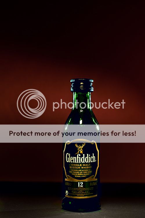
I carelessly and recklessly used a mask to get rid of my background. In other words, I didn't fuss the mask. It's late and I'm calling it a night very soon.
Glenfiddich : Prateek Dubey
Original
Glenfiddich : Prateek Dubey
Edited by Kevin Stecyk

I like the composition, but I wonder if the picture wouldn't be more apealing when you could see the scotch itself. Ask yourself what is the subject of your picture: the whiskey, the bottle it is in, the label or a combination of those three. As with your perfume bottle, you also have to take in account your audience. Is it a whiskey for the weathered Islay-drinker, or for the occasional speyside-nipper? Is it a male or a female whiskey? Is it spring-like or autumn-like? What is its taste-pallette, and should you see a hint to it in the picture?
Most people associate whiskey with 'gold', the sunset, a woodfire, the area it's coming from etc etc. (I should know, I collect single malt scotch) Your picture gives the appearance of 'darkness', it is like there is cough-sirup in the bottle, and everything except the label is dark. I wouldn't be compelled to get myself a bottle of this stuff.
If you would spotlight it from the side or the back, the light would spread through the contents of the bottle, and it would give the glass a nice green shine. There are not much whiskeys that come in a green jar, but if you Google-search for pictures of f.e. Ardbeg, Laphroaig or Caol Isla (brown bottle) you should get an idea. You will notice that even when the background is dark, the bottle contents are well lit. Also you will see that sometimes the golden color is edited in. The association with it is is more important than the accurate depiction of the colors.
")