• Please use real names.

    Greetings to all who have registered to OPF and those guests taking a look around. Please use real names. Registrations with fictitious names will not be processed. REAL NAMES ONLY will be processed

    Firstname Lastname

    Register

    We are a courteous and supportive community. No need to hide behind an alia. If you have a genuine need for privacy/secrecy then let me know!
  • Welcome to the new site. Here's a thread about the update where you can post your feedback, ask questions or spot those nasty bugs!

Breaking Rules and making it in photography! Show what you have done!

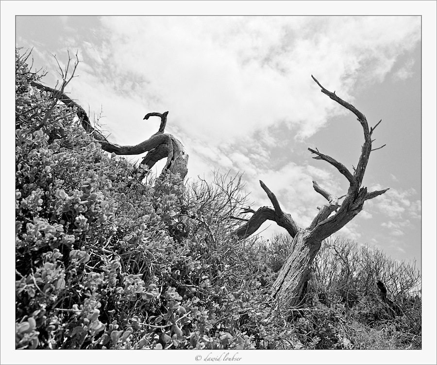
Photographs can get negative reactions when we break so-called "rules! But is it always appropriate to obey them?

random_tree_no__611_by_philosomatographer-d3itofi.jpg


[I](Ilford FP4+ 6x7cm, Mamiya RB67, Sekor-C 50mm f/4.5)[/I]


Dawid Loubser posted the above B&W photograph with a dramatic slope. I wondered "How did that great angle come about?" Then, below, Fahim raises the question of sloping horizons and breaking the rules. Well, we can learn a lot sharing examples where a picture works despite or even because of breaking the rules.

Let's find pictures that work despite our trespasses! Would it be as good otherwise? Do they work despite or because of "going against the rules". So that's the challenge! Good hunting! ADK


I have grappled with tilted horizons. Are they effective? Always or sometimes? Where, when?
I think a tilted horizon brings dynamics to a static image. But, for me, the question remains when is a tilted horizon most effective and when not?

I do not know the answer but I think it is quite effective in your fourth image.


I very rarely tilt horizons, and when I do so, I like to think it's always purposeful. My only other example I have is from 2007,

Divisions of faith
Divisions_of_faith_by_philosomatographer.jpg

(APS-H digital, Canon EF 200mm f/2.8L)

(This was an experiment to try and create harmony when doing everything "wrong": out-of-focus foreground (f/2.8, 200mm), tilted horizon, shot straight into the sun, etc.)

http://fc02.deviantart.net/fs22/f/2008/015/f/9/Divisions_of_faith_by_philosomatographer.jpg
 
Last edited by a moderator:

Asher Kelman

OPF Owner/Editor-in-Chief
Hi Fahim,

I shoot 35mm, MF and LF film as and when appropriate (and often when not appropriate!). Each format certainly has its merits. If a medium-format RB67 wasn't so darn bulky, though, i'd chuck the others and just shoot it :) The LF camera is, on the other hand, a total submission to ridiculous size/weight, and being tripod-bound - may as well go all the way, for the images it makes possible.

In the darkroom, I often still chuckle to myself when I see the huge negatives - it's another world.


I very rarely tilt horizons, and when I do so, I like to think it's always purposeful. My only other example I have is from 2007 (sorry, in colour, hijacking a B&W thread!):

Divisions of faith
Divisions_of_faith_by_philosomatographer.jpg

(APS-H digital, Canon EF 200mm f/2.8L)
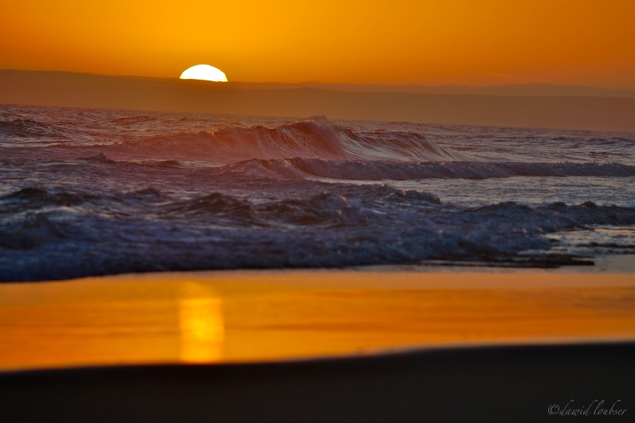
(This was an experiment to try and create harmony when doing everything "wrong": out-of-focus foreground (f/2.8, 200mm), tilted horizon, shot straight into the sun, etc.)

http://fc02.deviantart.net/fs22/f/2008/015/f/9/Divisions_of_faith_by_philosomatographer.jpg


I'm fine with this, Dawid! This shows rules can be broken but how do we deal with the result. Yes, it's interesting and more so than a pretty sunset. We'd need more of this ilk to see how it works out. As a one off, one has a harder time of placing it in some evaluative scale, but if were a true scholar and genius, I could do better.

Asher
 

Jerome Marot

Well-known member
I prefer the first picture to the second. To me, the first picture does not look as if the horizon was tilted but could have been of a slope or mountain. Tree sometimes do not grow straight on windy slopes. It is only by looking at details (bushes growth), that one can conclude that the frame is deliberately tilted.

The color picture does not work very well for me. The horizon is obviously tilted, and I see no reason why. It is possible to take a picture with the horizon tilted but, in my opinion, the reason must be obvious or the viewer will think it is just accident.

I don't have a better example at hand, but this picture of mine is taken with the camera tilted, but I wanted to compose elements in the frame so the reason is, at least in my eyes, obvious:


Asher Kelman

OPF Owner/Editor-in-Chief
Divisions of faith
Divisions_of_faith_by_philosomatographer.jpg

(APS-H digital, Canon EF 200mm f/2.8L)

(This was an experiment to try and create harmony when doing everything "wrong": out-of-focus foreground (f/2.8, 200mm), tilted horizon, shot straight into the sun, etc.)

http://fc02.deviantart.net/fs22/f/2008/015/f/9/Divisions_of_faith_by_philosomatographer.jpg
The color picture does not work very well for me. The horizon is obviously tilted, and I see no reason why. It is possible to take a picture with the horizon tilted but, in my opinion, the reason must be obvious or the viewer will think it is just accident.

Jerome,

I had another take on Dawid's drunk picture. Because the image is tilted, the immediate clues to identify the pyramidal shapes as "waves and water" and not "mountains and rocks" are gone. The tilt creates a temporary dystopia where we're now no longer quite sure of the planet! So there can be something in this beyond the obvious reality that the horizon is crooked. Once again, with thematic issues or motifs, we need more than one picture to allow us to conclude which sort of interpretation to assign here: clumsiness or inspired technique!

I'm not saying that it's good, just that this image jolts us to think of other possibilities.

Asher
 

Asher Kelman

OPF Owner/Editor-in-Chief
I don't have a better example at hand, but this picture of mine is taken with the camera tilted, but I wanted to compose elements in the frame so the reason is, at least in my eyes, obvious:


Jerome,

The tilted horizon does not immediately announce itself here! The red of the metal the curve and the three black "fingers" take all our attention. So it seems to me that, to work best, the horizon is best not the most strongly defined element. I wonder if that's true generally.

Asher
 

Jerome Marot

Well-known member
Ah, but the reason was obvious to me - It was to create a perfect symmetry along the horisontal axis, .e. between the foreground and the background...

Now that you said it, it is obvious to me and I am not able to see the picture again as I used to see it before.
 
I remember having a tough time composing this in the few moments available. The image needed some sort of reference. I finally decided to use the top of the frame as a the anchor.


original.jpg


©Winston C. Mitchell


Asher Kelman

OPF Owner/Editor-in-Chief
I remember having a tough time composing this in the few moments available. The image needed some sort of reference. I finally decided to use the top of the frame as a the anchor.


original.jpg


©Winston C. Mitchell


Winston,

This is an excellent image for the series and the way it works is a little puzzle.

"The image needed some sort of reference. I finally decided to use the top of the frame as a the anchor."

Well, it can't be just the top of the frame. Rather you have several major show-stopper "blobs"/masses which get attention. You have successfully linked these to the top frame as their upper borders are almost parallel to the top border. So then the picture is anchored successfully.

Asher
 

Ruben Alfu

New member
I'm against the notion of compositional rules, whatever works, works! Here's another wrong horizon.


20081105-_MG_5625_flat.jpg


Ruben Alfu : Dead trunks


Asher Kelman

OPF Owner/Editor-in-Chief
I'm against the notion of compositional rules, whatever works, works! Here's another wrong horizon.


20081105-_MG_5625_flat.jpg


Ruben Alfu : Dead trunks


Excellent example! This is such a strong image. The base of the wood columns relating to the lower border of the frame, is the organizing structure in our orientation of the picture. This appears to be the inverse of Winston's picture where that organization occurs on the top border.


original.jpg


©Winston C. Mitchell


So this might mean that we can get an equally strong and meaningful image where the top or bottom border is made the horizon, or horizontal line of reference for our orientation. We'll have to see if this works in other images too. I wonder if such anchoring, where the true horizon is ignored can be on the sides and work as well as in Winston's and your examples.

Asher
 
I'm against the notion of compositional rules, whatever works, works! Here's another wrong horizon.


20081105-_MG_5625_flat.jpg


Ruben Alfu : Dead trunks


There is a thrill in looking at a rule broken, a horizon tilted, and I wonder if that thrill is akin to a vicarious buzz when witnessing an act of vandalism. Actually turning the world on its head is a valuable artistic trope that causes us to question previously untested certainties.

I do confess to enjoying Ruben Alfu's Dead Trunks but the joy comes not from the picture, anything iconocastic would do, but from Ruben Alfu's delightful audacity.
 

Asher Kelman

OPF Owner/Editor-in-Chief
Maris,

I love your explanation of why it works so well: audacity! The thrill of turning things upside down!

Asher
 

fahim mohammed

Well-known member
Scotland...

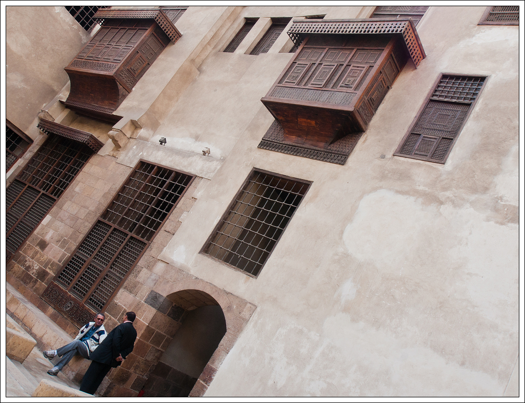
Here's something so different. The use of an oversized black border is hardly ever able to help a picture's presentation. More often than not, the black border constrains the image and makes it unable to spread its influence to the surrounding white space on the wall where it's displayed. So why does this transgression work so well? ADK


p789543269-5.jpg


Fahm Mohammed: Untitled

Austria


This is for comment here.

Thanks Fahim!


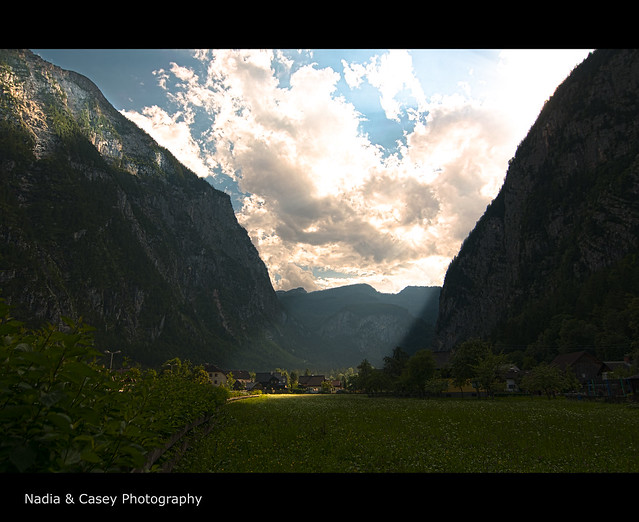
Now look at the following picture. Does this black border work in the same way?


6029545073_895eec0cb7_z.jpg


Casey Herd: Untitled

Austra


Thanks Casey!
 

Mark Hampton

New member
hi,hi.

nice thread with some images I like - that work - some that try - these are more intreasting - photography can be increably anal - the sense of play get lost... i will add a few - some parts work - toghter they may be stronger ... they are parts of whole... they were made with a film camera and scanned - then worked into what you see below... a personal story


lisa1.jpg


lisa2.jpg


lisa3.jpg


a.away.week - M Hampton


Mike Shimwell

New member
Dawid, I understood and liked your colour picture immensely. Perhaps the mathematician in me?

Winston, craking picture. Breaking the rules requires either thought or intuition I suspect. There again, I don't think of the rules when taking pictures anyway:)

Mike


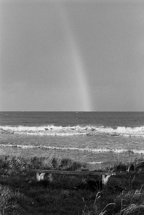
A monchrome rainbow:)
alnmouth-1-of-2.jpg


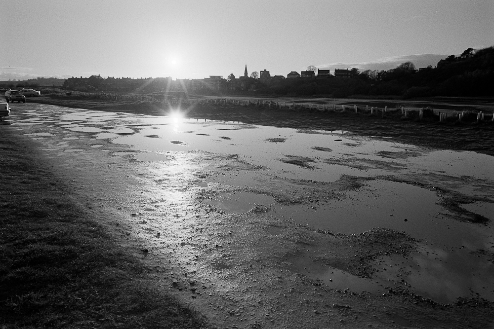
Shooting directly at the sun
alnmouth-2-of-2.jpg
 

fahim mohammed

Well-known member
Mark, Mike...

I likeMark's series and even on their own each one is a personal pov.

Mike, and why not a mono rainbow!. Shooting into the sun has me looking at what is below.

Regards.
 

Asher Kelman

OPF Owner/Editor-in-Chief
Dawid, I understood and liked your colour picture immensely. Perhaps the mathematician in me?

Winston, craking picture. Breaking the rules requires either thought or intuition I suspect. There again, I don't think of the rules when taking pictures anyway:)

Mike


A monchrome rainbow:)
alnmouth-1-of-2.jpg


Mike,

Amazing! I see this in color! I saw the greyscale but the edges of the rainbow were are in color to me. That shows how we fill n the gaps of what s shown and it's not necessary to complete everything. As with Ben's picture, above, you centered the horizon, a "no no"! I wonder whether "openng up" the tones on the bench would strengthen the mage?

Asher

Asher
 
Last edited:

Ruben Alfu

New member
I don't want to interrupt the flow of "forajido" photos going on here, so just a brief but sincere thanks to Asher, Maris, and Fahim for your kindness.

Regards,

Ruben
 
Top