• Please use real names.

    Greetings to all who have registered to OPF and those guests taking a look around. Please use real names. Registrations with fictitious names will not be processed. REAL NAMES ONLY will be processed

    Firstname Lastname

    Register

    We are a courteous and supportive community. No need to hide behind an alia. If you have a genuine need for privacy/secrecy then let me know!
  • Welcome to the new site. Here's a thread about the update where you can post your feedback, ask questions or spot those nasty bugs!

Approaching the flower with a dark background: how it might work?

Nathanial you make a very good point. I am quite sure a lot of the difference comes from the different lighting in each but I also think the colored gels on the background help a lot in separating the flowers from that background giving it more of that pop.

Asher, the gels are on my two small Nikon SB-R200 Speedlights. The blue gel is actually sitting right on top of my table, to the right of the flowers. The light with the red gel is on a small light stand that is positioned on the floor behind the table on the left side. All 4 of the flashes are being triggered by the SU-800 Speedlight Commander that is in the hot shoe of my D3.
 

RoyVarley

New member
Ok. Here's my attempt with this theme. My wife brought some of her roses in from the garden...

2973609482_f2c42b6085_o.jpg


Single monobloc with snoot. Piece of black card. White reflector underneath. Squirt of water from spray. 180mm macro.

I quite like it but it's not very popular on flickr.
 

Asher Kelman

OPF Owner/Editor-in-Chief
James,

I had to come back to these. I would have always thought I'd go for the natural light. However the second picture is so well drawn. Nathaniel has mentioned the 3D look. This really shows how good it is to use extra lighting well.

0808_5051.jpg


However, I really don't like the colored background but I'm so impressed with the form of the flowers.

0808_5066.jpg


James Newman said:
and a look at the setup just for kicks.

0808_5070.jpg


The last picture, I actually like. It has some human value. Thanks!
 

Asher Kelman

OPF Owner/Editor-in-Chief
Ok. Here's my attempt with this theme. My wife brought some of her roses in from the garden...

2973609482_f2c42b6085_o.jpg


Single monobloc with snoot. Piece of black card. White reflector underneath. Squirt of water from spray. 180mm macro.

I quite like it but it's not very popular on flickr.


Hi Ron,

Of course I like your picture. I wonder if you have more of the stem of the rose. Stems on roses are part of the romance! Did you print it? If so what kind of paper and how did it come out?

How big was the snoot? How far away was the light? I'm thinking that a larger light source would build the softer form of the flower in a gentle set of overlapping curves. What is the thinking behind using a narrow light beam? Where you trying for a harder look?

Or did you use natural light, too?

Asher
 

RoyVarley

New member
I liked the veining in the petals and wanted to show that structure. The flower is beautiful but also intricate - I liked that. Snoot around 10cm. About 80cm away. No natural light - but emulating direct sunlight.

Oh, and yes I did print it on premium lustre at 60cm x 90cm. Looks lovely.
 
Last edited by a moderator:
I did another along these lines tonight as my photo a day subject. My lovely wife brought ME flowers this time! I had my white background paper setup for something else and it's there, you just can't tell it in this photo. I was experimenting again with my off camera flash. I actually handheld the flash unit, trying different positions and angles until I came across something I thought worked pretty well. I like this one with its shadows and also the textures I can see in the new bloom. Taken with the Nikon D3 and my 105mm macro lens on a tripod with SB-600 flash.
ISO 200 f/22 1/60 sec
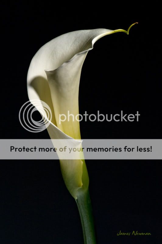
01-21-09.jpg
 

Asher Kelman

OPF Owner/Editor-in-Chief
I did another along these lines tonight as my photo a day subject. My lovely wife brought ME flowers this time! I had my white background paper setup for something else and it's there, you just can't tell it in this photo. I was experimenting again with my off camera flash. I actually handheld the flash unit, trying different positions and angles until I came across something I thought worked pretty well. I like this one with its shadows and also the textures I can see in the new bloom. Taken with the Nikon D3 and my 105mm macro lens on a tripod with SB-600 flash.
ISO 200 f/22 1/60 sec


This is a really interesting flower. It's simple and elegant. It gently transforms from a clean stem with subtle markings to a white elengated bloom wrapped on itself. I felt it could be enhanced by using a series of brightened images and masking each layer to reveal more of the darker center.


01-21-09.jpg
01-21-09.jpg


© James Newman Original and Treated Picture (A.K.)


I hope you like my version of your elegant flower!


Asher

I'll fix the left hand lower corner later!
 

Cem_Usakligil

Well-known member
This is a really interesting flower. It's simple and elegant. It gently transforms from a clean stem with subtle markings to a white elengated bloom wrapped on itself. I felt it could be enhanced by using a series of brightened images and masking each layer to reveal more of the darker center.


I hope you like my version of your elegant flower!


Asher

I'll fix the left hand lower corner later!
Hi Asher,

I understand your intentions with the version you've done and I praise them. The execution of it, however, is less successful unfortunately. You might want to check the calibration of your monitor. In your version, the mid tone and highlight details are almost wiped out. The vein structure of the flower is much less visible. Local contrast (clarity) is greatly reduced. And finally, the blacks have become lighter with a lot of noise (although this is easily repairable by masking the black background and filling it solid black).

I hope you don't mind me pointing these problems out? :)

Cheers,
 
Last edited:

Asher Kelman

OPF Owner/Editor-in-Chief
Hi Asher,

I understand your intentions with the version you've done and I praise them. The execution of it, however, is less successful unfortunately. You might want to check the calibration of your monitor. In your version, the mid tone and highlight details are almost wiped out. The vein structure of the flower is much less visible. Local contrast (clarity) is greatly reduced. And finally, the blacks have become lighter with a lot of noise (although this is easily repariable by masking the black background and filling it solid black).

I hope you don't mind me pointing these problems out? :)
Great that there's someone here to stand up to me for the safeguard of fine technical detail. We want to do the best. You are correct in this, I assume, as I can't see this on my 17" Macbook Pro laptop. I'll recheck later when I wake up, LOL! If this was in b&W, then the points you have made, are likely inescapably damaging to the look of the flower. There we have nothing but tone and fine details to dress to the shape of the flower and enthrall us.

In color, however, the impact of this flower to the ordinary person would I posit, be much more powerful and agreeable in the new version I have presented. The esthetic experience would lead to more enjoyment. On that basis it works. But that's just my opinion for now and I'm open to further opinions and doing better.

Still, if your are indeed correct, then I could make an improved version using my G5 with the Eizo monitor which will give me the ability to recognize the finest details and then preserve and even enhance them. I did no sharpening nor curves so it there's a lot of room for improvement. furthermore, my corrections were done on a rather small 8 BIT jpg so the robustness of the file to any alterations is limited by the mathematics anyway.

At the end of the day, it's the gestalt of the image. I can see for you, it falls short. We'll have to work harder!

Asher
 
Asher, I must agree with Cem on this one. Your treatment looks a little like your antihistamines were still at work:) That's ok though. At least I know your heart is in the right place even if your eyes may not have been. Although I am a bit down tonight I was still able to take one more photo that does not convey the same feelings that I am experiencing. These were some daffodils that my sweet wife brought home for me to work with. It is good to be able to sink myself into something distracting if only for a little while. Tomorrow promises to be a better day.
Thanks to those that answered my other post concerning my layoff today. I will answer those replies more fully tomorrow after a good night's rest.
James Newman

01-22-09.jpg
 
In all this discussion about black backgrounds for flowers no body has pointed to Joyce Tenneson's book "Intimacy-The Sensual Essence of Flowers". Great photos of flowers with black backgrounds. anyway here is a shot I did a couple of years ago.. not dead black background, but................
16163160.jpg
 
Thanks Duke for the book suggestion. It looks like a very interesting read. Your photo is very pleasing too. I like the softness and texture of what had to be a very tender bloom.

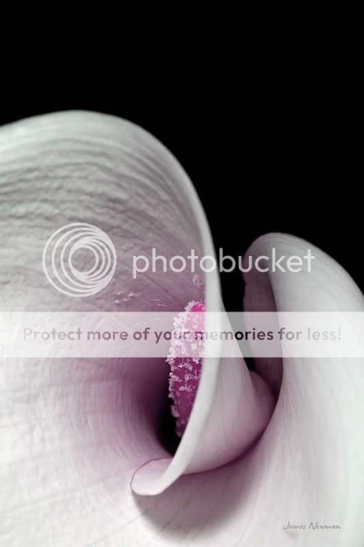
This is one more from my recent study of the Calla Lillies my wife brought me. Of course you can't see much of the dark background here either but it's there and I liked the feel of the final crop. The lighting was from a small pen light behind and shining up through the blossom.

James Newman

_DSC3216.jpg
 

Asher Kelman

OPF Owner/Editor-in-Chief
James,

This is very special and so intimate and impressive. As you have cropped, the flower itself opened up for us. Did Dukes picture or his reference to Joyce Tenneson's book "Intimacy-The Sensual Essence of Flowers" influence you here? Did you find the book or the referenced pictures?

Asher
 
Thanks for looking and responding Asher. This is one of my favorite threads. I was already aware of and very interested in the sensual side of certain flowers and plants and have dabbled at trying to capture it in some of my photos. This type of flower lends itself wonderfully to this study. Duke's post did indeed make me go look up this particular book by Joyce Tenneson because I was until now, unfamiliar with her work. I have not seen the book, only the front cover, and I can only imagine what wonders are inside the covers. I may have to make a run to the bookstore and see if I can find it if only to leaf through the pages and look for more inspiration. I have a few other things I want to try with these particular lillies before they lose all of their beauty to old age.
James Newman
 
James.. The black background is implied and evident in you shot. I like the crop. Very nice.
Joyce Tenneson also has another flower book. "Flower Portraits, The Life Cycle of Beauty". The photos in it also have all black backgrounds, but the images are all brown/sepia. You can see some of the images at
http://www.tenneson.com
If you look under 'Books' and in the 'Galleries' section, you can see some of her work.
 
Thank you Duke for opening my eyes to something or someone new (to me) and exciting. I looked at her work and loved it all. She is obviously so very talented. I will be asking for her new book as a birthday gift so that I can see all of the images and not just the few select ones on her site. I can't wait.

She inspired me so much I had to go give my lily another try. The poor things are now wilting pretty badly, turning brown around the edges, and basically losing the battle. They gave their all however and their life was definitely not in vain. As long as my hard drives and disk backups remain, so shall they.

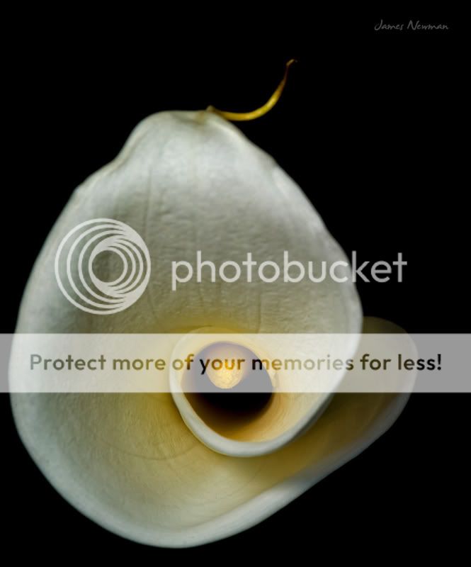
This first one was a tad different for me in that I altered the hue and coloration a little but all else, along with the second, normal colored shot, was basically the same setup as others recently shot...Nikon D3, 105mm macro lens, three external flashes this time.
James Newman

01-25-09.jpg
01-25-09B.jpg
 
Oh... I like both of these. I might crop the one one the right so it goes more with the series you are creating.
I like the Intimacy series better that the ones in Flower Portraits. But both books are good. Seems like the black background thing goes in and out of fashion. But I like them.
 
Thanks again Duke for the input. I do like the full image of the last one but, as you said, if I am working on a series it may be more fitting to crop it a bit like the others. I have this one more attempt at that to see what you think. I hope I have not digressed within this thread too much. It is still a flower with a black background but I have gotten a little off track and possibly my portion would be better moved somewhere else. I am sure Asher, Cem or someone else will let me know if that is the case.
James Newman

_DSC3263.jpg
 

Asher Kelman

OPF Owner/Editor-in-Chief
Thanks James for concern but no worry, this is exactly what we should be doing, exploring. If it ever gets to become a separate entity, we'll make it a separate thread.

Asher
 

Ken Jackson

New member
This is a beautiful thread we should update! Any takers?
Asher I shot this last spring in Woodburn OR at the Mall. Every month or so, they change the movable gardens and this spring they had Fuscias and more Fuscias. I saw thes in a corner of a display and they sort of leaped out and grabbed me. Again this is on the black background thingey.... I hope you like it

Twins
658890009_56BG7-L.jpg
 
Last edited:

ErikJonas

Banned
I have some awesome macro flower shots...When the forum gets to where i can directly upload them i will =) Nice pictures in this thread already though......
 

Asher Kelman

OPF Owner/Editor-in-Chief
Ken,

That's unusual, the fuscias look like decorations of a Christmas tree as they are very saturated. Is this film? I looked at your file and there is no IPTC code or EXIF info. Always a good idea to add your © info there! Hopefully a huge rich company will steal it!

Mike,

Very cleanly imaged flowers. What do you think of cropping ech to lose the top 35-40%? In each case it keeps asymmetry. With the image on the right, one also gets a pleasing gradient of background lighting from left to right. Thats a great idea for us to think of. Here, even though the flowers end up centrally placed, the b.g. lighting makes the picture work in the crop I suggest.

Asher

Could you name them, by the way.
 

Asher Kelman

OPF Owner/Editor-in-Chief
658643630_Z3R3u-XL.jpg

William Blackford Light

William,

This picture, (copied from your original posting here), adds a lot to this thread. The title "Light" is apt as the illumination of the bloom is key to making it impressive. How was it lit? Also how did it appear in color?

The vein structure is shown well in the lighting going through the petals. The bloom is like a generous offering. It might be an idea to consider adding 0.5 inches of black at the top.

Asher
 
Last edited:
Top