• Please use real names.

    Greetings to all who have registered to OPF and those guests taking a look around. Please use real names. Registrations with fictitious names will not be processed. REAL NAMES ONLY will be processed

    Firstname Lastname

    Register

    We are a courteous and supportive community. No need to hide behind an alia. If you have a genuine need for privacy/secrecy then let me know!
  • Welcome to the new site. Here's a thread about the update where you can post your feedback, ask questions or spot those nasty bugs!

Landscape Pictures: open for dissection: the why and how!

Alain Briot

pro member
According to the tenets of this forum section, I am presenting this work for your questions and discussion. To start the process I have included the text I featured on my blog about this photograph

JT-CF020688-600.jpg

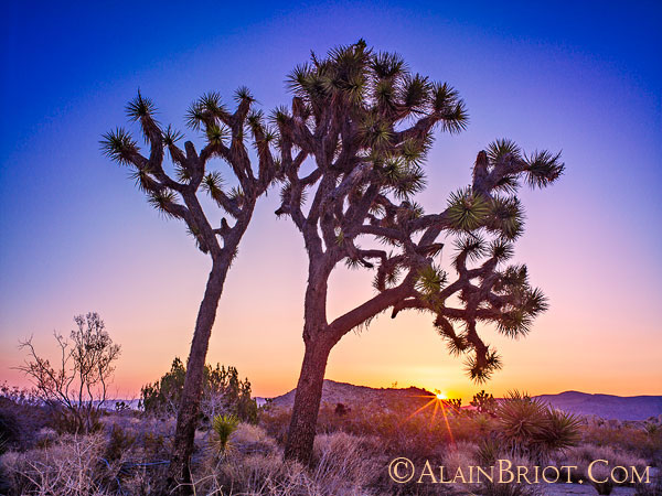
Sunrise, Joshua Tree National Park, California

The photograph above was taken during our Joshua Tree workshop this May. It is a single capture. Because of the dynamic range of the Phase One back that I use, and because of my processing technique, I was able to get details both in the shadows and highlights.

I initially wanted to do this image as a silhouette, the way I did in my previous visit to Joshua tree, but when I started processing the image I realized that the feeling of dawn breaking over the horizon would best be expressed by having some details in the shadows. Not a lot, but some, enough to give the feeling that night is breaking away, that we are starting to see into the shadows and that light is slowly filling the landscape, pushing away the cover of darkness and revealing details that could not be seen previously. I also want to express the feeling of warmth and color that comes with a late spring sunrise, as well as the transition between day and night.

This is why I made the top of the image a deep blue, dark enough to give the feeling of night breaking away, but not so dark that we feel it isn’t dawn yet. That’s also why I gave the lower portion of the sky, the part over the horizon, a yellow/pink/orange glow, to both echo the color of the sun rays and to contrast with the deep blue of the sky above. Color is very important in my work, and control of color is one of the aspects of digital processing that I enjoy the most and that I have learned to master over the many years I have been practicing photography.

Alain Briot
Beautiful-landscape.com
 

Antonio Correia

Well-known member
I am more impressed with the second image than with the first. (I mean: I like best the second one).

I do like the shadow detail and ... the clouds. Fantastic clouds ! Curiously - and you know this far better than myself - the sky is very different according to the place we are in the World.

A sky in the Himalayas is surely different from a sky in California for example.

The meteorological and physical conditions are quite different and water is an element with much influence in clouds.

I have noticed that you do have a consistency - remarkable - of colors all over your work.

Of course, the equipment you have has a deep influence on the results you obtain.

Knowledge and motivation are also very important.

But it is also a fact that I would not be able to get these results using the very same equipment ! :) :)

But back to the last image: composition fantastic with bright yellows... Beautiful ! Very well dome Alain ! :)
 

Jerome Marot

Well-known member
According to the tenets of this forum section, I am presenting this work for your questions and discussion. To start the process I have included the text I featured on my blog about this photograph

I don't know why that picture did not attract any comments. Maybe just bad luck, it sometimes happen when too many new subjects are posted at the same time.

You said that you lifted the shadows to get some details in the tree and foreground. I find that indeed it works very well here, because it is dawn and there would have been almost no shadows just before sunrise. But I wonder whether that image will sell as well as one with crushed blacks. Generally speaking, I believe that people are more attracted to high contrast images and do not mind if there is no detail in the shade.
 

Alain Briot

pro member
Hi Eric,

Without name recognition or style it is true that high contrast, saturated colors and lots of red will generate better sales. With name recognition and personal style those become the selling point. You can also charge a whole lot more but that's another story.
 
I am more impressed with the second image than with the first. (I mean: I like best the second one).

I do like the shadow detail and ... the clouds. Fantastic clouds ! Curiously - and you know this far better than myself - the sky is very different according to the place we are in the World.

A sky in the Himalayas is surely different from a sky in California for example.

The meteorological and physical conditions are quite different and water is an element with much influence in clouds.

I have noticed that you do have a consistency - remarkable - of colors all over your work.

Of course, the equipment you have has a deep influence on the results you obtain.

Knowledge and motivation are also very important.

But it is also a fact that I would not be able to get these results using the very same equipment ! :) :)

But back to the last image: composition fantastic with bright yellows... Beautiful ! Very well dome Alain ! :)
I believe that Alain also considered some of the clouds shape... that are looking like flying spirits... and he tried to relate them (successfully) to the shape of the "standing figure" that the rock in the medium foreground has....
 

Chris Calohan

Well-known member
I've sent a PM with several questions regarding Image #2. I find the overarching blue sky vignette in the first too contrived for my simple tastes...coming form the man who can't seem to leave a sat slider be...it's rich, but it is what it is... ;-}
 
I've sent a PM with several questions regarding Image #2. I find the overarching blue sky vignette in the first too contrived for my simple tastes...coming form the man who can't seem to leave a sat slider be...it's rich, but it is what it is... ;-}

Chris... photography is not reproduction of reality... it's an art of mastering light and as in every other art, the artist acts under visualisation of the final result (i.e. the print...). In art, it is important to only include vital information (but you have to include all of it) and to reject everything that can be destructive to what the artist aims... For example, if colour is destructive it has to be removed (again removal is visualised before capture), this is no different to colour photography where there is visualisation with the colour included ...however, not the scenes colour, but the one that was visualised.
If I have one objection, this is not with Alain's work (which I find very creative), but rather that he keeps posting it to the MF forum (although there is the appropriate forum in the photography section), which I believe that is not beneficial at all for OP forums since it obstructs conversations that could attract more people (and important ones) to MF discussions... I think that Asher has to look into this...
 

Alain Briot

pro member
Hi Chris,

I responded to your private message. I did not have time to visit OPF for a while hence my delayed response.

I can post in other parts of the forum. It's just practical to have all my images in one plce. Plus, that's how Asher set it up and I like it that way.
 

Asher Kelman

OPF Owner/Editor-in-Chief
Congrats, Alain! I'll download it, but worry about hitting my limits with those great pictures! Can one download it directly to the Mac?

Asher
 
Top