
Matt Halstead
New member
Hi guys,
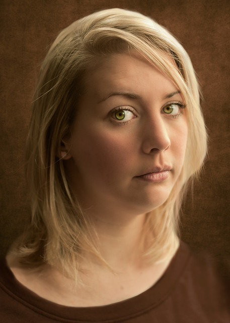
I've just finished working on this image. Again, lit and processed to acheive a painterly effect.
I often get picked up on the subject blurring into the background, so to confirm, this is done deliberately:
Feedback is more than welcome.
Thanks,
Matt
I've just finished working on this image. Again, lit and processed to acheive a painterly effect.
I often get picked up on the subject blurring into the background, so to confirm, this is done deliberately:
Feedback is more than welcome.
Thanks,
Matt
") .
.