Lghting, blur, sharpness in assigning importance to features in an image composition.
No problem Trudy..
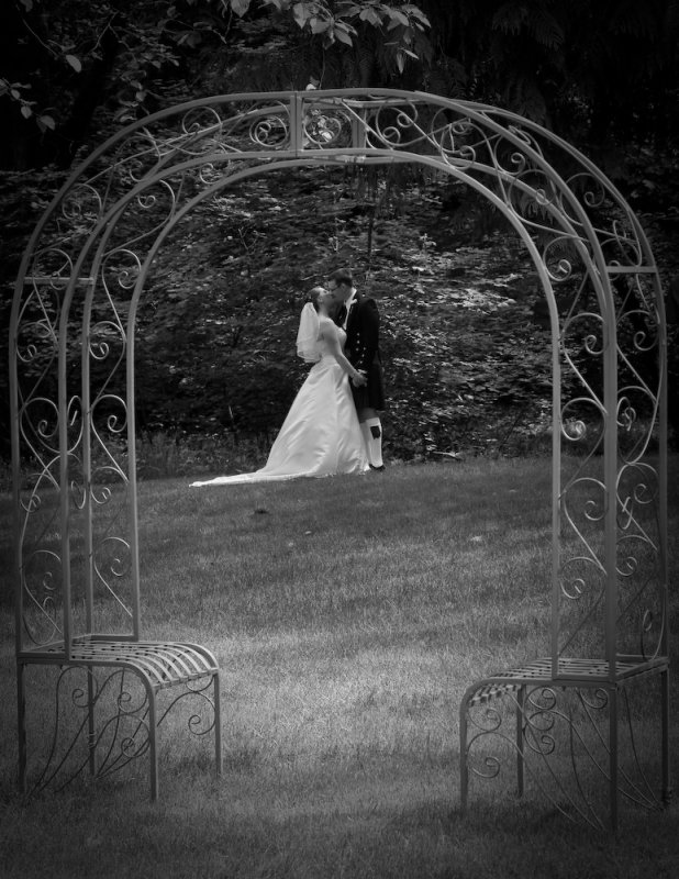
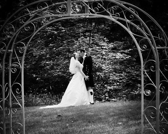
There are always an infinite number of ways to do the post proc. The grass came out a very funky color when I was trying a color version.. The bw came out much better.. I was standing on a deck watching the kids and photog. I kept looking through the ARBOR
")
to frame them. Anyway I like your version also.. I have a couple of other shots take in the same direction that the grass came out weird. Thanks for looking and playing.....
Hi Duke,
I'm glad that your photograph still draws attention. Studio photography allows the lighting to define what is important. Romantic outdoor settings for wedding or fashion photography often require post production unless you have control of lighting, which for weddings is tough beyond the formal shots. I am going to use your wedding photograph as an excuse to present a useful way of editing. This is a simple but logical way of making sure that what
you want in the picture will be there for the viewer to be able to read the story you are presenting. The camera has no idea of what's important to any of us! So we need to provide clues so as to draw attention to components in the measure that is fitting to the meaning we want to project.
The picture is already taken! It cannot be repeated; that time has passed and it won't happen again! When we didn't arrange everything as we would in a studio, how do we tell the story we want to convey
perfectly? Maybe it's a street photograph grabbed as people passed. Perhaps it's a picture like the one here which is going to be a treasured memory for the bride and groom. So how do we clearly assign levels of importance to components of an image file?
These are things we need to consider:
- Write down the title of the picture and what its narrative might be. The following steps will make sure this story is encoded properly.
- Isolate each significant component of the picture in a reasonably accurate selection that you record. (Select, save selection). Always keep an unchanged copy as a layer, but switched off for now.
- When you alter that layer, make sure you specify that the filter applies just to that layer. So check that box in the layer dialog that pops up!
- The most important things are often the brightest and most clearly defined. At least this works in wedding pictures.
- Rank the level of brightness, sharpening and degradation (Gaussian blur) you mught want for each component. Now make all the planned changes working on each isolated feature.
- With the unaltered version of each component switched on and below the "optimized" version, we are ready to determine what we really need.
- Now take a break. We need to set the mind back to some neutral state. Look at the original picture, the whole image and then back to work.
- Make sure that there are only pairs of all the components switched on. You might just have one grouping of the bride and groom and the latest version of the picture to that point as the "background" or else you could have multiple pairs of isolated cut out components free of anything else.
- Reduce the percent of each altered sub-component/feature or grouping you have "perfected" as for sure, we are likely to need only 3-85% of that perfect idea we had. As you reduce the contribution of the "perfected layer" the original form of that feature or grouping will reassert itself. At some point, the combination of the two will look natural and work perfectly with the rest of the picture.
- "Select all" and copy all the mixtures you have decided on to one layer! Now switch off all layers leaving just the top and original (i.e. after any perspective or geometric corrections). Now, the counter-intuitive step. Can one reduce the top layer by even 1-3 percent? Adding back just a such a small trace of the original can help make the picture. We want it really mature, with sense of unity. That return of the original smoothes over junctions of the altered areas. Does the picture tell your narrative? With that, the picture is complete. Congrats!
In this case, the main grouping is the bride and groom, but wait! They may have to be split up as we want to see detail on the black suit as well as the nuances on the fabric of her expensive delicate gown. Their faces and hands should match in illumination from the bride to bridegroom, but the hands not so bright as the face.
The arch anchors the foreground of the picture and is the tool by which the brain will understand and place everything else in the picture. So t needs to be well shown perfectly.
Light should strike a path for them to the arch. Thats done by painting with the dodge tool with a soft edge or else selecting it as a separate unit and adding a large feather for the edges. The edge of the entire picture can be blurred a tad and dimmed. Each change should be pulled back from what you thought was perfect, since at that time, we are hyper-focussed on only a sub-unit of the photograph and so we need to tame our over-corrections to something entirely subtle, like a feather-touch of a mother's soft fingers delicately moved over an infant's face.
Asher