Ruben Alfu
New member
Hello,
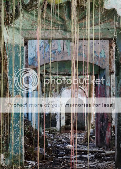
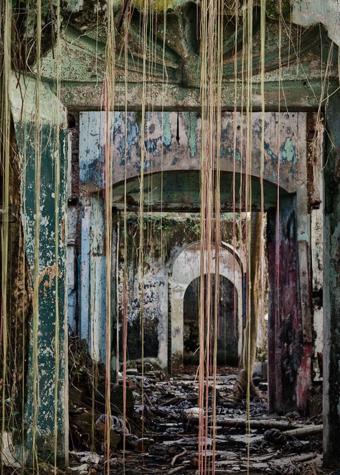
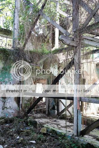
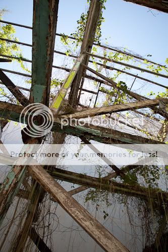
After years photographing "Casco Viejo", the old part of Panama City, I found this place just last Saturday hidden behind a stone wall that needs the help of iron beams to stay standing. Here's one of the shots that I like the most, I hope you too!
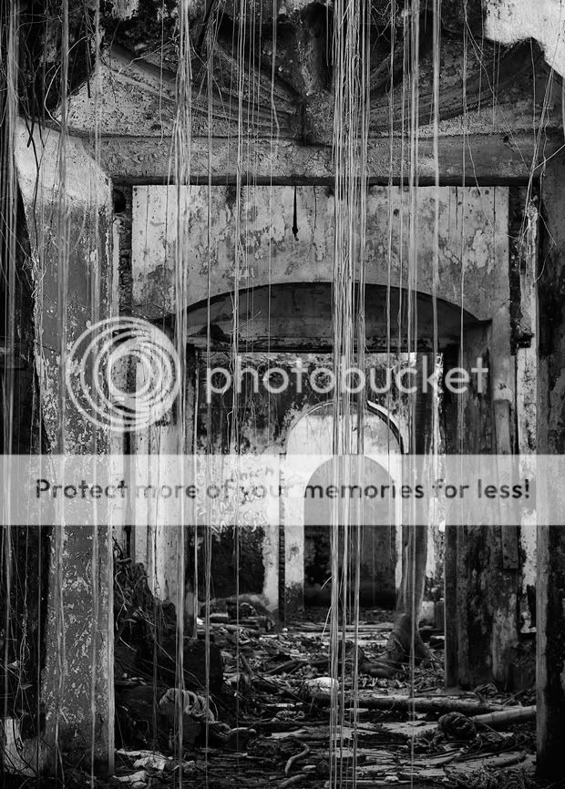
Ruben Alfu : Lianas and Doorways
Regards,
Ruben
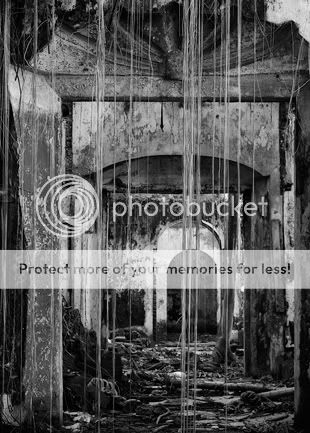
After years photographing "Casco Viejo", the old part of Panama City, I found this place just last Saturday hidden behind a stone wall that needs the help of iron beams to stay standing. Here's one of the shots that I like the most, I hope you too!
Ruben Alfu : Lianas and Doorways
Regards,
Ruben
") .
.