• Please use real names.

    Greetings to all who have registered to OPF and those guests taking a look around. Please use real names. Registrations with fictitious names will not be processed. REAL NAMES ONLY will be processed

    Firstname Lastname

    Register

    We are a courteous and supportive community. No need to hide behind an alia. If you have a genuine need for privacy/secrecy then let me know!
  • Welcome to the new site. Here's a thread about the update where you can post your feedback, ask questions or spot those nasty bugs!

Playground portrait

Ivan Garcia

New member
Yet another picture of my son playing. I called his name for this picture.
BW conversion via chanels.
hope you guys like it.
IMG_2649.jpg
 
Last edited by a moderator:

Asher Kelman

OPF Owner/Editor-in-Chief
I was out taking pictures. I'm starting a new thread to bring attention to people viewing all the images posted but not responding.

I like your image, but I don't yet know why. It catches my attention as this nice boy is looking at me. The bottle at first seems like something heldup in a roadside accident , the IV fluids for the injured. But it's a bottle. Then in the hand, is that a bracelt or a rosary.

When I ask question, I'll explore more.

On my screen, a 15" Apply LCD display in my kitchen, the image seems dark, so I'm not benefitting from all the ues. I'll look at it again on my other monitor later today.

Meanwhile, thanks for posting. I'm going to provide a better interface to immediately bring to attention new images.

Please continue to post as I remedy this. :)

Asher
 
Last edited:

nicolas claris

OPF Co-founder/Administrator
Hi Ivan
I'm just coming back from a long pro trip, and find you post and your image...
As you may have noticed I'm not a great fan of B&W contemporary photos... However the boy has an incredible sight that you did catch, good thing, this is the heart of the image.
I'm not also a fan of crops... (I love huge prints so I need the full resolution of the shot) So in the same context I would have zoomed to keep only the sight.
For me the bottle, the right arm, the pants and the background as well disturb the eye, I would have frame something like this:
IMG_2649.jpg

His expression is so powerfull, we need to keep concentrated on it.
Well, a good start and a very nice looking son, he seems to know what he wants!

Hope this helps
 

Ivan Garcia

New member
Hi Asher/Nicolas
Thank you for your comments. Just for you, here is the colour version, cropped as per your advice.
I am not sure if I like this new version, I may need some time for it to grow on me.
2649c.jpg
 
Last edited by a moderator:

Asher Kelman

OPF Owner/Editor-in-Chief
Now I feel better!

For once Nicolas and I have both changed our positions Nicolas is very religious about giving his opinions on other people work. He does not like to critique and say how your work should be. How can anyone say that because we are not you and it is, after all your vison that has to be exressed.

It is very generous for Nicolas to travel this road, however, he has, I believe taken you to a place where the idea, IMHO, of the image is much clearer. If what Nicolas has suggested expresses your own ideas too, then we all have succeeded. If not, then at least, we learn something and I here thousands of miles away from both of you feel I am now in better communication with this lad.

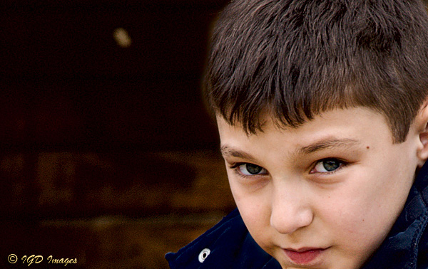
After all, now it seems that the bottle was not important.

It is surprising then that it was Nicolas, not myself who was prepared to boldly cut away what was distracting.

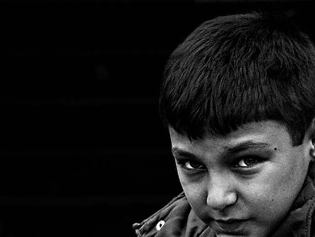
I myself did not yet have any clarity. Frankly, I was troubled by the, to me at least, blotchy tonality of the B&W conversion without richness in tones I would have expected. Then again it is not my creation. I was still trying to figure out whether or not this was a boy with a Rosary and then this had some meaning important to the picture which deleting would obliterate.

I still would like to know what else is in his hand besides the bottle!!

Right now, I have a boy intently staring at me from behind my Eizo monitor and this kid is very real and wont be ignored.

The B&W image is rough, gritty, and the texture is kind of blotchy and carries a much darker meaning.

So here Ivan, you have to dig inside yourself and ask what it was about the B&W image you were trying to project. Is this missing from the color image. If it is, no matter how much I like it, it's not your intent. It could be a new intent but it is not the art you are struggling to make.

Making a picture is work. The starting point of the creation is to have a feeling bound up in the image which as you work on the image becomes clearer and more powerful. you may not be able to articulate it simple terms, but you know when you have done it right.

So you wil have to think about it.

My feeling is that Nicolas has made the image clearer to me by the crop, but is it also clearer to you?

Asher
 

nicolas claris

OPF Co-founder/Administrator
Thanks Asher for clarifying my mood.
I like much better the new version poste by Ivan, However as I'm in now, I'll add a new version with:
- face more sharpened (this IMHO adds deepness to the boy's sight)
- darken the background and a bit of the face to get a stronger feeling about that little boy looking at Asher thru Asher's Eizo ;-)
- croped his chin (the ply is not very nice as you don't see anymore that its relying on the knee)

The real good question for wich we need an answer from Ivan is the Asher's one:
but is it also clearer to you?

I'd like you take an offensive defense of your work, it is your vision, my comments was/is about how I would have done that pic... not very interesting, what part of the picture do you wish to have comments? We're not teachers (please no!) but we can exchange, this could eventually help you, but me too...

Have a good day and if I may say a nice "tap tap" on your kid's shoulders. Seems to be a very nice and good young fellow...

2649d.jpg
 

Diane Fields

New member
Ivan Garcia said:
Hi Asher/Nicolas
Thank you for your comments. Just for you, here is the colour version, cropped as per your advice.
I am not sure if I like this new version, I may need some time for it to grow on me.

I do like the cropped version putting emphasis on his face--but how different in emotion the color seems from the b/w. The intensity I saw in the very gritty, intense mono is not there for me in the color. Since it is your creation---it seems that you would need to decide if you want to emphasize that same emotion--which you can do in color also. I would not say if one is 'better' than the other, but rather which is your intention.

Diane
 

Ivan Garcia

New member
Hi Diane/Asher/Nicolas.
Thank you for your comments.
The colour image was very bland for me, so I played around with it for a while and decided on the BW conversion, a higher percentage of the blue channel gave me the best intensity on his eyes, it also creates a very blotchy look and feel, which placed me in some very poor and rundown neighbourhood (the picture was taken in hide park which is well far and away from a poor area of London) the intention was to create a “lost boy” image. I did think about cropping the image to concentrate just on his face, however I decided against it, his pose and the use of a mineral water bottle for a toy helps with the “street merchant/lost boy” look, which I couldn’t achieve with the cropped or colour versions . The reason I posted the image, was to get an overall feel of the emotions it generated with an audience outside my immediate circle of friends and family, I am in two minds whether to include this image in my portfolio presentation.
By omitting my intentions for the image, I was trying to avoid adulterating the honesty of your responses.
Thank you all for taking the time to help, you have given me a different approach to look at. :)
Kind regards
Ivan
Ps: Asher, to answer your question, the rosary you see is just his sleeve. lol
 
Last edited:

John Sheehy

New member
Asher Kelman said:
On my screen, a 15" Apply LCD display in my kitchen, the image seems dark, so I'm not benefitting from all the hues. I'll look at it again on my other monitor later today.

It's not a monitor issue; the shadows are all clipped to black in the JPEG. Large blocks of 0,0,0.
 
Last edited by a moderator:

Ivan Garcia

New member
John Sheehy said:
It's not a monitor issue; the shadows are all clipped to black in the JPEG. Large blocks of 0,0,0.
mmm Thank you John.
Your comment is a good remainder to look at the rgb values , something I forget to do from time to time.
I might also need to re-calibrate my apple monitor, a necessary step which I tend to neglect more than I should.
 
Top