• Please use real names.

    Greetings to all who have registered to OPF and those guests taking a look around. Please use real names. Registrations with fictitious names will not be processed. REAL NAMES ONLY will be processed

    Firstname Lastname

    Register

    We are a courteous and supportive community. No need to hide behind an alia. If you have a genuine need for privacy/secrecy then let me know!
  • Welcome to the new site. Here's a thread about the update where you can post your feedback, ask questions or spot those nasty bugs!

The confrontational portrait

I recently viewed an exhibit of more than 50 identically framed, identically posed, elaborately lit (two huge softboxes, with grids, which you can see reflected in both pupils of every subject), and highly enlarged head and neck portraits by Martin Schoeller. Schoeller is apparently strongly influenced by the exhaustive cataloging approach of the Bechers, who taught in Duesseldorf for many years and have produced quite a few distinguished students. The effect of seeing so many huge serious faces in close quarters, ranging from politicians to movie stars to Amazonian natives, is thought-provoking, engrossing, stimulating, but I couldn't help wondering -- if I had the display space and the $10K that it takes to possess one of these works, could I live with it? And does one of these studies work by itself, or is the effect only the result of comparing many?

At the same time, I have recently been reading Mike Johnston's series of essays on style, by which he means a sort of visual trademark that makes an artist's work instantly recognizable. I'm used to the unending debate between the roles of form and of content in making a picture that has lasting impact, but to have style trump both of them leaves me extremely nervous. If we used the word "fashion" instead of "style," it would really sound silly. But Johnston doesn't leave much room for success and importance if you don't have style. He identifies cases where seeking for style might not be needed, but these are wreathed in condescension -- it's OK not to develop a style if you are just having "fun," or if you like cameras because you enjoy debating the ineffable characteristics of their lenses or arguing the merits of your manufacturer against all others.

So I think I had better get cracking on developing a style, and the confrontational portrait is certainly one path to this. I won't imitate the better equipped and better connected, though. My studio seems to be restaurants, my lighting is available with the help of a white tablecloth for fill. The M8 used at ISO 2500 with only modest noise filtering gives a gritty high-tech look at web scale that may have some of the effect of a 5' high C-print of a single individual, and it certainly costs much less to produce. So here I will contribute a first step. I present a confrontational portrait in my standard studio setting of a minor celebrity. He can perhaps be identified by OPF regulars, but that will not be important once I have 49 more like him to show alongside...

87181195.jpg


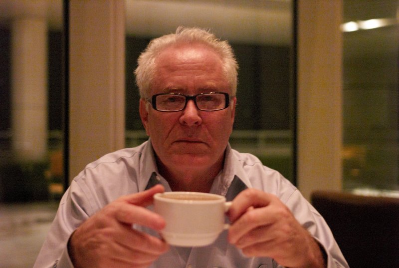
What do you think? Am I on to something, or is this just a picture that the client will be less than satisfied with?

scott
 

Eric Hiss

Member
hmmm not working at all for me.

I'm probably not going to win any friends here but I have to say that "Gritty, high tech look" is a very romantic way to describe really bad noise, banding and poor white balance that has become the sad telltale signature of a digital capture. Noise is one thing and luminous noise in particular can be passed off as film grain which most of us except the youngsters will accept as part of photography, however banding, and pattern noise (which are both present in your image in heaps) will not be endearing to viewers. Have you tried correcting the color and running a noise removal software on it? I mean if its that bad on a resized for web image, I'd hate to see the original. I shoot Leica and no way will I do more than ISO 400 on the DMR or 800 on the M8. If you want grit, you have to add it in post. There are so many ways to add noise, grit in photoshop...just do a google search.
 

Asher Kelman

OPF Owner/Editor-in-Chief
Hi Eric,

The picture is not for beauty, flattery or getting praise! Rather it's an attempt to confront the subject head on, without any niceties of compassion, empathy or other bonding, just the observation, like a clinical biopsy.

If it's art, then the noise doesn't matter! None of the things we generally worry about are the death knell for the modern photography art genre that's purchased to be successful or not.

Rather we merely look through a sort of window, smudges and all and see withing something of the subject, colored or distorted by that window perhaps or clear and sharp when the window is out of thew way. In either case, it's the subject and the radiation from it not the technique per se that dominates.

This release from the expectations of technical qualities we have considered the sine qua non of excellent work, may well be painful for many photographers to observe. However, for technique, we can hire a technician. Here, it's the artist, with no such restraints who draws as he ses fit and gets away with it!

Asher
 

Eric Hiss

Member
Both you gents write rather eloquently, but you've failed to see what this image is all about.

Its pure and simple a case of seduction by technology.

I've been there before and can recognize that as clearly as the vertical banding in the image.
 

Asher Kelman

OPF Owner/Editor-in-Chief
Eric,

Look, this is not a picture I like!!

Ed,

So forget about it!@!#$@#$ .

Scott, I imagine, was using his dry humor after his experience at an exhibition in Bevely Hills of famous people taken that way. Those pictures with a Mamiya 7, scanned and shown 6ft high, good or as bad! Some people came out beautifully. Others looked like degenrate street bums, including Kissenger, and some famous movie stars. So here we have a guy looking awkward and not really with it, LOL!

My writing on the posting of Scott's picture is really a defence of free speech and artistic expression. I don't see any art in this picture and I was not asked to select it. This is, as I said apparently presented as a a joke, but it's like a tale with the punchline in biblical Greek that no one understands!

Scott has plenty of images that are well framed and totally in a different class and I usually love his work. Everyone is allowed to have a bad day!

Asher
 
Now you've got me laughing!

I was contemplating this post in the background while I worked today and upon reflection, I realize I was thinking about the scenario where you take someone's photo in an akward moment and then get to know them enough afterwards to get a release form so the photo can actually be shown.

That's as far as I took my thoughts though. Nice. ;)
 

ron_hiner

New member
The whole is greater than the sum

Scott --
Sorry to say, your shot has none of the PUNCH that Martin Schoeller shows in every frame. My take on Schoeller is close to yours... twin striplights, critically sharp eyes, razor thin DOF -- nose and chin are out of focus, tight crop... and every shot is a celebrity that is normally seen in flattering portraits. All of that, expcially the last point, are what makes his shots have power. These are not flattering -- they are disturbing. Only Jack Nicholson looks normal. And only because he's Jack Nicholson.

I did a portrait series of 70 actors a while back... the sum of the collection (by all accounts) was outstanding, but many of the shots were merely 'good'. Somehow the whole was greater than the sum of the parts. Schoeller know that trick too. A single Schoeller shot of Bill Clinton would look goofy... but in a collection, every shot packs a wallop. Schoeller has a formula, and he can repeat it day in and day out to create an extraordinarly powerful collection. I have not seen the full collection, but I've seen about a dozen blown up to 30x40 or so. The effect is intense.

Here is a gallery -- check it out.... http://www.stern.de/unterhaltung/fo...ref=/unterhaltung/fotografie/544392.html&cp=1

And no, you dont need much money to product shots like this if you read Strobist. Tissue paper and bed sheets are cheap.

Ron
 
Confrontational?

Thanks for the links. The Schoeller show was, I think, printed to look meaner than the website images, or at least Jack Nicholson looked a lot nastier. I liked many of the images in Bruce McNeil's gallery. That's more like what I normally try for -- more of each person, and more of their environment. Also, most of the pictures feel like a collaboration between photographer and subject, not a subject subjected to a process invented by the photographer.

The question I was wondering about remains what is the dynamic by which a collection gains the power to stimulate comparison and contemplation? How many pictures does it take? In McNeil's galleries, the first group of pictures with backgrounds whited out start to have that effect. If you take my no-light example (which I agree should never be shown to the client), it could be extended to a series of "photographer friend across the table in a restaurant" pictures by one or by multiple photographers. Care to contribute?

scott
 
"photographer friend across the table in a restaurant"

Aha! Another clue! :)

Although significant, the number of photos needed to prompt comparison is secondary to the commonality in the photos, in my opinion.

Perhaps if all the photos were taken just at the moment where someone was picking up their coffee <click>, that would provide the commonality to prompt comparison?

If there were some guidelines as to commonality, I would be interested in contributing. You probably did not intend "photgrapher friend across the table in a restaurant" to be the last word on what the commonality would be, but I am interested in discussing that!?
 
Aha! Another clue! :)

...Perhaps if all the photos were taken just at the moment where someone was picking up their coffee <click>...?

If there were some guidelines as to commonality, I would be interested in contributing. You probably did not intend "photgrapher friend across the table in a restaurant" to be the last word on what the commonality would be, but I am interested in discussing that!?

Yes, but in pictures. Add one, and we'll see where the theme evolves.

scott
 
FOV for comparable shots

I used a 35/2.0 asph Summicron, which x 1.333 is 47 mm-eff. I think anything taken with a basic 50mm lens would be comparable.

scott
 
Top