janet Smith
pro member


Hope these brighten up your day too....

I think the last one is not in the ballpark of the serie made by the first 3… too different.
Hope these brighten up your day too....
Number 4 could use some postprocessing. I would e.g. try to darken the entire image, except for 5 leaves in the center foreground, to create more depth. Then play with saturation a bit for punch
But it just ndon't go in the same serie as the others… perhaps you have more of the same kind and have a second serie…
Have a lovely day too! Hug to Paul
")

janet said:Hope these brighten up your day too....
These do start my day very well, thank you Janet!
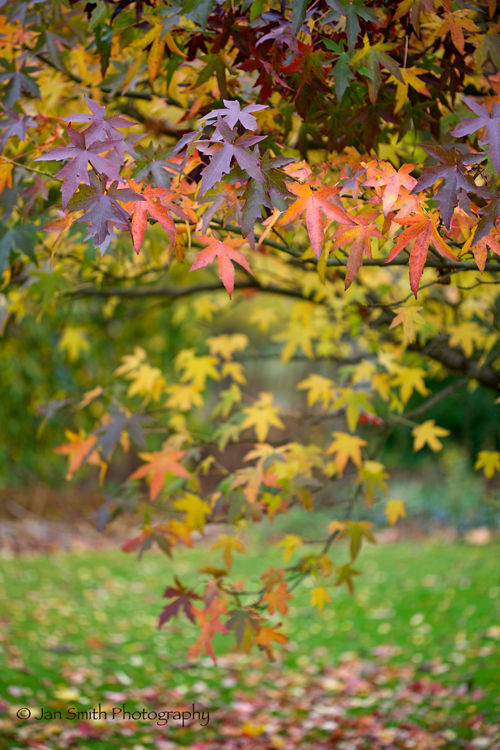
Layering: This last one should be singled out because the narrow depth of focus works well in blurring out the successive layers of leaves behind receding into the background. This effect in return pushes the main subject leaves forward to us so that floats lightly in the air
So in the pursuit of William's Anit-drab-a-Thon here's another one of the same tree.
...I subconsciously always look for geometrical shapes that define the composition.
like a ballet from arm to floor
branch to ground
Maybe it's just me, but I subconsciously always look for geometrical shapes that define the composition. I'd try and emphasize it a bit more than it does by itself.
Excellent use of depth of field!
Hi Bart
Could you explain what you mean by "emphasise it a bit more" for me - what technique did you have in mind....

Geometrical shapes don't define composition. They're aspects of spatial arrangement, which is one part of the many elements which, in sum, define wholistic composition.
Thanks for sharing these. Beautiful and inspirational.