• Please use real names.

    Greetings to all who have registered to OPF and those guests taking a look around. Please use real names. Registrations with fictitious names will not be processed. REAL NAMES ONLY will be processed

    Firstname Lastname

    Register

    We are a courteous and supportive community. No need to hide behind an alia. If you have a genuine need for privacy/secrecy then let me know!
  • Welcome to the new site. Here's a thread about the update where you can post your feedback, ask questions or spot those nasty bugs!

Frame or no frame and what about background for pictures?

Asher Kelman

OPF Owner/Editor-in-Chief
The presentation of art is a major part of the work of anyone making an exhibition, be it the artist, photographer or museum/gallery curator. Here I just want to address important aspects of showing pictures.

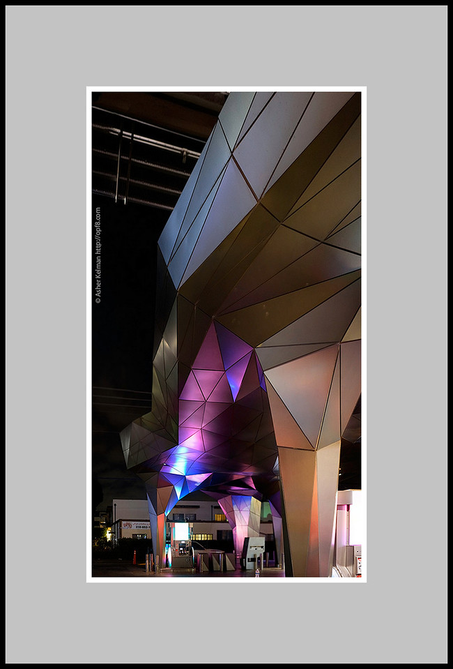
Frame: The purpose of the frame traditionally has been to protect, respect and enhance the artwork. The frame if used should not imprison or overpower the image. But lets just consider the framing of images not in a bricks and mortar gallery, but rather here in OPF. Some think that is doesn't matter much, while I for one have had strong opinions: I have felt that the b.g "wall we have in our fora works fairly well, despite requests for a darker b.g. Generally I do not use frames in presenting my pictures in OPF, just center them with white space all around. Well today, I was surprised when the frameless picture I had just made, (7 images-panorama handheld at night to cover a geometrically complex ARCO gas station) at night. Here it is with

#1, our regular b.g.

#2 a "charcoal" frame

#3 A "stainless steel" frame


[Group 1]-_DSC3775__DSC3785-11 images_no border_600.jpg


Asher Kelman: Arco Gas Station Side view #1


[Group 1]-_DSC3775__DSC3785-11 images_Charcoal 600.jpg


Asher Kelman: Arco Gas Station Side view #2


[Group 1]-_DSC3775__DSC3785-11 silver_600.jpg


Asher Kelman: Arco Gas Station Side view #3


I'd like to know your opinions as to what difference the frame/b.g. color makes in this instance. Feel free to also give your own examples.

Asher
 

Doug Kerr

Well-known member
Hi, Asher,

My vote is for number 1 (but of course I am just a telephone engineer).

Now, on the Open Picture Framing Forum, I might have a different opinion.

As to the background, that might be another matter altogether. It might be that a global background other than 247,250,255 might be good. I will ponder that.

Best regards,

Doug
 

Antonio Correia

Well-known member
Of them all, the second is my favorite as long as the background is white (or near) but only for presentation here in OPF.

If the background were black or dark grey then yes, the white border would be suitable. Perhaps even larger...

However if the image is to be printed and presented in a gallery or simply to be hang at home, things may change a bit ...

I am very biased by my own "style" of framing.

Oh... this is nice ! Sony photo ? Several photos stitched perhaps...
 

Doug Kerr

Well-known member
Hi, Asher,

I said:
As to the background, that might be another matter altogether. It might be that a global background other than 247,250,255 might be good. I will ponder that.

I just remembered that this background color is a creature of the forum style I had in place, "NC style".

A background of 255,255,255 can be put in place by choosing the style "NC white Background". (The capitalization there is a bit peculiar, perhaps borrowed from the German. It gets more peculiar yet for some of the other choices, such as "NC Black text - White Background".)

Best regards,

Doug
 

Asher Kelman

OPF Owner/Editor-in-Chief
Thank Doug and Antonio,

It's a challenge to design a page that can have as an option to choose the b.g. color.

Asher
 

Doug Kerr

Well-known member
Hi, Asher,

It's a challenge to design a page that can have as an option to choose the b.g. color.
Indeed. So perhaps you should offer a style that has a background you think would often be nice for photos (a fairly high-luminance "cream", for example).

This would be elected by the viewer, not the presenter.

Best regards,

Doug
 

Asher Kelman

OPF Owner/Editor-in-Chief
Hi, Asher,


Indeed. So perhaps you should offer a style that has a background you think would often be nice for photos (a fairly high-luminance "cream", for example).

This would be elected by the viewer, not the presenter.

Best regards,

Doug

Well, we can do both, perhaps, within the bounds of the total design. One issue is that the color has to work with the OPF artwork in the Logo etc. But I will address that.

We might even have an adjustable grey level for each post/all posts. We'll consider that. Whatever we do must respect the artist and design investment in the site, overall, but be most inviting for the individual viewer. It might be, form the design level, to have several choices to take account of ease of reading text and "wall presentation" of images. The simplest system, the better!

Asher
 
I like the idea of frames because otherwise some images with light components can bleed out onto the page. I like #2 though I think I'd prefer a thinner frame and I like Antonio's suggestion.

The ultimate would be to have several formatting choices for a post though I imagine that's wishful thinking.
 

Antonio Correia

Well-known member
The matte (assuming that I am understand correctly that the matte is the grey area) can be white but then the image itself would be lost inside the black frame.

I have tried another color to colorize the matte with one of the colors of the image but I didn't like it and moved to the grey which looks too strong for me now :)

I could now remember kuler. Here are 5 examples of possible colors.

In my opinion only two - perhaps three - can be used but much much lighter...


Asher Kelman

OPF Owner/Editor-in-Chief
That's a wonderful tool to incorporate into our design, if we could! I need to know more about it! I wonder if there's a tool box associated with it to allow it to be incorporated into the website?

Asher
 

Asher Kelman

OPF Owner/Editor-in-Chief
Kate Santa Monica Mural.jpg


Asher Kelman: Kate and the Dragon

Stitched Panorama

Hollywood July 2014

20"x44" at 300 dpi


Look here at the improvement by providing a charcoal b.g.!


Asher
 
Top