• Please use real names.

    Greetings to all who have registered to OPF and those guests taking a look around. Please use real names. Registrations with fictitious names will not be processed. REAL NAMES ONLY will be processed

    Firstname Lastname

    Register

    We are a courteous and supportive community. No need to hide behind an alia. If you have a genuine need for privacy/secrecy then let me know!
  • Welcome to the new site. Here's a thread about the update where you can post your feedback, ask questions or spot those nasty bugs!

Fun with a model! How bad can it look?

Asher Kelman

OPF Owner/Editor-in-Chief
I prefer to use Lab so my color is much less dependend on the Luminocity value. Then it's quite easy, caucasian skin has a a* value of about 13, and a b* value of about 17 (a bit more yellow than red, one could say). Dark skin is a little redder, asian skin a little more yellow...
It's hard to imagine that there would be consistency of the a* and b* values at different values of L*.[/quote]

So now lets say these figures are indeed valid.


Hi, Joey,


It's hard to imagine that there would be consistency of the a* and b* values at different values of L*.

For example, these two colors have the same chromaticity:

L*a*b* 75,13,17
L*a*b* 56,10,13

This is of course because the L*a*b* space is a "luma-chroma" space; in fact, for the same chromaticity, a* and b* scale directly with L*.


Typically true if we are speaking of the L*a*b* coordinates of the reflective color of the skin.

But of course the L* value of a patch of skin in an image is hardly constant (unless we always use a "zone-system" approach to exposure and all instances of the skin are under the same illumination (no shadowing, for example).

Best regards,

Doug

So can we just work on rations of a/b being 0.76?

If that's true, we just need to adjust color of skin to that ratio. How then do we calculate the L* value if we know the a* and b* values and want an a/b ratio of 0.76 in a shadow? Can we insert each value separately. I'm concerned about entering the values for a color in L*a*b* as altering one of the existing components will alter the remaining two. Surely we'd want to maintain L* but just alter both a* and b* values. Can we do that in Photoshop.

Asher
 

Kevin Stecyk

New member
Joey, AFAIK, there isn't much stuff in LAB with regard to skin tones. All that can be said is that generally B > A. But even that isn't absolute. I have remarked about that ealier in this thread. Please see:

http://www.openphotographyforums.com/forums/showpost.php?p=103195&postcount=63

My own experience is that these values are a rough guide. I recently photographed a young woman outside. In certain parts of her skin, using LAB, B>A, and other parts A>B. Yet, colors were correct. So these values are not absolutes.

As a hint for future work, when shooting women, don't necessarily focus on the face for colors. They often wear makeup, which throws out the colors. Look for an exposed shoulder, lower neck, chest areas, and arms. You can use legs too. I generally look for areas of the skin that are usually exposed to the elements so it should be representative of woman's general skin.

Skins tones are subjective. That said, Varis is well known in the retouching world, so I rely upon his knowledge and extensive experience.

If you look at CMYK and RGB, you'll notice:

C R
M G
Y B
K

If cyan is out, adjust red; if magenta is out, adjust green; if yellow is out, adjust blue.

For those not well versed in colors, you can set these two colorspace in your left and right dropper displays while correcting skin. Again, I have my right hand side to always display LAB values, regardless of my active colorspace.

Why Varis choose CMYK as his colorspace for measuring skin, I don't know. It might be historical. That is, his background might be in print, and that's where he developed his knowledge and expertise. Moreover, although CMYK is a smaller colorspace than LAB or sRGB, skin should fit within that colorspace, so it isn't an issue.

Going back to LAB, as Margulis stresses, LAB is good for strong, heavy color shifts. When it comes to more subtle shifts, not so much. Instead, he suggests--and I concur--that rgb is a better colorspace to adjust colors. You have much more control.

Many high-end retouchers will visit more than one colorspace during a retouch. So it's probably a good idea to become comfortable moving from one to another and back again. Yes, I realize that you need to be careful about going out of gamut as you move from one to the other.

Can I show you my corrected version? I would need Will's permission and access to his file. It wouldn't be hard to do, and it wouldn't look impressive in terms of color or sharpness. Rather, the color casts would be largely removed. I wouldn't bother with any retouching or sharpening.

Overall, I like Will's shot. The model is gorgeous. The photograph itself just needs a little care, time, and attention.
 
Why Varis choose CMYK as his colorspace for measuring skin, I don't know. It might be historical. That is, his background might be in print, and that's where he developed his knowledge and expertise.

Hi Kevin,

There is probably no other logical explanation, he has a background founded in CMYK, so he uses CMYK. Meanwhile, the world has shifted to an RGB centric environment, process printing being the exception.

Moreover, although CMYK is a smaller colorspace than LAB or sRGB, skin should fit within that colorspace, so it isn't an issue.

While true, most images are made up by more than skin alone. Also, the conversion to and from a different colorspace is lossy, not only for out-of gamut colors.

Many high-end retouchers will visit more than one colorspace during a retouch. So it's probably a good idea to become comfortable moving from one to another and back again. Yes, I realize that you need to be careful about going out of gamut as you move from one to the other.

I disagree, unless used for mask creation. In general, my advice is to learn and use RGB tools properly first, then see if there is more merit than loss from colorspace conversions.
Only too often do I see complicated composites and combinations of techniques for something that is simple to achieve with one of the built in tools or a plugin (many of which only make it easier because they combine functions).

Cheers,
Bart
 

Asher Kelman

OPF Owner/Editor-in-Chief
Bart,

Say one want's to beef up the tonality alone. Do you object to using the L profile from LAB for that, bringing it alone back into the RGB color space. Or you would just keep to RGB manipulations.

Asher
 

Kevin Stecyk

New member
There is probably no other logical explanation, he has a background founded in CMYK, so he uses CMYK. Meanwhile, the world has shifted to an RGB centric environment, process printing being the exception.

While we might have switched to an RGB centric environment, many others haven't. There is no right, nor wrong. And even those that have switched continue to use CMYK for its many benefits, not the least of which is an additional supply of channels for blending.

While true, most images are made up by more than skin alone. Also, the conversion to and from a different colorspace is lossy, not only for out-of gamut colors.

Your point is largely irrelevant. We're just measuring skin using CMYK readouts. We don't need to switch into CMYK to color correct skin using CMYK values. We can use RGB, as indicated in my last post.

As far as being lossy is concerned, it's so small that you'll have other larger issues to deal with. Margulis et al., have made tests where they switched from LAB to RGB a high number of times (don't recall the number) without noticeable differences. Degradation from lossy colorspace shifts is literally the least of my worries.

I disagree, unless used for mask creation. In general, my advice is to learn and use RGB tools properly first, then see if there is more merit than loss from colorspace conversions.

Only too often do I see complicated composites and combinations of techniques for something that is simple to achieve with one of the built in tools or a plugin (many of which only make it easier because they combine functions).

Disagree all you wish, the reality is that many/most do. Again, they like the additional supply of channels, if nothing else. Yes, those additional channels can be used for mask creation. Or they can be used for blending. Or they can be used for whatever. An example is CMYK's black channel. It's extremely valuable, especially if you tinker with CMYK presets.

Again, you loss concern is a red herring, unless you are out of gamut.

Many retouchers eschew plugins. I have no concern either way. All I care about is the final image. I don't care about the path taken to get there.
 

Doug Kerr

Well-known member
Hi, Asher,

So can we just work on rations of a/b being 0.76?

That would be true for the specific (arbitrary) chromaticity conjectured in the example.

If that's true, we just need to adjust color of skin to that ratio.
No, not all colors with that ratio of a*/b* have the same chromaticity. (They have the same hue.)

(All colors of the same chromaticity have the same ratio of a*/b*, but not conversely.)

I assume you are thinking of a situation in which we want the skin to have a certain chromaticity.

How then do we calculate the L* value if we know the a* and b* values and want an a/b ratio of 0.76 in a shadow?
I'm not sure I follow the scenario you are contemplating. Please tell me more.

Can we insert each value separately. I'm concerned about entering the values for a color in L*a*b* as altering one of the existing components will alter the remaining two. Surely we'd want to maintain L* but just alter both a* and b* values.
OK, let me state what the scenario there seems to be. We have an existing color of a certain skin patch. We wish to change its color, keeping L* the same, but moving to a certain desired ratio of a*/b*. Can we reckon new values of a* and b* that will do this?

Note that there are an infinite number of answers, depending on the "saturation" of the new color. For example if we want a*/b* to be 1.1, and the current (and new) L* is 76, then that could be:

L*a*b*= 76,80,88
L*a*b*= 76,50,55
L*a*b*= 76,0,0 (reference white)

So I have a feeling that we do not yet have a meaningful definition of the scenario.

And so I think I'll quit at this point, while we try and refine what the conditions and objectives of the hypothetical exercise are.

By the way, there is no color choosing system available in such editors as Photoshop that allow us to directly set the chromaticity of a color. (That would actually require us to edit in the CIE xyY color space!). Choosing in the HSB coordinate system is perhaps the closest (and it is gravely deficient).

In any case, why would we want to do this sort of thing in L*a*b* coordinates anyway?

Best regards,

Doug
 

Asher Kelman

OPF Owner/Editor-in-Chief
In any case, why would we want to do this sort of thing in L*a*b* coordinates anyway?

I used the example simple because a definition of an example of good skin color was given in a LAB color space.

If one can such a say European skin should be a/b= 0.76 but with the same luminance, to have a constant hue, then you say we have to specify saturation.

O.K. then then where do we stipulate saturation? Is there a guide to know where one is in saturation by percent if the hue and luminance are constant in a particular LAB color space?

So can I designate an a/b ratio of .76, a saturation of 30% and then you can come up with the a and b values to achieve that?

Asher
 

Asher Kelman

OPF Owner/Editor-in-Chief
Note, down the road, we may separate daughter topics out so that we have single topics. So don't be concerned, for now, if some questions seem to leap across others.

Asher
 
Bart,

Say one want's to beef up the tonality alone. Do you object to using the L profile from LAB for that, bringing it alone back into the RGB color space. Or you would just keep to RGB manipulations.

Hi Asher,

Lab is not very suited for that, due to what Doug has already mentioned. Changing the L value also changes the chromaticity (try it in the PS Color Picker dialog). It's much simpler to use a Luminosity blending layer, or start with multiple Raw conversions with e.g. different ëxposure"settings" and layer them if special effects are intended (e.g. different color balances) and use masks or blend-if scenarios.

For visually very exact adjustments (e.g. maintaining correct saturation when changing luminosity) one needs better tools, such as a (free) plug-in that allows to adjust along the path of a Color Appearance Model (CAM) such as:
http://sites.google.com/site/clifframes/ciecam02plugin

Cheers,
Bart
 
Hi Kevin,

I was responding to the remark you left out of the quote, so I'll repeat it (emphasis is mine):

Many high-end retouchers will visit more than one colorspace during a retouch. So it's probably a good idea to become comfortable moving from one to another and back again. Yes, I realize that you need to be careful about going out of gamut as you move from one to the other.

While true, most images are made up by more than skin alone. Also, the conversion to and from a different colorspace is lossy, not only for out-of gamut colors.

Your point is largely irrelevant. We're just measuring skin using CMYK readouts. We don't need to switch into CMYK to color correct skin using CMYK values. We can use RGB, as indicated in my last post.

With this I agree, using CMYK or Lab as a (secondary) readout in the info panel won't cause any harm to our RGB image, converting to and fro can harm our RGB image, if and how much depends on the actual colors.

Again, you loss concern is a red herring, unless you are out of gamut.

Not only OOG colors get changed, but then all I can do is inform people that when playing with fire, they can get burnt. People are free to try it regardless.

Cheers,
Bart
 

Joachim Bolte

New member
... And why does that matter? I think this is not forensic photography.

Hi Doug,

And yet we are all trying our best to make our point considering the question 'what did Will want to achieve with this picture setup'... That's kind of investigative, isn't it? :) One takes the mathematical approach to answer that question, the other the aesthetic one, but we all try to give our vision of 'how things should be'. Yet what it all boils down to is the question what the original photographer wanted us to see.

So maybe it's time for Will's story about this picture, and his opinion about the edits. Hey, I still don't know if I'm in trouble by starting the editing! :D
 

Doug Kerr

Well-known member
Hi, Joey,

Hi Doug,

And yet we are all trying our best to make our point considering the question 'what did Will want to achieve with this picture setup'... That's kind of investigative, isn't it? :) One takes the mathematical approach to answer that question, the other the aesthetic one, but we all try to give our vision of 'how things should be'. Yet what it all boils down to is the question what the original photographer wanted us to see.
I agree.

It's always possible he wanted us to see a cute model in a very nice pose and an interesting setting.

I saw that 147 posts ago!

Best regards,

Doug
 

Asher Kelman

OPF Owner/Editor-in-Chief
Let's Take a Deep Breath, Find New Pictures to Post and Reflect!

Time out Joe and Kevin!

Both have you have contributed greatly. I myself am going to study your approaches. We need to digest a reread a lot of posts. Still, on the way we have seen some unique and helpful insights as to how one might approach colors in an image. It's a combination of science and art since no matter what the numbers declare, if the monitor calibrated and one is not getting a colored reflection on the screen, then the final adjustments have to be based on taste.

Let's take a rest on this so we can review and allow the components to stew.

Let's refocus on new pictures and hold the thoughts here. We don't want actual animosity to develop between two guys interested in helping and making things easy for others to understand.

I am about to start on a new big shooting project of some hundreds of portraits and would love for us to be discussing more new pictures over the coming 4 weeks, if we can. This will give us more perspective and allow us to see where our good ideas are not necessarily applicable even where we thought it was straightforward! Also, it's entirely possible that areas of disagreement are, in the end, difference is preference or just different views of the same concept.

We can discuss color management, of course, but we cannot neglect our new pictures, the llife-blood of our getting together! Photographs provide instant payoff in joy and interest as well as the value of the critique we write. I will post some new pictures myself. Meanwhile, have you each looked at the pictures mentioned here. While we are dissecting and discussing colors, we don't want worthy pictures like these to be come orphans at a young age!

This is not to lessen the value of any one approach above, rather, I don't want to pay less than full attention to this hot and highly technical discussion on color fidelity and preferences.

Asher
 

Joachim Bolte

New member
Let's take a rest on this so we can review and allow the components to stew.
You're right about that, got a little carried away. Let's be Zen.
I am about to start on a new big shooting project of some hundreds of portraits and would love for us to be discussing more new pictures over the coming 4 weeks, if we can. This will give us more perspective and allow us to see where our good ideas are not necessarily applicable even where we thought it was straightforward!
Looking forward to see those. When I have an opportunity, I'll take a look at the threads you mentioned.

cheers,

Joey
 

Will Thompson

Well Known Member
Another one from the same shoot but different light and background.

Will_Thompson_C_2010_012K2033_2.jpg
 

Doug Kerr

Well-known member
Hi, Will,

Another one from the same shoot but different light and background.

Will_Thompson_C_2010_012K2033_2.jpg

Cute model, cute pose.

For some reason, it looks like a hand-colored B/W.

Her face also looks a little OOF.

The right leg heading considerably forward but cut off doesn't work well for me.

Best regards,

Doug
 

Asher Kelman

OPF Owner/Editor-in-Chief
Another one from the same shoot but different light and background.

Will_Thompson_C_2010_012K2033_2.jpg


Will,

I just think this is a cute fun picture that could help with the girls portfolio. Of course, gray cards are relly great to use, but as the shooting distance, LOL!

Now you have to raise your prices again. You will be able to buy the new Pentax Medium format to lend to me and this!


Asher
 
Last edited:

Will Thompson

Well Known Member
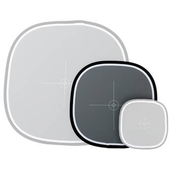
Too small, I would have to be shooting macro to use that postage stamp size thing.

This is what is needed!


Will,

I just think this is a cute fun picture that could help with the girls portfolio. Of course, gray cards are relly great to use, but as the shooting distance, LOL!

Now you have to raise your prices again. You will be able to buy the new Pentax Medium format to lend to me and this!


Asher
 
Last edited by a moderator:

Asher Kelman

OPF Owner/Editor-in-Chief
Will,

I have liked your work for a long time. This last picture is going to help the model get a job. Kudos!

Asher
 
Top