Hey Chris - a wonderful portrait indeed.
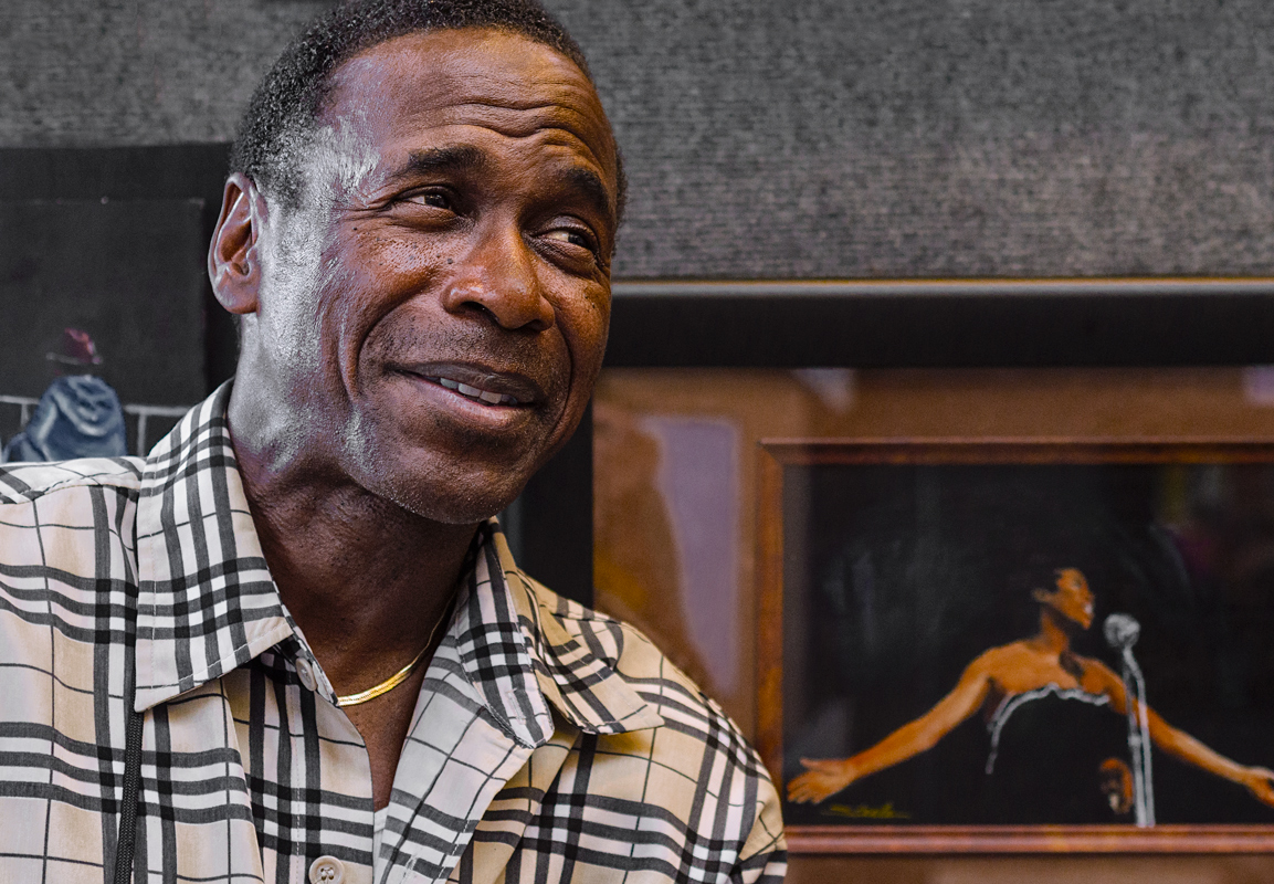
I wasn't sure what comparison you were referring to, until I hunted around for a while and happened to come across your other post with the black and white print. You may wish to include that version here in this post as well. As well, I wasn't familiar with Ricky Steele.
Without having knowledge of him, I had to presume that the portraits in the background were ones of his - - - and based on that, I really find the colour image to be more compelling and story telling. I find that the colours make the most important elements stand out (example the skin tones of the woman in the painting) - as well his skin tone is wonderful in colour.
And so then when I did a Google search for Ricky Steele (
http://www.artbyrickysteele.com), I came across some of his paintings and recognized the colour pallet that he used. The paintings that I saw were all in colour and that impressed even more on me how nice the use of colour in your photographic portrait was.
If there were no context needed, and this was just a portrait of the man - the back and white treatment looks wonderful.
This is just what struck me at first glance. Without seeing the black and white image, I made a choice that the colour one was great.