• Please use real names.

    Greetings to all who have registered to OPF and those guests taking a look around. Please use real names. Registrations with fictitious names will not be processed. REAL NAMES ONLY will be processed

    Firstname Lastname

    Register

    We are a courteous and supportive community. No need to hide behind an alia. If you have a genuine need for privacy/secrecy then let me know!
  • Welcome to the new site. Here's a thread about the update where you can post your feedback, ask questions or spot those nasty bugs!

Challenge: Great Doorways as frames for pictures

Asher Kelman

OPF Owner/Editor-in-Chief
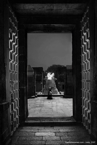
This is one of Antonio Correia's recent trio of images from India.

144331654-L.jpg


The other two were market scenes.

This one is unique in that the doorway is itself remarkarcable in design and interest and then we are introduced to a series of outdoor shrines. This scene look very imposing and religiously sacred.

Of course the sky could have been made perfect with wonderful clouds and we could have several humming birds visiting. Antonio didn't think of that!

In fact this has an errie feeling of emptiness and perhaps ghost of long time ago.

Would it have been better with a wonderful sky. I ask you to think about that. I'd love to also see this in B&W since I wouldn't be suprised if it was even more powerful and that B&W matured it by shedding the glamour of color.

Of course, I don't know what was on Antonio's mind apart from recorded his visit. Still, this image is here, and makes mec think of the past and a lot of ceremony and offerings.

Asher
 
I loved Antonio's picture in the very moment I saw it!

Yes, in deed I thought about the sky, I would not think of "hummingbirds" to "improve" it <smiles>, and you do have an excellent point in deed when you say that the washed out sky allows the viewer an undistracted focus onto the rest of the meditative scene.

On my mind was not the "grandcanyon sky" or similiar, more something like a single and distinct little cloud, lost in the rest of the sky which could have contributed to the focus. Imagine this little clould would be centered half way over the head of the bigger statue in a blue sky. Too much?

I have only done one BW conversion so far. I also wanted to see how this would look in b&w.

I hope that's ok and Antonio doesn't mind! Here my humble attempt.

- converted to 16bit
- channel mixer,
- tried to select the big statue then lowered brightness & increased contrast
- selected the door frame, then inversed selection to unselect the scene
- added warming filter 40%, softlight, opacity 75%, fill 45%
- reselected door frame, inversed again
- added gradient layer, dithered and reversed at 15% fill
- added gradient tool starting from the nose of the big statue diamond shaped

Antonio_bw.jpg


P.S.
<grins> Then again, this is probably a good example how b&w conversion should not be done, hehehe, I have no idea.
 

Antonio Correia

Well-known member
Please watch how the sides - I don't know the English for that but I'm sure you will understand - of the door are a little arcqued ( like an arc ).
I do have corrected the perspective and I only saw now the little error.
About the sky: The sky was white. Bright sunshine. One of those skies that appear bearned in the histogram.
As I have told often here and there, I was using a CPF with superb results.
I could if I knew how - but I shouldn't - changed the sky for a new nice one.
It's not the kind of image manipulation I like to do...
This is the natural sky.

The photo is the melting of 2 pics: one for the outside, darker, and one fot the inside, lighter.
Then, Masks, LAB, Curves, SS, Lens Correction, Frame.
I do have another framed window to be photoshoped.
In time I will post it here.
I erased the 2 photos because they were non-sence in here. Sorry.

 
Last edited:

Michael Fontana

pro member
I like that doorway shot a lot; as it shows "sort of macro" - the ornamental door, and "micro" the outdoor shrines.

The color version "smells" more India.

The gates are quite impressive in that land...
 

Kathy Rappaport

pro member
Color has more detail

Somewhere in the conversion, the B&W image seems to have lost some of the detail that the color image has. Wonderful composition and framing.
 

Jack_Flesher

New member
Of course, I don't know what was on Antonio's mind apart from recorded his visit. Still, this image is here, and makes mec think of the past and a lot of ceremony and offerings.
Asher

Not my personal best, but one from two years ago I felt was better presented as a B&W, so maybe it qualifies ;)

cloisters2.jpg
 

Asher Kelman

OPF Owner/Editor-in-Chief
Jack,

It absolutely does quailfy.

There's a passage with no options most of the journey to turn left.However, one can l;ook through the windows, to what we don't know.

The right side is open. At the end of the corridor, there's perhaps choices of going either left or right.

This picture then is a metaphor for our lives. Choices and lack of choices.

I do like the architecture. The lighting inside the structure is beautiful but here it looks as if the outside is perhaps blown out.

Thanks so much for sharing. Is this film?

Asher
 

Jack_Flesher

New member
This picture then is a metaphor for our lives. Choices and lack of choices.
~~~
Is this film?

Excellent synopsis Asher -- it's what I like about this image!

It is a digital original -- 1D MKII converted to B&W in PS. (In the print, the outer area is direct sun-lit grass and it is not blown, but at the edge. The shadows areas are more open in the print and show a bit more detail than they do here in web view.)

Cheers,
 

Asher Kelman

OPF Owner/Editor-in-Chief
Well, Jack!

Kudos to you and to the 1DswII.

I would be impressed for film, for Digital double that.

Did you experiment to see which papers gave you a more "realistic" B&W print.

IOW, is this such that one might think it is film or does it have a different esthetic for you?

Asher
 

Jack_Flesher

New member
Well, Jack!

Did you experiment to see which papers gave you a more "realistic" B&W print.

IOW, is this such that one might think it is film or does it have a different esthetic for you?

I have yet to find an inkjet on paper solution that does honest justice to a traditional B&W silver print. (My friend Jim Collum keeps pushing me to try Platinum using digital negatives for this reason!)

That said, this image looks quite "traditional" when printed on luster paper and mounted behind glass. Silver rag is a great paper, but there is a fairly distinct and somewhat odd gloss-differential quite visible on a naked B&W print -- at least with Epson inks, and I am printing with the latest K3 inks... I have not completely resolved this issue as respects my personal viewing preferences, so I'm not sure how much I like this paper yet; in some ways it is superior to the look on Luster, on others not so. In the end, I think it is a good third paper option, which brings us to my favorite -- but still not perfect -- paper for this image: it is very nice when printed on Epson Ultrasmooth Fine Art and for me, this paper renders the best overall "feel" for the un-framed, naked print.

Paper choice is a very subjective issue and I realize opinions vary widely, but as an artist I tend to choose what works best for me...

Cheers,
 
Last edited:

Antonio Correia

Well-known member
Well, I think this is what you all were expecting me to do ! :)
I'm not very used to convert to B&W but ...
Do you like this ? Should/shall I improve it ?
145086343-L.jpg
 

Antonio Correia

Well-known member
Well, I think this is what you all were expecting me to do ! :)
I'm not very used to convert to B&W but ...
Do you like this ? Should/shall I improve it ?
145086343-L.jpg


In fact it has not the quality of Jack Flesher's photo. :(((
I want to cry !!!
 

KrisCarnmarker

New member
Antonio, I think the B&W version has lost all the magic. I see absolutely no reason to convert it; it's not like the color version has "distracting" colors or anythings. Just wonderful warm brown doors with gray surroundings (with a tad of green in the distance).
 

Antonio Correia

Well-known member
Antonio, I think the B&W version has lost all the magic. I see absolutely no reason to convert it; it's not like the color version has "distracting" colors or anythings. Just wonderful warm brown doors with gray surroundings (with a tad of green in the distance).

Thank you for the comment.
I do like the coloured one very much.
More than the BW version.
Those doors in that colour, kind of orange - let me define it unproparly like that - are very nice.
The sky is a little (only a little ?) burned but ...
I have been browsing among my images looking for this one and I saw another interesting door way.
Sooner I think I'll be able to post it here.
Thank you.
 

Asher Kelman

OPF Owner/Editor-in-Chief
Well, I think this is what you all were expecting me to do ! :)
I'm not very used to convert to B&W but ...
Do you like this ? Should/shall I improve it ?
145086343-L.jpg


In fact it has not the quality of Jack Flesher's photo. :(((
I want to cry !!!

I agree with you Antonio that the color one looks great straight off. That is because color brings delight. It is very decorative and is a fast way of adding sense and interesting materials to the image.

Black and white is a huge challenge. Although, pictures with messy colors can be better with B&W, it is not as simple as that as you allude to in your reference to Jack Flesher's B&W work.

So I have tried to have a B&W sibling to this picture, (which happens to be great in the original color). (I worked fast from the small jpg and the junctions are not perfect)

144331654-L_AK.jpg

© 2007 Antonio Correla, Edited by Asher Kelman discussion purposes only.


If this was a blown up large picture, it would easier to make out the idols and then the image would have much more meaning. Since this image shows a religious subject, without seeing these objects clearly, full impact is kept from us. This is one example where bigger is better! Still, I hope this conveys some small part of the potential in this image for alternative interpretation to bring out the sense of ceremony and sprituality. This does not argue here for or against B&W or original color since that is only the perogative of the artist.


Asher
 

Jack_Flesher

New member
First off, I agree that not all good color images make good B&W images. Next, I also agree that this particular image is quite good as-is in color and probably should be left that way.

However, for discussion, I think it is worth pointing what might make it work better as a B&W...

In my humble opinion the reason this particular image does not work well in B&W is the relatively large field of near-white sky being too prominent and too distracting -- my attention is immediately focused on it and nothing else in the image. The colors present in the color version are enough to draw our attention back out to other elements in the image and so it works better.

So for my first change, here is the color version with some cloudy sky added in CS to replace the existing sheet of light gray sky:

indianshrinesky.jpg


Next I convert this image to B&W, do some minor curve adjustments and get this:

indianshrineskybw.jpg


I feel this is now a better overall image for B&W as it has more more "depth" as I look into it. However, I think it remains a strong image in color...

Cheers,
 

Asher Kelman

OPF Owner/Editor-in-Chief
Yes, Jack,

It is now more powerful and balanced, but to have the esthetics of prayer and ceremony, the statues/idols/gods must be larger, so the picture cannot work the way I imagine it small.

Asher
 

Antonio Correia

Well-known member
I want to thank you both for the time spent on my photo. :)
Jack, you did a very good job puting that sky in the picture.

These days, I have been kind of obcessed with the photos from India and yesterday night I found myself in a hurry to photoshop them all, or part of.
I stopped and said to myself: What is this ? I do it for pleasure ! Not an obligation. Slow down !

All this to tell you that I am preparing some pics in B&W for a contest.
But about this I'll post a thread later on.

Then, I would love to read your comments.
Thank you.
Cheers and Health !
 

Jack_Flesher

New member
I realize the title of the post was about using doorways to frame, but really I think the tactic can use any shape to frame... IMO the more important issue artistically speaking is to have significant enough contrast between the frame and subject to make them stand apart.

Here are two examples from a recent workshop. The first uses a dark room to set the mood and frame the "junk" at the end:

into_the_light.jpg


Just around the corner is this open kiln with lighting almost fully the reverse of the above image. IMO this works too, but conveys a totally different, less dramatic mood:

full_kiln_crop.jpg


What do you think?

Cheers,
 

Antonio Correia

Well-known member
Jack Flesher. It's with pleasure that will write these lines.

Let's go for the 1.st picture.
It's the one I like best.
I do like the door and the different colour temperature of the light coming from ... toilet ?
Doesn't matter if it's a toilet or not - Americans call it a rest room, to rest ? - but for me it looks like someone is coming from there to receive us.
There is another light. May be a light from above, a skyline (is this correct?), I mean light from the top. Zenital light. And it looks natural. Colder than the other light what benefits the picture.
Intentionally I think you left the forepart of the picture in the darkness. Good. It has - in my monitor - little enought and little detail.
The photo is also well composed and balanced.
I would not mind to have shot this picture. :)

Second picture.
Indeed it is the other way around. Light in the foreground and darkness in the background.
It is also a very nice picture. It has some detail at the bottom but may be, I mean may be, some magenta cast ?
Am I saying anything wrong ?

As you have posted - and somebody else before you - pictures of frames I post here one of mines.
The light also comes from the top. It's my friend Carlos.
104533620-L.jpg
 

Jack_Flesher

New member
Antonio:

The interior of that old factory had many different types of lighting, which made light balancing essentially pointless!

In the first shot, you are correct -- it is daylight hitting the junk and then the warm tungsten light emitting from the bathroom.

In the second shot, there is a large industrial sodium lamp (VERY yellow) above and behind me and some bleed from the gas-jets in nearby kilns that were running, and additionally some filtered daylight from an outside door letting shaded sunlight in the rear.

To make matters even worse, much of the facility had mercury lamps (VERY green) in some areas! Here is a shot with mercury lighting the pipes and sodium lighting the background(!):

green_pipes.jpg


There was also a lot of very warm light from the gas-fired kilns adding to the mix. Here an exhaust fan is lit by mercury overhead and the operating kilns from the side and front:

kiln_blower.jpg


In the end, I just tried to use it all to the image advantage ;)


Cheers,
 

Antonio Correia

Well-known member
Jack
I like the top one but I think the other one is too red/magenta.
I do know that this happens because of the colour temperature of the oven.
The one on top is a really - another - nice picture.
I like the green.
But may be we are hijacking this thread.
Don't you think so ?
At the moment I have to go and make some house work (ah ah, yes yes, I must or else my wife beats me ) but I would like to post here more of my frames.
Later on.
Cheers.
 

Antonio Correia

Well-known member
I have been away for some time now, but I'm back. :)
Today I post another door from inside a temple, in India. :)
As you can see I used fill flash with some sucess I think.
 

Asher Kelman

OPF Owner/Editor-in-Chief
Welcome back, Antonio!

I wondered where you were!

Yes, the flash worked. I'll be happy to see more.

Grreat shooting to you!

Asher
 

Antonio Correia

Well-known member
Welcome back, Antonio!

I wondered where you were!

Yes, the flash worked. I'll be happy to see more.

Grreat shooting to you!

Asher

Hello Asher.

No, I have been home all the time ! :)

Only I have been more busy and a little more lazy also.

I do have shot with some frequency, but I'm still working on the last pictures from India !

Cheers.
 
Top