Put these four up for your critique. A few of my youngest again...low light, outside, little bit of reflector fill only, 85mm at 1.2, trying a different look with the super shallow DOF. C&C welcome, always looking to improve.
This lens is, besides the Canon 50 1.2 L one of the fines you could choose for protraits. Also these lenses are mase to be used wide open. The way your model moves to different poses, almost like a kitten jumping for drops of milk, creates a delightful sequence of shots but a challenge for that narrow depth of field. One cannot expect to have more than occaisional winner because there as so many variables in the geometry and shaping of featues with such close distances and even more so from above that one can be lucky to have an keepers out of 10 shots. With a seated posed stationary classic setup, these lenses are still challenging but more predicatable.
Still you have achieved some nice shots.
1.
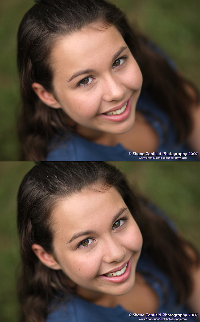
In the first picture, of course she is charming and her smile captivating. However, this is still tentative, we are not quite there. Some selfconciousness. The light on the nose is a little too bright and in this case, under exposing or reflecting the added light through a diffusing sheet to spread it or a diffuser for the sunlight might help. Still, if this was the only image, it's delightful. Everyone would be happy. (BTW, there's some posterization in the makeup on the cheeks and forehead and maybe that's a jpg artifact (or else the PS corrections were made in 8 BIT or were drastic). Since these artifacts are pretty well absent in the other three pictures, it's likely to be a processing artifact in PS. I wonder? No big deal. jpg can do that in one picture of a bunch because of differences in lighting.
2.
This and the last two images picture have no highlighting issues. Again the eyes are in perfect focus. The bridge of the nose is too. I'd venture to selectively sharpen the lips. I'd try blurring the inside rim of the glasses to take away emphasis in them. The eyes are beautiful and the thickness of the lower inside rim appears distracting as we move our eyes to hers.
3.
Playful and a good experiment.
4.
[/QUOTE]
On est arrivé! This is the picture. I like the bold diagonal, the placement of her face in the strongest position and the secrue balance shown by her right arm. It does more than keep her and her picture in equilibrium. More it speaks to the trying to support herself as an individual person and come to you on some of her terms. Here she is presented as herself represented in her face. The body, in lovely blue, is softly taken by the bokeh. This is the picture. Congrats!
The cropping at first is bold and maybe harsh. However, this is what powerfully places her so that she looks into the frame as into a window. We do not need any of her head or body we cannot see and not seeing htem is better for tHe picture. The picture as is works. Again I might suggest sharpening the lips a tad and in a new image trying to have a wisp of hair that ends up in the plane of focus too. I'd also consider doing a set after her her prepared professionally. You'll treasure htese pictures anyway, but a few which bring out more of her wonderful hair would be another part of this project to expore with her.
Often, I rail against the fashion to crop close when people leave themselves no room for rethinking the creative process during the "darkroom phase" of making the picture. Here however, the framing in the camera appears to have worked. Is this, BTW, how you framed or is it crop? If the latter, that only supports my feeling that unless one is a reincarnation of Ansel Adams, composition is, like making the photograph, part of a continuous process in which trades of territory, shape, sharpness and emphais and shading are made to achieve the final result. so if you cropped in PS, great! That is perfectly as good as doing it when one shoots. Insisting it should be completed and decisive in the stage of light capture is to me at least, to restrictive.
Asher


") It gets a little boring for kids doing this.
It gets a little boring for kids doing this.