Jerome Marot
Well-known member
This is not a B&W picture.


")


Ruben Alfu : Green Leaves

I like it...but did the "gamut warning" flashed on yours as well?
It doesn't matter for now, here, but I like to check it from time to time, and sometimes (particularly with greens) it gives me a winter wonderland spirit. It's been a long time that I haven't printed (with care) something anyway.
Yes, this is over saturated for CMYK, and probably for any printing method.
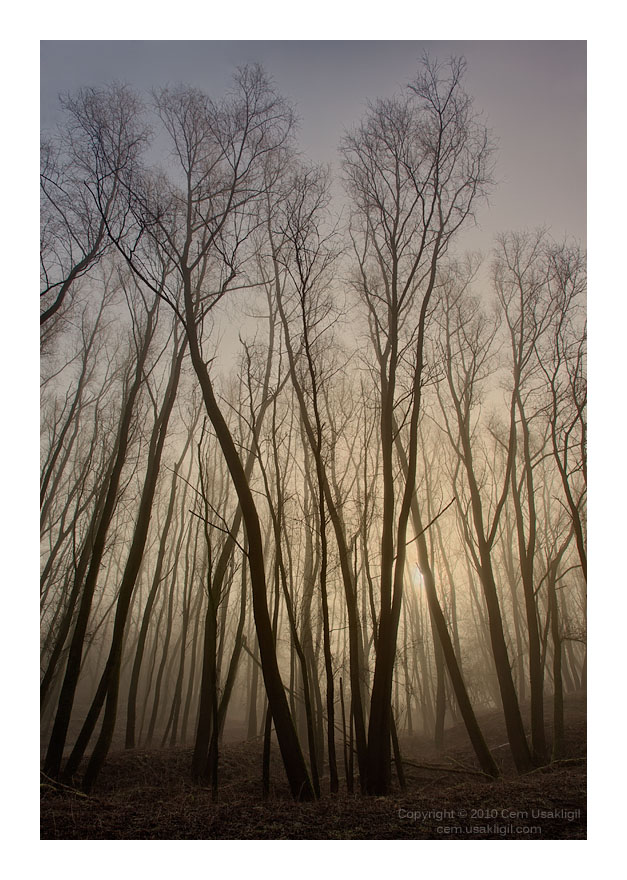
Some very nice pictures in this thread, which makes it a challenge to add something worthy to the collection. Nevertheless, please allow me to share one of mine.
Hi, Cem,
Lovely!
Best regards,
Doug
Likewise........Nice to see you again!
aaaahhhhhhh
Not as good as the last crab from Jérome BTW...
I had a hard time for this one, it was hard to catch up the speed with only 1/1000th sec. Ah! Wildlife photography!
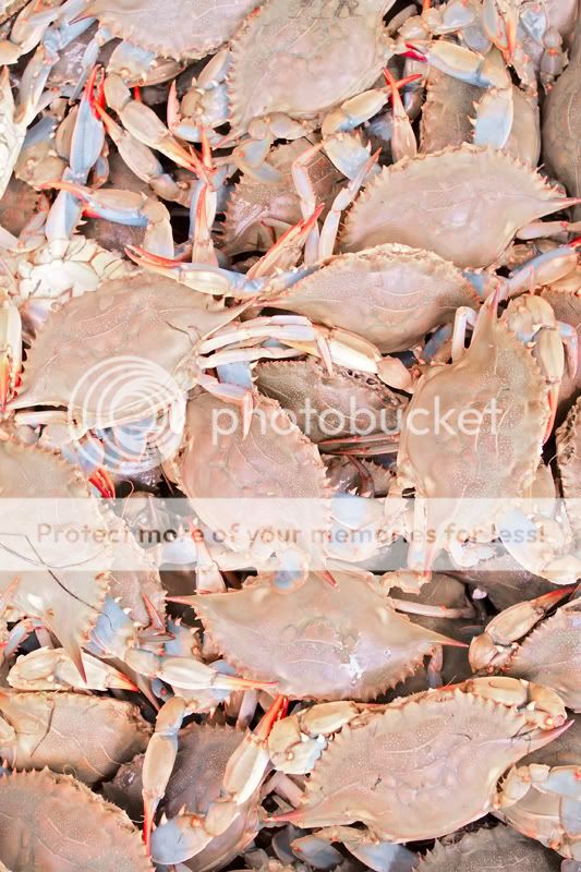
Nobody likes crabs, apparently. Let me try something different:
Some very nice pictures in this thread, which makes it a challenge to add something worthy to the collection. Nevertheless, please allow me to share one of mine.
Cem,
This is fine!
You took your time,
but the sun is always there, waiting for us each day,
behind the details of the leaning, reaching crisscrossed trees that make so much of the fabric of life.
Asher

Maybe this seascape is monochrome enough?
What a sky! really really beautiful.
