• Please use real names.

    Greetings to all who have registered to OPF and those guests taking a look around. Please use real names. Registrations with fictitious names will not be processed. REAL NAMES ONLY will be processed

    Firstname Lastname

    Register

    We are a courteous and supportive community. No need to hide behind an alia. If you have a genuine need for privacy/secrecy then let me know!
  • Welcome to the new site. Here's a thread about the update where you can post your feedback, ask questions or spot those nasty bugs!

My World: Potter's Wheel

Asher Kelman

OPF Owner/Editor-in-Chief
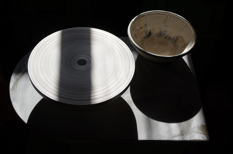
This is the mobile workplace of a potter we know. The picture was taken after the first clean-up at the end of the day.

I thought of b/w but decided against it as the colours are already subtle.


Michael,


Your allowance for the pink is a great decision and adds much more dimension to what could have been merely a great B&W picture. This nuanced color brings us a some lyricism and relief from the strictness of monochrome.

Others, like Jim Collum, have taken to the extra step of adding a color version layer of pigment ink to a platinum print, to get such an effect.

You, however, are seeing ahead of time and managing to achieve this magic in a pure state, and in just one preconceived creative stroke. Kudos! :)

Asher
 
Michael, I really like the interplay between the rich, subtle round shapes (the wheel and the bowl), the their stark, intersecting shadows.

Such a balanced, pleasant image. Pity the shadow didn't perfectly bisect the wheel!
 

Antonio Correia

Well-known member
Great image benefiting from the subtle colors.

Duotone and this kind of subtlety enhances the gamut - correct me if I am saying something wrong - and returns a far pleasant look to the eye than the pure black and white.

I realized so reading / reviewing LensWork, looking at it+s images and testing over and over.

Thank you for posting. :)
 

Michael Nagel

Well-known member
Asher,

Thanks! This was one of the occasion 'just because it's there'. I thought of b/w for some time, but could not see how the picture would improve, so PP is minimal here.

Best regards,
Michael
 

Michael Nagel

Well-known member
Dawid,

Thanks! I had the same thought, but on the other hand, too much symemtry might not have been better.
Moving the Wheel would have been possible, but this thing is heavy...

Best regards,
Michael
 

Michael Nagel

Well-known member
Antonio,

Thanks! I considerd b/w as a little too strict and cold for this view. There was only minimal PP required.

Best regards,
Michael
 
Top