• Please use real names.

    Greetings to all who have registered to OPF and those guests taking a look around. Please use real names. Registrations with fictitious names will not be processed. REAL NAMES ONLY will be processed

    Firstname Lastname

    Register

    We are a courteous and supportive community. No need to hide behind an alia. If you have a genuine need for privacy/secrecy then let me know!
  • Welcome to the new site. Here's a thread about the update where you can post your feedback, ask questions or spot those nasty bugs!

Review: Gigapan: Stitched Panoramas of fascinating Streets at Night! "Rodeo Drive!" to start.

Asher Kelman

OPF Owner/Editor-in-Chief
Gigapan: Stitched Panoramas of fascinating Streets at Night! "Rodeo Drive!" to start.

Well, I'm trying different ways of entertaining myself with the G10 15MP digicam (and soon to share with you the GX200 Ricoh). Since I hurt my back, I'm trying to be creative using less! It turns out that as long as one tries to keep to ISO 80 with the G10, one has a camera capable of serious effort.

So I ventured to Rodeo Drive just near the super fancy private road that houses luxury like Cartier, Porche design and Euro prestige stores for the tourists and the few delusional natives who think it's all real and exclusive. Well it is for those who want to hand over their money! Even for Beverly Hills, this little area is almost an Island. I photographed it with the G10 handheld to see how easy it would be to get great panos as suggested by AutoPano Pro.


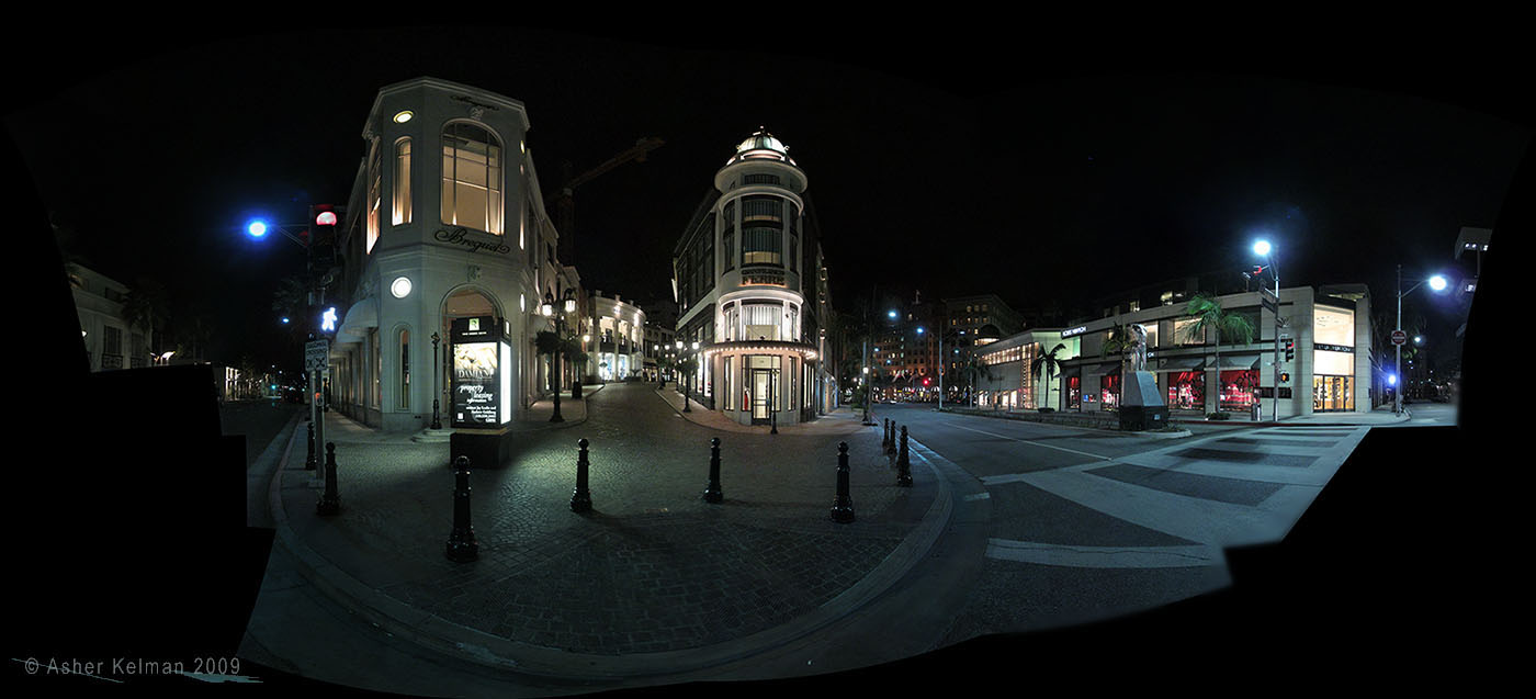
Pano - IMG_4912_BHRODEO_Night_BrightAdvertLightbox_1400pixels4opf .jpg


© 2009 Asher Kelman "Rodeo Drive Nightly" 22 G10 images Stitched with AutoPano Pro 64 BIt Spline.​


The city of Beverly Hills is very conservative, (except perhaps for the Graham Sculpture which folk go past every day and don't take in fully). Well then, strict at least as far as quiet at night. For sure one can dine until 10:30 to even 11 pm but very soon after that the stores all close and the streets empty. Maybe a few stragglers might appear at the fountain but sadly there cannot linger over a coffee or a glass of wine!

So what pictures of streets at night do you have and what stories do they to tell?

Asher
 

Kathy Rappaport

pro member
Wow

Asher,

Your image really does tell quite a story. Even the richest and most indulgent of places is feeling the effects of our state of affairs. In today's Wall Street Journal there was an article that said that even the affluent are scaling back because it's trendy. People who would never have shopped at Target or Walmart are doing so. This is proof .... on the East side of Rodeo used to be Carroll O'Connor's Place - always hopping even until midnight during the week. I grew up on that street - my mother worked in an office building which housed a bookstore on the corner (Hunter's Books was my favorite place to go - their children's book department was a delight to me) on Rodeo and Brighton Way.

Anyway, it's a beautiful image. I cannot see any stitching. If you hadn't told me it was 22 images composited to be a pano, I'd not have known.
 

Ken Tanaka

pro member
That's a technically good pano, Asher. But, geez, it looks like a scene from a sci-fi film or a Gregory Crewdson image.
gregory-crewdson-1.jpg


It would cost fortune to get a scene so devoid of humanity in most cities. It's been many years since I was at that intersection in the evening but I don't remember it being that empty.
 

Asher Kelman

OPF Owner/Editor-in-Chief
The folk in B.H. are as I have said, conservative about some things like growth. Still stores decrease taxes for schools that would otherwise be the responsibility of residents. So the citizens want the tourists but no noise or traffic! This custom built micro-shopping Disneyland, is just across the road from the Beverly Wilshire Hotel (I'll check the name in case someone wants to go there, LOL)! So the visitors can pour out of the hotel, shop till they drop on Rodeo drive, go back to their luxury suites and email their friends about the splendor and riches of the city they have seen! Later, at night, there's no action, zilch! There is one street a few blocks west, where one landlord got a permit for a night club on one night of the week, I think. This is resented and the few revelers are ushered downstairs and looked upon as a "risk" and really that's not part of the city, so to speak. However, this is not on rodeo drive. That would take An Act of Congress to change!


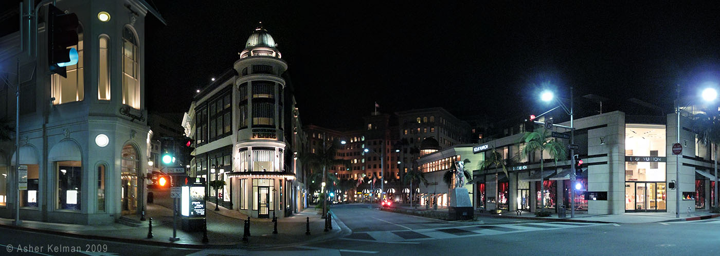
Pano - IMG_4934 BH_RODEO_Night_black_4opf_01.jpg


© 2009 Asher Kelman "Rodeo Drive Island 2:00 am" 22 G10 images Stitched with AutoPano Pro 64 BIt Spline.​


Here at night the architectural structures with brightly lit windows stand apart, as an island of "super-wealth" within the already luxurious Rodeo Drive itself! So I did not crop this Panorama, except along the pedestrian crossing on the right. The rest of the black truly belongs there. Notice the light really doesn't go past the stanchions. In that area, anyone with a fancy camera is stopped. I hope you might like the choice of leaving in the black empty areas. I added a little more black above the pano, just a tad. I want to increase the isolation.


Asher
 

Asher Kelman

OPF Owner/Editor-in-Chief
That's a technically good pano, Asher. But, geez, it looks like a scene from a sci-fi film or a Gregory Crewdson image.
gregory-crewdson-1.jpg


It would cost fortune to get a scene so devoid of humanity in most cities. It's been many years since I was at that intersection in the evening but I don't remember it being that empty.

Well, Ken,

In essence you're quite correct in thinking of a movie set! The difference is that these might be broken down when the movie ends! This is very similar to a lot in Universal Studios where one can go on a tour. Architecture comes straight from the oldest and finest and exclusive but imaginary cities of Europe. All the buildings are made to seem like they are independently designed and even squeezed in a place left by some previous much older structure. However, it's all one immense enterprise of facade. It's as if there's a masked ball, but the buildings are the mask and the dance is "Le Shopping".

Underneath all this "old looking" street, there's a grand circular cobblestone drive where one leaves off one's car for free valet parking! Why not if you are shopping in 4th gear.

As you might guess, I'm interested in using this as a set. what I'm now doing is mapping my backgrounds.


Asher
 

Kathy Rappaport

pro member
Asher,

The building on Wilshire and Rodeo that you photographed is called Two Rodeo. It has never been a real hot spot other than for a few tourists who arrive on tourst busses. While the design is pretty, the Japanese restaurant at the top was about $250 per person for sushi dinner. McCormick and Schmick is sort of chain like - high end but formulaic and there are much more interesting places to be in Beverly Hills. The center was built in about 1990 when I worked on Santa Monica and Wilshire in what is now the former CAA building.
 

Valentin Arfire

New member
hello Asher

Another very nice pano, thank you Asher for sharing it; as always the story behind it has charm and makes it even more valuable. Actually the poetic atmosphere you're so eloquently present I'd bet is much more prosaic - especially now in crisis.

APP made a real good job with the stitching - I add to my surprise :)

The small personal problem is my feeling the lights aren't as they should - there is too much blue while the details in blown or darker regions diminish. A daylight one has probably moving people and the stitching problems they raise, but would definitely present natural colors.

regards,
 

Asher Kelman

OPF Owner/Editor-in-Chief
Another very nice pano, thank you Asher for sharing it; as always the story behind it has charm and makes it even more valuable. Actually the poetic atmosphere you're so eloquently present I'd bet is much more prosaic - especially now in crisis.
The place spawns the words!

APP made a real good job with the stitching - I add to my surprise :)
Valentin,

I'm not sure but I think that smart blend and the 64 BIT spline do a better job. Also Lionel and company at APP are very active in addressing problems so the software evolves. It will even be simpler for beginners. I'm impressed with APP's future potential.

The small personal problem is my feeling the lights aren't as they should - there is too much blue while the details in blown or darker regions diminish. A daylight one has probably moving people and the stitching problems they raise, but would definitely present natural colors.

What makes it look right for night would be out of place by day. Of course colors seen are dependent on the wavelength distribution of the illumination from the artificial lights. We wouldn't want the streets to look like they appear by daylight but represent what one would see at night. It's situation like sunset. Using a gray card to correct the photo will wipe out that golden glow! So I'm not sure if there's a problem with the lighting? However, I'm open to your suggestions in this.

As far as the highlights and shadows go, either one needs to use a camera with a wider dynamic range, which I cannot do at present, or else use bracketing. At present, I'm exploring the places I will be imaging over the next several months that are close to me so I can keep revisiting if needed.

This work, as it is, hand-held is fraught with chances of time-consuming errors. I am planning to go to a LF camera with a stitching back as one option or a Gigapan epic and bracket to enable the shadows and highlights to be captured in this challenging light without compromise.

My idea is to see which method will cut down the total time needed to reliably deliver a planned panorama and at a reasonable cost. I hope you might share what gear you are using and why.

Thanks for giving me valuable feedback!

Asher

P.S. My wife just reported to me, (after a music conference in New York) that the few fancy restaurants in New York were packed with folk waiting an hour in the past week! Go figure, I thought we had a crisis of credit? In L.A., there is definitely a major squeeze on and places are already closing, but not for the richest clients, not yet!
 

Michael Fontana

pro member
Good morning Asher

I find it a bit cold, too, but if you make the street warmer, off course the houses will get to hot.

Another solution, a screenie from my actual job: impossible to get a accurate image without the two WB:

kalt.jpg


plus


warm.jpg


becomes:

mix.jpg
 

Asher Kelman

OPF Owner/Editor-in-Chief
Good morning Asher

I find it a bit cold, too, but if you make the street warmer, off course the houses will get to hot.

Another solution, a screenie from my actual job: impossible to get a accurate image without the two WB:
Hi Michael,

So what did you do here? You did a WB on the building in one and the wall in another. but how did you combine them?

The issue to me is what should the color be? After all we want in my case we want the cold isolated look. But is that how it is. I'll print it and return to the location to see if the camera changed it as I admit I don't have an accurate calibration profile for my G10.

Now for architecture, you must want true colors. for that I'd take my time and sample the bricks, wall and steps separately with a close up pictures, using midday sun and gray cards and use that as a standard to get color coordinates that are accurate.

This is an important issue; accuracy and mood. Your ideas and experience are helpful in this dilemma.

Asher
 

Cem_Usakligil

Well-known member
Hi Asher,

This is a good attempt considering the fact that it was taken handheld in the middle of the night, congrats. I agree with Valentine and Michael regarding their remarks on the color balance. It could be a tad warmer if you ask me. Do you have a monopod, BTW? Maybe you can reshoot using a monopod to get rid of the camera shake at lower shutter speeds. It is more agile than using a tripod and it also helps to ward off anybody who might get too close ;-).

Show us more please, I am curious how you'll develop this project further.

Cheers,
 

nicolas claris

OPF Co-founder/Administrator
Pano%20-%20IMG_4912_BHRODEO_Night_BrightAdvertLightbox_1400pixels4opf%20.jpg


Pano%20-%20IMG_4934%20BH_RODEO_Night_black_4opf_01.jpg


Bonsoir Asher
I guess the 2 panos were not made with the same shots, you have you been using 2 different sets, right?
I reposted them together for better comparison…

What where the angle from left to right in real life?

I like the 1st quite well though I'd like some more human presence…

In the 2nd one, I don't like the black areas, they are too much geometrical, it seems that anyway you had no choice as some images would have been missing…
However the idea of isolating in the dark (not the pure black) is interesting and a reshoot taking this into consideration would be very interesting!

Anyway, pretty good work handheld!
 

Asher Kelman

OPF Owner/Editor-in-Chief
Bonsoir Asher
I guess the 2 panos were not made with the same shots, you have you been using 2 different sets, right?
I reposted them together for better comparison…
Thanks Nicolas for you input. Yes there are two positions and I'll do more. The idea is to locate the angles I want and repeat the panos using a tripod and different ways of doing the scene. So I'll use film, stiched LF with a 5D on the back of my LF camera, the G10 and also an automatic pano head.

What where the angle from left to right in real life?
I'll add that shortly.

I like the 1st quite well though I'd like some more human presence…

In the 2nd one, I don't like the black areas, they are too much geometrical, it seems that anyway you had no choice as some images would have been missing…
However the idea of isolating in the dark (not the pure black) is interesting and a reshoot taking this into consideration would be very interesting!

Anyway, pretty good work handheld!

Well the pictures will be repeated in the daytime too with moving people so that's another challenge. However a major motivation is to use these as backgrounds for my art and figure out which positions yield locations for my actors.

I have a lot of work to do but I really like the second pano. As I move from left to right, i'll get views into the different streets. Then I'll go to the side with the steps and fountains.

So the panos serve the purposes of testing different pano techniques, day v. night and then also finding backgrounds for my art.

Asher
 

Michael Fontana

pro member
Asher

yep, I run the 5 bracket shots twice, with two different WB, as none of the single WB would be accurate for the situation, wrapping anything in the same color.

Let me explain this first, to show the gap between accuracy and mood:

the new building at the left came out of a architecture competition, in which the narrow, but long ground at disposition - due to the medieval city wall - has been one of the difficulties.
The winning and realised project followed that shape by respecting the available ground. In terms of urbanisme, the new building mirrors somehow te old wall - with a garden in between.

The position of the camera shows exactly this mirroring, but unfortunatly, the color doesnt says mirror, with both WB of 2700 K and 4500 K. (in C1)

In the mixed version, sky and garden are from the colder WB, meanwhile the new building and city wall are both warm and do mirror now. Okay, it's a bit more complex, some layermasks, but basically....

now, with the blue sky and the green garden, the yellow of the tungstene gets a new quality, it is not parth of the brownish, overall-mud anymore.


So what's the point of all this writing?
The colors have become a function in the image - they help transporting the mirror.
(It's highly possible in nights shots - much more than in day photography.)

None of these colors (WB) is less or more true... nor "But is that how it is."
It took a good while to get the WB adjusted, and delicatly balanced out.

But the blue-green kicks in the a.... of the yellow, to make it stronger and giving both a new duty.

I hope its understandable....
 

Asher Kelman

OPF Owner/Editor-in-Chief
Hi Michael,

Then we are on the same wavelength! I too feel that one has to work with distribution of colors to set up and guide the viewers brain to the underlying ideas you would like to be invoked. You have done a brilliant job of getting the ancient to be reflected in the modern.

Dare I challenge you then yo go one huge step further, but it's something you could do which would take your picture to the nth on your concept of reflection. Replace some of your windows with lights off and have the wall reflected in it.

To make this work I'd add several floodlights brightening the tower part of the wall and then we'd see this in the windows. That little glimpse will put this project in a new class. Well that's just my imagination working with your creative concept.

Anyway, for my own work, I'll have to put in that kind of effort too.

Asher
 

Mike Shimwell

New member
Asher, interesting work and it looks well stitched. I'm with Ken on the Greg Crewdson look - it feels a bit strange even to a UK country oy like me.

Ken, I like your intersection also, it has a certain period feel.

Mike
 

Asher Kelman

OPF Owner/Editor-in-Chief
Asher, interesting work and it looks well stitched. I'm with Ken on the Greg Crewdson look - it feels a bit strange even to a UK country oy like me.

Ken, I like your intersection also, it has a certain period feel.
Mike,

Do you see the stage look as good or bad or is it in your taste? I wanted the look of an empty stage, as really, that what it is, However, the colors might be tweaked after I have another look and refer back to the various ideas exrpessed about blue light and the window colors.

Asher
 

Ken Tanaka

pro member
Asher, interesting work and it looks well stitched. I'm with Ken on the Greg Crewdson look - it feels a bit strange even to a UK country oy like me.

Ken, I like your intersection also, it has a certain period feel.

Mike

Mike: If only it was "my intersection"! That's a very small thumbnail of a very large print by photographer Gregory Crewdson. Greg goes to film-industry lengths to create real-life scenes such as this. Spending a quarter of a million on a single shot is commonplace for him. Of course he generally get his money back. This image probably sells for $60,000-$75,000.
 

Asher Kelman

OPF Owner/Editor-in-Chief
That's a technically good pano, Asher. But, geez, it looks like a scene from a sci-fi film or a Gregory Crewdson image.
gregory-crewdson-1.jpg


It would cost fortune to get a scene so devoid of humanity in most cities. It's been many years since I was at that intersection in the evening but I don't remember it being that empty.

Mike: If only it was "my intersection"! That's a very small thumbnail of a very large print by photographer Gregory Crewdson. Greg goes to film-industry lengths to create real-life scenes such as this. Spending a quarter of a million on a single shot is commonplace for him. Of course he generally get his money back. This image probably sells for $60,000-$75,000.


Well, Ken,

I am going to take your comments as a large compliment. Making a pano is one thing. Getting ideas into that as a photograph that stirs folk, is another. I want to show not what everyone else sees but the way I see differently. At least you have a sense of a direction that I'm working towards. That's pretty damn nice of you to make me feel that I might be doing something the way it needs to be done, despite the cold colors or maybe partly because of them.

Asher
 
Asher- I really enjoy your picture. In my unprofessional opinion, I think the colors you used suit the mood of the scene real well. I think the way you left it gives it more of an empty feeling, as opposed to a warm "orange" feeling, which may not have been the feeling as you experienced it.
 

Michael Fontana

pro member
Good morning Asher

I find it a bit cold, too, but if you make the street warmer, off course the houses will get to hot.

Another solution, a screenie from my actual job: impossible to get a accurate image without the two WB:

kalt.jpg


plus


warm.jpg


becomes:

mix.jpg


Some images have a longer life - or the efforts pays sometimes a bit later

The final photo made it on the first page of the architects book, at the left side of the introduction - there isn't any photo on the cover.

Initially, everbody liked that image, but nobody had a direct use for it - it has found its place now.
 

Asher Kelman

OPF Owner/Editor-in-Chief
Some images have a longer life - or the efforts pays sometimes a bit later

The final photo made it on the first page of the architects book, at the left side of the introduction - there isn't any photo on the cover.

Initially, everbody liked that image, but nobody had a direct use for it - it has found its place now.

mix.jpg
[/QUOTE]

Michael Fontana Mirroring Medieval Stone and Modern Architecture


Congratulations. what is the name of the Journal. I'd love to see it in print!

Asher
 

Michael Fontana

pro member
Asher

it' s De aedibus 31 - no adds inside, therefore not a magasine, but kinda little library of contemporary european, mostly swsis architects and their most important buildings.

When klicking at the site at the right of the small image, behind Bilder Nr. 4, you see another photo of the same project, with snow.
 

Mike Shimwell

New member
Excellent Michael. I have a friend who is an architect and regularly shares his architectural 'compendiums' with me. I will not be surprised to see your picture in due course, and will of course be pleased to say that I 'konw' the photographer:)

Mike
 

Michael Fontana

pro member
Thanks Asher and Mike
for your interest and kind words.

I like it when images get their life on their own - these are things that you can't calculate.
Initially that photo wasn't ordered/intended, but then I took and edited it - finally they liked it very much as well.

Asher - if you can't get it, I should have good chances to get/buy a copy at the little party/book vernissage which will be at the end of the month in Zurich.
 

Asher Kelman

OPF Owner/Editor-in-Chief
Bump! :) I really enjoyed this thread and especially hte posts by Michael and Kens mention of Gregory Crewdson.

Asher
 
Top