
Chris Kresser
New member
Hello,
All feedback is welcome, but in particular I'd be interested in any visceral or emotional reactions this picture evokes in you. Does it move you in any way? If so, how? I'd also like to know what your eye is drawn to first and how that affects your overall impression of the image. Finally, and thoughts you have on composition, form and any particular passages in the picture that stand out are appreciated.
Thanks in advance,
Chris
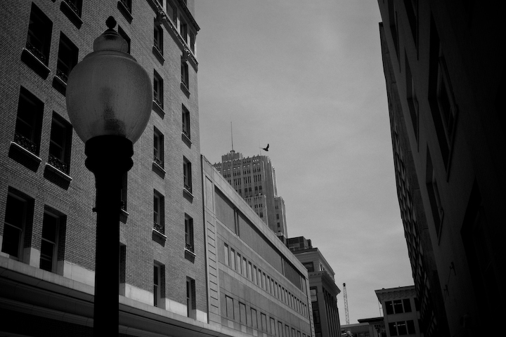
") .
.