• Please use real names.

    Greetings to all who have registered to OPF and those guests taking a look around. Please use real names. Registrations with fictitious names will not be processed. REAL NAMES ONLY will be processed

    Firstname Lastname

    Register

    We are a courteous and supportive community. No need to hide behind an alia. If you have a genuine need for privacy/secrecy then let me know!
  • Welcome to the new site. Here's a thread about the update where you can post your feedback, ask questions or spot those nasty bugs!

I have a question between two edits of the same shot

Jim Olson

Well-known member
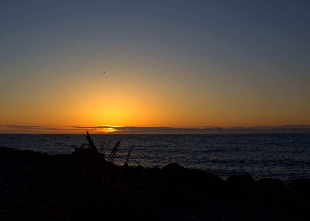
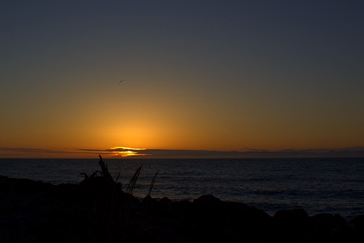
Sunset shot in Port Angeles over the ocean with a seagull.
IMG_2983 E3 C2 S12 STR -2.6 crop.jpg

I changed the Highlights in this one but I still think it needs to be darker.
IMG_2983 E3 C2 S12 Hi-11 STR -2.6 crop.jpg
 

Robert Watcher

Well-known member
Yeah - there is virtually no difference. A danger in darkroom work has always been spending way too much time making subtle changes, trying to make a photograph right - and in the end there is little or no obvious difference. Nice colours. (y)
 

Jim Olson

Well-known member
Cant tell the difference, Jim.
Theres either little difference, they are the same photos, or my retina has a long retention time.
Yeah - there is virtually no difference. A danger in darkroom work has always been spending way too much time making subtle changes, trying to make a photograph right - and in the end there is little or no obvious difference. Nice colours. (y)
I guess it was getting late last night but I did make a small change. Thank you for your input & I think you guys are correct.
Still learning my way around the editing
 

Doug Kerr

Well-known member
Hi, Jim,

Sunset shot in Port Angeles over the ocean with a seagull.

I prefer the first one (.5010).

But you are the artist. Edit it to suit you. (Unless the client who is paying you $7500.00 for the shot needs something different).

Best regards,

Doug
 

Asher Kelman

OPF Owner/Editor-in-Chief
These pictures are so different. They appear so
Liar as one sees the brighter one first with orange rising 1/3 of the picture height. After seeing that the dimmer one seems indeed little different.

But let’s reverse the order:

7D78E4B9-B26F-4C47-B62B-DF2FBCF31A25.jpeg


903ADDA0-C55E-4E9C-BE70-B73606F083D9.jpeg

It’s like a light was switched on in the Sky with a yellow ball surrounded by orange!

its now dramatic!

But having said that, Jim, I will now examine your intuitive idea of pulling back somehow on brightness, somewhere or other!

Asher
 

Asher Kelman

OPF Owner/Editor-in-Chief
Jim,

I was surprised. To me, at least there’s a lot more beauty to be revealed applying curves to reveal more of the fabulous sky and then, the payoff, the reflection of that orange red sky in the left foreground edge of waves.

2D1E06D6-9FDF-468A-8123-85ACC906242D.jpeg
In addition, adjust the curves locally for the waves, reveals a lot of eye catching structure.

That hull in the sky can be enhanced, but I haven’t tackled that yet as I am, (forgive me Nicholas), editing with Snapseed on my iPhone XsMax!

I will tackle this again later on Photoshop! I will then not be so aggressive on the sky!

Asher
 

Jim Olson

Well-known member
Will likes this one that I took with my phone at the same spot & time that I was waiting for the sun to go down

IMG_20200601_205622.jpg
 

Asher Kelman

OPF Owner/Editor-in-Chief
I do too.

It’s so good to introduce us to intimate details of the foreground. Tgecshot becomes so much more than just another pretty su

Again, since you are now expert at stitching, the foreground deserves several overlapping shots. Here horizontal position of a phone would allow the foreground to be mostly in one shot and the background on two more so you don’t suffer from parallax issues.

Stepping back would help too!

Asher
 

nicolas claris

OPF Co-founder/Administrator
Cant tell the difference, Jim.
Theres either little difference, they are the same photos, or my retina has a long retention time.
@Tom dinning and @Robert Watcher :
I'm surprised you can't tell the difference!
This may be due to the fact that @Jim Olson's photos are saved with the Adobe RGB profile which is a good thing for working with images on a computer but a very bad thing for posting an image on the internet as not all monitors can correctly render the full range of color and brightness of this profile.
For Internet, one should only post images saved with the Srgb profile which is the standard but also a PIA because the range reproduced is much smaller... Especially for reds and blues.

Here is a side by side comparison but savec in Srgb:

aa.jpg
 

Tom dinning

Registrant*
@Tom dinning and @Robert Watcher :
I'm surprised you can't tell the difference!
This may be due to the fact that @Jim Olson's photos are saved with the Adobe RGB profile which is a good thing for working with images on a computer but a very bad thing for posting an image on the internet as not all monitors can correctly render the full range of color and brightness of this profile.
For Internet, one should only post images saved with the Srgb profile which is the standard but also a PIA because the range reproduced is much smaller... Especially for reds and blues.

Here is a side by side comparison but savec in Srgb:


Thanks , Nic, for the explanation. But I’m none the wiser.
The impact is much the same.
Marginal differences are a matter of personal preference.
I’ve seen a few sunsets in my time. They’re all nice but one doesn’t stand out among the others unless I was in the arms of a beautiful woman, which is somewhat rarer than sunsets I’ve seen.
 

Robert Watcher

Well-known member
I could recognize in the first entries that the one pic was a tad lighter - but it made no real difference to the image. The little bit of density change doesn’t make the photo better or worse.

Another fact nowadays is that digital images are for the most part displayed on screens that have no consistency and there is no control over how the pictures will look as they will display differently on each persons device and even with the angle of view that person looks at them —— and so my advice to Jim was/is that it is often a waste of time to put many minutes or hours into such subtle changes that no one will be able to recognize (unless one takes two crops of the areas where there is more darkness and lightness and put them beside each other or switch them on top or below each other for greatest effect). Even in my wet darkroom days where I printed all of my professional work, I could easily get caught up in spending hours and wasting tons of paper and chemical making small CC’s of colour changes - only to conclude in the end that there wasn’t enough variation in many of the prints that anyone would notice.

I tend to agree with Tom about sunsets. Anyone can snap a picture of the sky later in the evening and it looks like a sunset regardless of what colour, density or contrast it has. It just always works and people say beautiful sunset. Unless I can make use of the colours as a backdrop to interesting content in the foreground, my preference is to take a sunset in with my eyes - often with a beautiful woman - my wife. But that is simply personal preference.
 
Last edited:

nicolas claris

OPF Co-founder/Administrator
I could recognize in the first entries that the one pic was a tad lighter - but it made no real difference to the image. The little bit of density change doesn’t make the photo better or worse.

Another fact nowadays is that digital images are for the most part displayed on screens that have no consistency and there is no control over how the pictures will look as they will display differently on each persons device and even with the angle of view that person looks at them —— and so my advice to Jim was/is that it is often a waste of time to put many minutes or hours into such subtle changes that no one will be able to recognize (unless one takes two crops of the areas where there is more darkness and lightness and put them beside each other or switch them on top or below each other for greatest effect). Even in my wet darkroom days where I printed all of my professional work, I could easily get caught up in spending hours and wasting tons of paper and chemical making small CC’s of colour changes - only to conclude in the end that there wasn’t enough variation in many of the prints that anyone would notice.

I tend to agree with Tom about sunsets. Anyone can snap a picture of the sky later in the evening and it looks like a sunset regardless of what colour, density or contrast it has. It just always works and people say beautiful sunset. Unless I can make use of the colours as a backdrop to interesting content in the foreground, my preference is to take a sunset in with my eyes - often with a beautiful woman - my wife. But that is simply personal preference.
I fully agree with you Robert (and with Tom by the same way):
My point was more as a technical approach, I haven't commented wether one of the 2 shots was better or worse than the other.
But while opening the files (to make the side by side) I discovered that Adobe RGB profile was embeded, and that change a lot the perceprtion of the colors/brigthness on a "standard" computer.
So yes between the 2 shots there is a visible difference, but is one better or not is another subject.

I know that Tom and you are fully aware of this, but to show to some who may not know, here is an illustration of the color spaces:


colour-profiles.jpg


My workflow is to work my files within ProPhoto, and scale down to sRGB for the files I post on the Internet.
My pro lab were my art prints are done is uses Prophoto
 

Asher Kelman

OPF Owner/Editor-in-Chief
I would warn against being too dismissive of repeated beauty. It’s one of the oft repeated aphorisms of photography to say it’s merely a pretty post card sunset!

But icecream is also merely “delicious” and a child playing in the water is always beautiful to us too! So are fresh sea air and billowing clouds!

.......but to go beyond “sentimentality” and make a picture that stands out and lasts and demands being preserved for posterity, the sunset must have some essential extra magnetic feature or character not found in the billions of sunset images we enjoy every day!

My sunsets merely represent the lacuna of happiness and gratitude for being alive and safe in this sometimes harsh world.

Tom treats birds as “Sunsets”too.

To me fine pictures of birds are a gift from heaven. So we all have our own perspectives.

But if I would need to sell a $10,000,000 yacht, both pretty women and sunsets are needed, LOL!

Asher
 

Jim Olson

Well-known member
And why not a sunrise?


Yes, that does make it more dramatic & I really love all the input. But I'm not sure how Adobe RGB comes into play. I edit with a program called Shotwell on Linux OS so I don't have Adobe on my system, unless it's in the distro. Linux does have a lot of programs that in downloads automatically in the background.
TNX again for all the input...
PS. I did take the exifdata & found...

Color Space sRGB

So I see what you guys are talking about now.

@Tom dinning and @Robert Watcher :
I'm surprised you can't tell the difference!
This may be due to the fact that @Jim Olson's photos are saved with the Adobe RGB profile which is a good thing for working with images on a computer but a very bad thing for posting an image on the internet as not all monitors can correctly render the full range of color and brightness of this profile.
For Internet, one should only post images saved with the Srgb profile which is the standard but also a PIA because the range reproduced is much smaller... Especially for reds and blues.

Here is a side by side comparison but savec in Srgb:

 
Last edited:

Jim Olson

Well-known member
Here is one last shot from that evening. This one has a little more interesting content in the foreground. Unfortunately, my wife was standing behind me at the car. I just pulled over real quick to get the rocks.
IMG_3129 E-3 C10 S12 STR -1.3 crop.jpg
 

Robert Watcher

Well-known member
I fully agree with you Robert (and with Tom by the same way):
My point was more as a technical approach, I haven't commented wether one of the 2 shots was better or worse than the other.
But while opening the files (to make the side by side) I discovered that Adobe RGB profile was embeded, and that change a lot the perceprtion of the colors/brigthness on a "standard" computer.
So yes between the 2 shots there is a visible difference, but is one better or not is another subject.

I know that Tom and you are fully aware of this, but to show to some who may not know, here is an illustration of the color spaces:


View attachment 5032

My workflow is to work my files within ProPhoto, and scale down to sRGB for the files I post on the Internet.
My pro lab were my art prints are done is uses Prophoto

That is definitely valid. At this point in time, all images posted online should be in sRGB format. First thing I learned when I started developing websites in 1998.

For Jim, the way your images are automatically converted to sRGB regardless of the colour profile used when shooting —- is to use Save For Web in Photoshop. I’m sure there will be something similar in other programs. 👍🏻
 

Jim Olson

Well-known member
That is definitely valid. At this point in time, all images posted online should be in sRGB format. First thing I learned when I started developing websites in 1998.

For Jim, the way your images are automatically converted to sRGB regardless of the colour profile used when shooting —- is to use Save For Web in Photoshop. I’m sure there will be something similar in other programs. 👍🏻
Thank you Robert, I'll look right now
 

Asher Kelman

OPF Owner/Editor-in-Chief
Jim,

Today, some printers are so fabulous that they actually print colors that sRGB cannot show! So now we export to those higher class printers from Photoshop in the larger Adobe RGB 1988 color space!

However, it’s foolish to get a great picture printed commercially unless you ask them what color space they use!

Here, I couldn’t understand How some couldn’t perceive the huge differences so obvious to me! Frankly it never occurred to me that anyone would load a picture in a wide color gamut!

Asher
 
Top