• Please use real names.

    Greetings to all who have registered to OPF and those guests taking a look around. Please use real names. Registrations with fictitious names will not be processed. REAL NAMES ONLY will be processed

    Firstname Lastname

    Register

    We are a courteous and supportive community. No need to hide behind an alia. If you have a genuine need for privacy/secrecy then let me know!
  • Welcome to the new site. Here's a thread about the update where you can post your feedback, ask questions or spot those nasty bugs!

Jasmine on Gold

Asher Kelman

OPF Owner/Editor-in-Chief
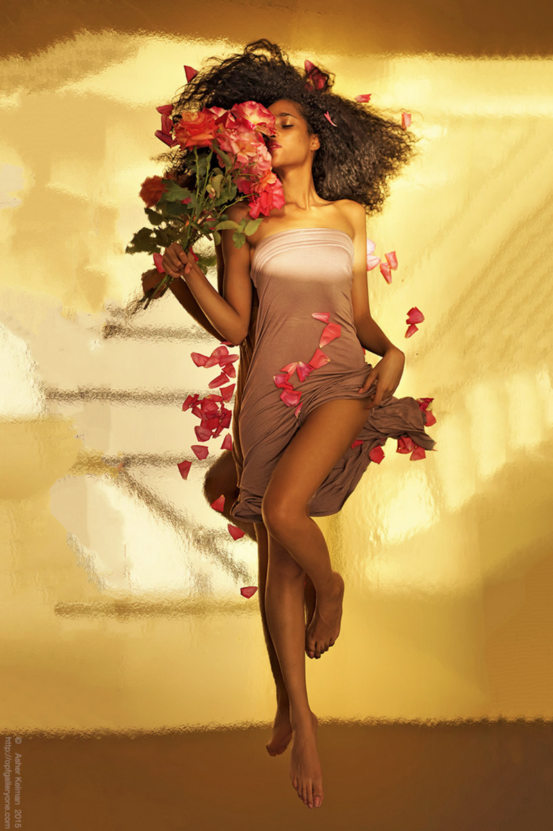
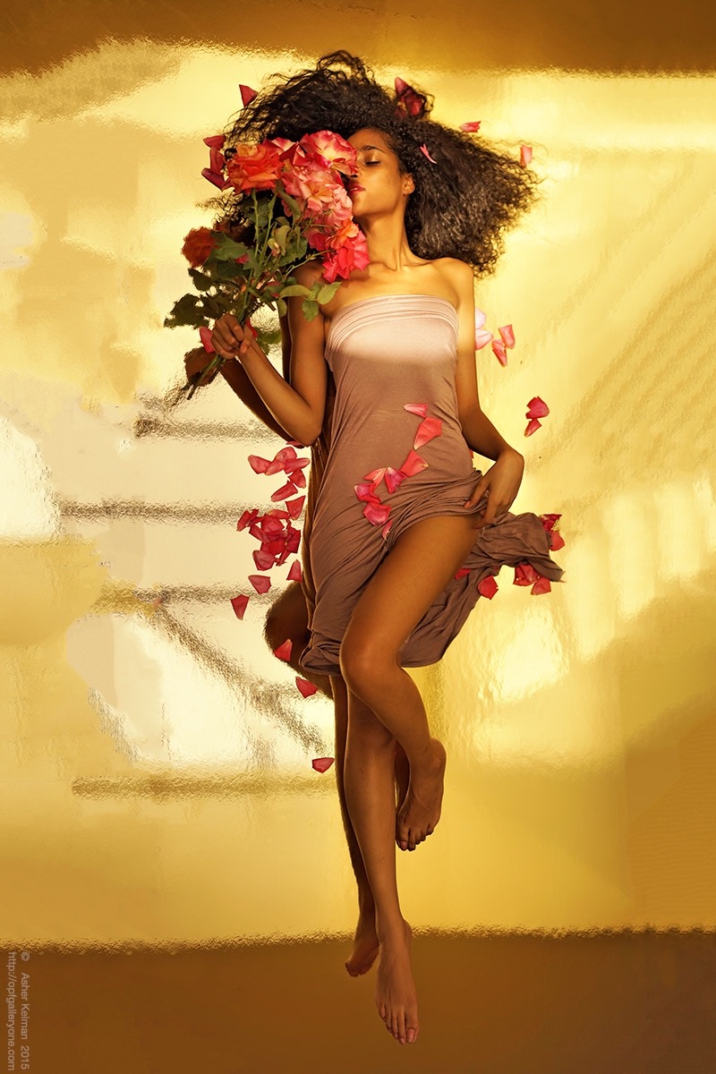
Having already made portraits of leaves my grandsons found for me in a gold bowl, I went to the next obvious step, repeating this with woman on gold! I am fortunate to have another wonderful muse and her name is Jasmine! My wife had just gotten the best fresh roses from a neighbors garden. Good to know the neighbor's maid! Anyway, she told me these were not for me........

Note, we are looking down toward Jasmine! The camera is some 10 feet or so above her.
F1D373E0-ECC1-49D5-967A-F1CF59144DF5.jpeg


Asher Kelman: “Jasmine on Gold with stolen roses!”

Sony A7R 55mm Zeiss Sonnar f1.8,
sequential adjacent pictures
stitched with Autopano Giga
Photoshop CC & Topaz Clarity

I put a sheet of gold reflected styrofoam sheeting 4ft x 8 ft on a 1" thick tempered glass layer over a steel frame beneath a 15 ft x15 ft skylight at a hight of approx 20 ft above the model. The camera is about 12 ft above Jasmine, looking down on her. This set up allowed me to reproduce the effect I discovered with leaves in a gold plated bowl previously. Sadly, a lot of the petals fell and so these were used in the picture too. However, I did manage to return 3 of the roses intact and a collection of petals for making scented rosewater!


I hope you enjoy Jasmine's first work with me!


Asher
 

Wolfgang Plattner

Well-known member
Hi Asher,

to me, there's too much gold and similiar color in it, it is hard to find out what's going on in the picture.
Second, I can not stop thinking that the next moment the girl would slip down and out of the picture, as the perspective is so irritating ...
 

Asher Kelman

OPF Owner/Editor-in-Chief
Hi Asher,

to me, there's too much gold and similiar color in it, it is hard to find out what's going on in the picture.
Second, I can not stop thinking that the next moment the girl would slip down and out of the picture, as the perspective is so irritating ...

Wolfgang,

Thanks for visiting and giving your feedback.

We are looking down on Jasmine lying below us on the gold surface. She's enjoying the scent of fresh cut roses. She's comfortable and not in danger of falling. So fear not!!

For me, the gold adds a warmth of sunsets and fields of sunflowers! Why would you consider there's too much gold? It's intended to be full of gold, LOL, just like a a meadow is full of green and a stampeded herd of galloping zebra is full of stripes and dust, the nature of things. If I was photographing tomatoes, it would be nothing but red!

However, we need to also look at the picture devoid of color.

Asher
 

Lee Tracy

New member
Hi Asher,

to me, there's too much gold and similiar color in it, it is hard to find out what's going on in the picture.
Second, I can not stop thinking that the next moment the girl would slip down and out of the picture, as the perspective is so irritating ...

I'm with you Wolfgang, there is nothing in the picture to give us a clue that we are looking down at her, or where down and up are so there is a feeling of disorientation looking at it. Normally there is some surface/corner/some clue to indicate where up/down left/right are in a picture and here there is none.

For me the gold tones in everything are very beautiful and I would almost prefer there to be slightly more - gold body dust or gold in her make-up. If you are going to be OTT, then don't do it half-heartedly. What is off-putting for me, is the strong line of light/shadow across her body - that cuts her in half making her top half lighted completely differently from her bottom half - I think she needs to be lighted more uniformly from one side or the other and for the interplay of light and shadow to be part of the composition.

On the whole a good starting point with a beautiful model, but aspects need work.
 

Doug Kerr

Well-known member
Hi, Asher,

Truly remarkable.

I'm not sure what using a tempered glass base, rather than perhaps perhaps plywood, accomplished, unless of course you had it in stock.

Interesting that you did this in multiple exposures. It would be interesting to know how many.

I agree with Wolfgang that there is something unnerving about the image, perhaps as he says making us wonder whether the adorable Jasmine is about to roll down the wall.. I would not have expected that but it happens.

Carla also comments that the reflection of her limbs in the reflective surface leads to a peculiar effect, almost that of extra limbs.

A wondrous project.

Best regards,

Doug
 

James Lemon

Well-known member
Hi Asher

Beautiful woman and a wonderful pose! Interesting project but vertical lines extending through the frame rarely work. You might want to consider doing something with them?

James
 

Asher Kelman

OPF Owner/Editor-in-Chief
Hi, Asher,

Truly remarkable.

I'm not sure what using a tempered glass base, rather than perhaps perhaps plywood, accomplished, unless of course you had it in stock.
Yes, it's a typically over-engineered coffee table I made years ago! One needs a solid surface as the rug below would not support the styrofoam layer well enough and it would readily bend or even snap in getting set up with a model on the thin surface.

Interesting that you did this in multiple exposures. It would be interesting to know how many.
Just two! I couldn't get high enough on the ladder to cover a full length portrait using this 55mm lens. So overlapping frames is a simple solution. It also has the added advantage of devoting more pixels to a picture that might want to be printed, "life size"!

I agree with Wolfgang that there is something unnerving about the image, perhaps as he says making us wonder whether the adorable Jasmine is about to roll down the wall.. I would not have expected that but it happens.

That then is great! It adds uncertainty and drama.

QUOTE=Doug Kerr;162997]Carla also comments that the reflection of her limbs in the reflective surface leads to a peculiar effect, almost that of extra limbs.[/Quote] Precisely as intended! Thank Carla for that insight. I like that effect in prehistoric cave paintings of animals and in depictions of gods of India. It adds to movement and uncertainty!

A wondrous project.

Much appreciated! It is a finished work as even though it's made from a pair of out of the camera jpg files and only processed "sufficiently" for me to know whether or not this pair is worth the extra investment of fully processing from RAW files for printing or even to be repeated with strobe lighting supplementation and makeup, it is, in itself, just perfect, an export from my dreamed up composition, exactly as I intended. The folds I the dress that I made really brought out the delicate feminist of silk on the human form. That in itself, her enjoyment of the roses and the entire delivery on the promise I carried since doing the original Leaves in a Gold Bowl series, made this picture a winner for me.

After all, she was meant to be lit only from the skylight above and to eschew and makeup artist or the usual bevy of photography studio assistants. This work was a personal effort to satisfy me that the effects I enjoyed so much with simple leaves could transfer to an enormous picture with a real person!

I am, in fact overjoyed that an ethereal mental impulse of mine, (on meeting Jasmine), could actually be materialized to something that's so beautiful.

We didn't even buy the dress that was planned, just repurposed a long skirt as that missing garment!
 

Asher Kelman

OPF Owner/Editor-in-Chief
Hi Asher

Beautiful woman and a wonderful pose! Interesting project but vertical lines extending through the frame rarely work. You might want to consider doing something with them?

James

Great to have you visit, James!

I took some liberties with the sides of the reflection by being creative with expanding the mirrored surface on each side. These filled in areas are first created using the "Content Aware" tool of Photoshop and then the added portions are simplified to fit the composition. I could, of course, diffuse the skylight further using some sheeting and perhaps that would be a good thing. Certainly worth exploring. I might end up with a giant Molar light suspended above her and that would remove those bars entirely. For now, I actually like the bars, but there's more freedom without them.

Asher
 

Asher Kelman

OPF Owner/Editor-in-Chief
Jasmine_on_gold__ 800.jpg


Asher Kelman: Looking down on Jasmine on Gold with stolen roses!

Sony A7R 55mm Zeiss Sonnar f1.8, sequential adjacent pictures stitched with Autopano Giga

from out of camera jpg, processed in Photoshop CC 2015 and Topaz Clarity


I'm with you Wolfgang, there is nothing in the picture to give us a clue that we are looking down at her, or where down and up are so there is a feeling of disorientation looking at it. Normally there is some surface/corner/some clue to indicate where up/down left/right are in a picture and here there is none.

For me the gold tones in everything are very beautiful and I would almost prefer there to be slightly more - gold body dust or gold in her make-up. If you are going to be OTT, then don't do it half-heartedly. What is off-putting for me, is the strong line of light/shadow across her body - that cuts her in half making her top half lighted completely differently from her bottom half - I think she needs to be lighted more uniformly from one side or the other and for the interplay of light and shadow to be part of the composition.

On the whole a good starting point with a beautiful model, but aspects need work.

Lee,

I see your point on even lighting. It does certainly have merit. However, I like and exploited the asymmetry of a "spotlight effect" the natural light is giving. I would consider even extending that kind of lighting, (but in an exaggerated fashion), in a future version with studio lights.

"Starting point?"

It stands as a finished work ? !

It has so much delicate beauty that I have no problem, as with any of my other offspring, in accepting obvious beauty along with any "obvious defects!

Asher
 

Doug Kerr

Well-known member
Hi, Asher,

Yes, it's a typically over-engineered coffee table I made years ago!

Not surprised. I should have recalled.

Just two! I couldn't get high enough on the ladder to cover a full length portrait using this 55mm lens. So overlapping frames is a simple solution. It also has the added advantage of devoting more pixels to a picture that might want to be printed, "life size"!
Indeed.

Carla also comments that the reflection of her limbs in the reflective surface leads to a peculiar effect, almost that of extra limbs.

Precisely as intended! Thank Carla for that insight. I like that effect in prehistoric cave paintings of animals and in depictions of gods of India. It adds to movement and uncertainty!

Nice concept.

Much appreciated! It is a finished work as even though it's made from a pair of out of the camera jpg files and only processed "sufficiently" for me to know whether or not this pair is worth the extra investment of fully processing from RAW files for printing or even to be repeated with strobe lighting supplementation and makeup, it is, in itself, just perfect, an export from my dreamed up composition, exactly as I intended. The folds I the dress that I made really brought out the delicate feminist of silk on the human form. That in itself, her enjoyment of the roses and the entire delivery on the promise I carried since doing the original Leaves in a Gold Bowl series, made this picture a winner for me.

After all, she was meant to be lit only from the skylight above and to eschew and makeup artist or the usual bevy of photography studio assistants. This work was a personal effort to satisfy me that the effects I enjoyed so much with simple leaves could transfer to an enormous picture with a real person!

I am, in fact overjoyed that an ethereal mental impulse of mine, (on meeting Jasmine), could actually be materialized to something that's so beautiful.

We didn't even buy the dress that was planned, just repurposed a long skirt as that missing garment!

Thanks for those insights.

Again, a really superb work.

Best regards,

Doug
 

fahim mohammed

Well-known member
To me this image had to be taken from a camera above her. Try mentally envision the camera in any other position/angle..the frame structure underneath and Jasmine herself would take different shapes.

I checked with Ayesha...she enjoys these spatial puzzles...she concurs..only from the above.

I agree with James that verticals across the frame might need reconsideration. Indeed the glass below and the ensuing intermix of flesh and reflection is disturbing. Repositioning of the model and/or the cam
Could be considered.

The colors don't distract me, however gradual falloff of the golden hues might be attractive.

I like the endeavor and more so the muse. More experimentation wouldn't be a chore for you with that muse is attendance.
 

Tom dinning

Registrant*
I've take myself back a few years, Ash,,when my old man would renmind me of how to look at a painting, I this case substituting your photo.
The first thing he reminded me of was : it takes time to absorb everything.
Next: it takes time to establish a pattern of thought relating to what I see.
Nest comes: don't be critical. That is, don't think about how it aught to be or how you would like it or what you would have done. In the galleries of paintings he would add: you could not even paint the roof without spilling the paint so don't tell the artist how to do their job.
When you've got your thoughts together, go away and ponder, come back a few times and rethink, add to and contemplate. There will be new thoughts every time.
And lastly: keep you mouth shut. No one really wants to know what you think. They have their own thoughts on the matter.
 

Charlotte Thompson

Well-known member
Stunning look @ perhaps A Goddess in Mythology of unknown name but a Goddess none the less! I love how shadows wrap around her body-the very relaxed way she slides into the mood… The addition of the flowers framing one side of her face as if she falls in love/ the scent of roses waiting for her lover maybe…falling…falling she goes deeper inside of herself. The gold for me is the magic carpet- Dreams within dreams- Poetry!

Charlotte-
 

Asher Kelman

OPF Owner/Editor-in-Chief
To me this image had to be taken from a camera above her. Try mentally envision the camera in any other position/angle..the frame structure underneath and Jasmine herself would take different shapes.

I checked with Ayesha...she enjoys these spatial puzzles...she concurs..only from the above.

I agree with James that verticals across the frame might need reconsideration. Indeed the glass below and the ensuing intermix of flesh and reflection is disturbing. Repositioning of the model and/or the cam
Could be considered.

The colors don't distract me, however gradual falloff of the golden hues might be attractive.

I like the endeavor and more so the muse. More experimentation wouldn't be a chore for you with that muse is attendance.

Fahim and most amazingly precious Ayesha! For me, who had no toys, heat in the winter or shoes without holes to trudge through the snow, I am anyway in a dreamland, already in heaven. That I can also work with talented women is such a privilege, so why not go for gold too!

Add to that my appreciation for others, each with their empathy for humanity intact, that you bring to us here with your photographs of ordinary folk, is a richness here that is priceless! Thanks for stopping by!

Asher
 

Asher Kelman

OPF Owner/Editor-in-Chief
I've take myself back a few years, Ash,,when my old man would renmind me of how to look at a painting, I this case substituting your photo.
The first thing he reminded me of was : it takes time to absorb everything.
Next: it takes time to establish a pattern of thought relating to what I see.
Nest comes: don't be critical. That is, don't think about how it aught to be or how you would like it or what you would have done. In the galleries of paintings he would add: you could not even paint the roof without spilling the paint so don't tell the artist how to do their job.
When you've got your thoughts together, go away and ponder, come back a few times and rethink, add to and contemplate. There will be new thoughts every time.
And lastly: keep you mouth shut. No one really wants to know what you think. They have their own thoughts on the matter.

"Honey, don't kiss me so close to my chin. Don't you know the neck has more neuronal attachments. And the salmon on the plate, d'ya see it's cut is too geometric on one side. Shouldn't it just slope like a wide valley in the countryside, hawks circling overhead?"

How about telling that to a raindrop or a butterfly?

"But I am trying to help you improve!"

Asher
 

Asher Kelman

OPF Owner/Editor-in-Chief
Stunning look @ perhaps A Goddess in Mythology of unknown name but a Goddess none the less! I love how shadows wrap around her body-the very relaxed way she slides into the mood… The addition of the flowers framing one side of her face as if she falls in love/ the scent of roses waiting for her lover maybe…falling…falling she goes deeper inside of herself. The gold for me is the magic carpet- Dreams within dreams- Poetry!

Charlotte-

Thanks, Charlotte,

Yes it has magic and beauty, but it is a construct I created, first in my mind after I looked at that gold-plated bowl with leaves my grandsons found for me. I then searched for a woman to enter that realm of ethereal floating joy, nostrils overwhelmed with fragrance.

I like the challenge of being able to build what's in my mind, exploiting each corner of my house at their rich time of day as the sun makes it's journey past so many different entries.

........and I admit that the bars in the skylight are not friendly! They are all just criticisms.

Asher
 

Charlotte Thompson

Well-known member
Asher

.......and I admit that the bars in the skylight are not friendly! They are all just criticisms.


for me the poetry of the skylight bars represented an old Norse symbol it seemed to fit in my mind-

C.
 

Antonio Correia

Well-known member
One of the great differences between Asher's photograph and the "American Beauty" is the position of the model regarding the viewer, I mean us.

Asher's image - taking advantage of zenithal lighting - looks to me un-balanced... like if she is going to fall down...

Perhaps the very same image but in vertical would be better... Let me try.

And now that I have rotated it, it reminds me of a particular image I have seen before but can't find I am afraid.

Now, she won't fall because she is like flying, suspended in the air... better, better !...

She does have big feet but how come his right foot is that long ? Some kind of distortion. Oh never mind ! Not important !

i-wS3pxd3-X3.png
 

Asher Kelman

OPF Owner/Editor-in-Chief
Antonio,

Yes, likely as not there's some distortion as the images are stitched and the "feet" shot was at an angle. I could have done a rectilinear correction, but left it this way. I subsequently switched from the 55 mm Sonnar to a 28 mm Distagon so there's no need for such stitching in the second half of the shoot.

Asher
 
What a beautiful girl. Such a sensuous shot. Love the folds in the dress and the very ripe roses and inclusion of all the petals. I keep looking between your photo and the rotated version by Antonio and notice, of course, that in his version, our brains see immediately that it is from above. In your version - it's trickier. I think perhaps it is because it is the type of image that needs to be printed and seen full scale or even larger.

I agree with Charlotte that she looks like a goddess. She is such a beautiful girl too - lovely skin, gorgeous hair.

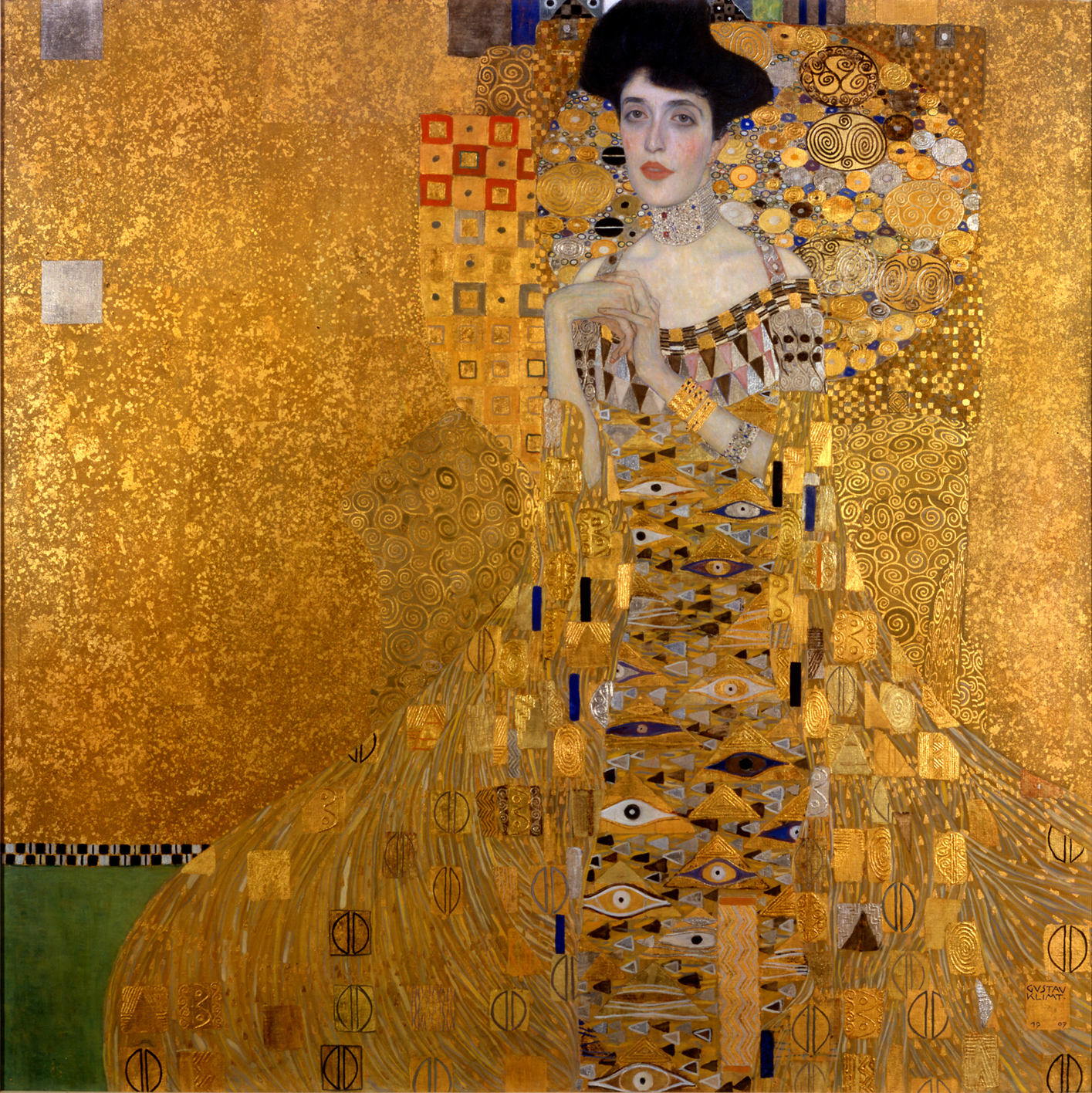
Because of the gold and the odd perspective, I immediately thought of Gustav Klimt obviously because of the gold and how most of his paintings that tickle the brain a bit to see what perspective they are in as the flatness of the paintings by the elimination of shadows. Here, you have reflections in the gold and the perspective that plays a similar trick on my brain. Not a bad thing.

Would I have done some things differently? perhaps; but then it would not be an Asher photograph, it would be a Maggie one. Your work should hold your voice and vision and it does. Well done.
 

Asher Kelman

OPF Owner/Editor-in-Chief
What a beautiful girl. Such a sensuous shot. Love the folds in the dress and the very ripe roses and inclusion of all the petals. I keep looking between your photo and the rotated version by Antonio and notice, of course, that in his version, our brains see immediately that it is from above. In your version - it's trickier. I think perhaps it is because it is the type of image that needs to be printed and seen full scale or even larger.

I agree with Charlotte that she looks like a goddess. She is such a beautiful girl too - lovely skin, gorgeous hair.

Because of the gold and the odd perspective, I immediately thought of Gustav Klimt obviously because of the gold and how most of his paintings that tickle the brain a bit to see what perspective they are in as the flatness of the paintings by the elimination of shadows. Here, you have reflections in the gold and the perspective that plays a similar trick on my brain. Not a bad thing.

Would I have done some things differently? perhaps; but then it would not be an Asher photograph, it would be a Maggie one. Your work should hold your voice and vision and it does. Well done.

Maggie,

A delightful feedback! Yes she's lovely. I am privileged that she feels both admired and respected by this and my dear wife loves her work too.

Interesting comment on gustav Klimpt. I've seen some of his work in person. Even more impressive than one could ever imagine. There's such a regal "presence"!

I'd love to here how you might have done differently here, for the Maggie production if you had been the art director and been requested to take over after I was called away! I do intend to repeat the composition with artificial lighting and my camera on a tripod and absolutely orthogonal.

Asher
 

Asher Kelman

OPF Owner/Editor-in-Chief
One of the great differences between Asher's photograph and the "American Beauty" is the position of the model regarding the viewer, I mean us.

Asher's image - taking advantage of zenithal lighting - looks to me un-balanced... like if she is going to fall down...

Perhaps the very same image but in vertical would be better... Let me try.

And now that I have rotated it, it reminds me of a particular image I have seen before but can't find I am afraid.

Now, she won't fall because she is like flying, suspended in the air... better, better !...

She does have big feet but how come his right foot is that long ? Some kind of distortion. Oh never mind ! Not important !

i-wS3pxd3-X3.png


Antonio,

I must admit that I first posted the picture vertically, but Jasmine objected and felt it should be shown as it had been taken and I realized she was correct! but now I see your preference, I must admit that still works for me too. So we have two different versions of the same photograph according to how you want to experience it.

Asher
 

Antonio Correia

Well-known member
The vertical is more like Klimt's...

The fact that Asher's photograph was done from above, contributes to a certain "flatness" of clothes and roses like Klimt's.


Gustav_Klimt_046.jpg
 

Asher Kelman

OPF Owner/Editor-in-Chief
DSC09075.jpg


Asher Kelman: Jasmine on gold II

Sony A7R 55mm Contax Zeiss Distagon 2.0
out of camera jpg, Photoshop CC 2015
 
Top