• Please use real names.

    Greetings to all who have registered to OPF and those guests taking a look around. Please use real names. Registrations with fictitious names will not be processed. REAL NAMES ONLY will be processed

    Firstname Lastname

    Register

    We are a courteous and supportive community. No need to hide behind an alia. If you have a genuine need for privacy/secrecy then let me know!
  • Welcome to the new site. Here's a thread about the update where you can post your feedback, ask questions or spot those nasty bugs!

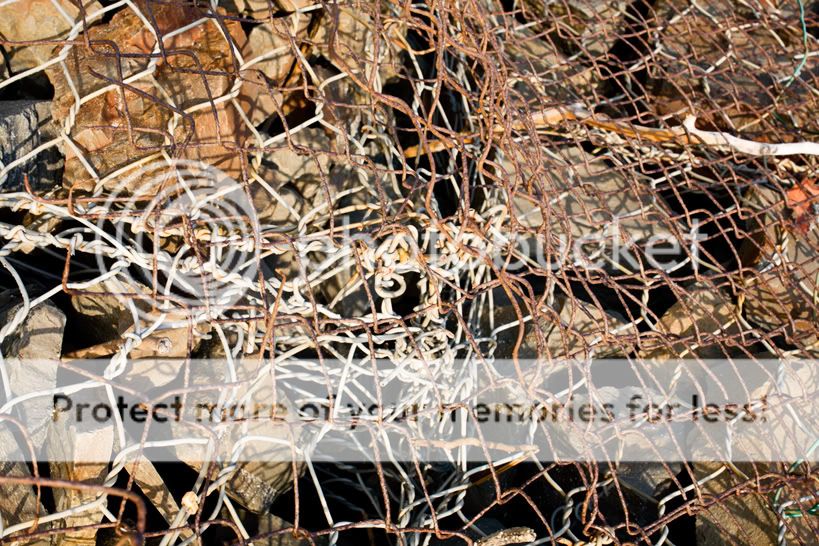
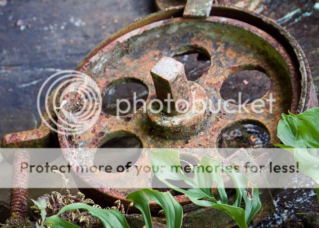
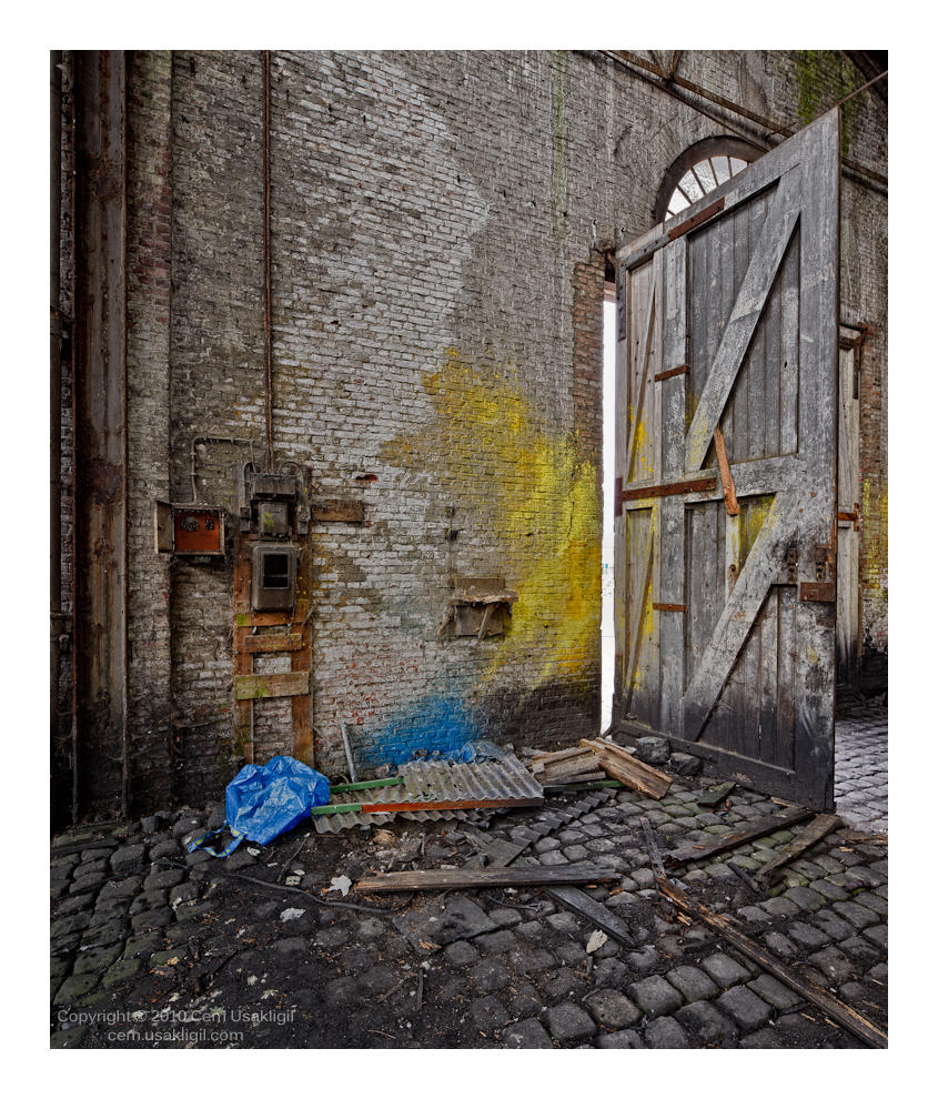
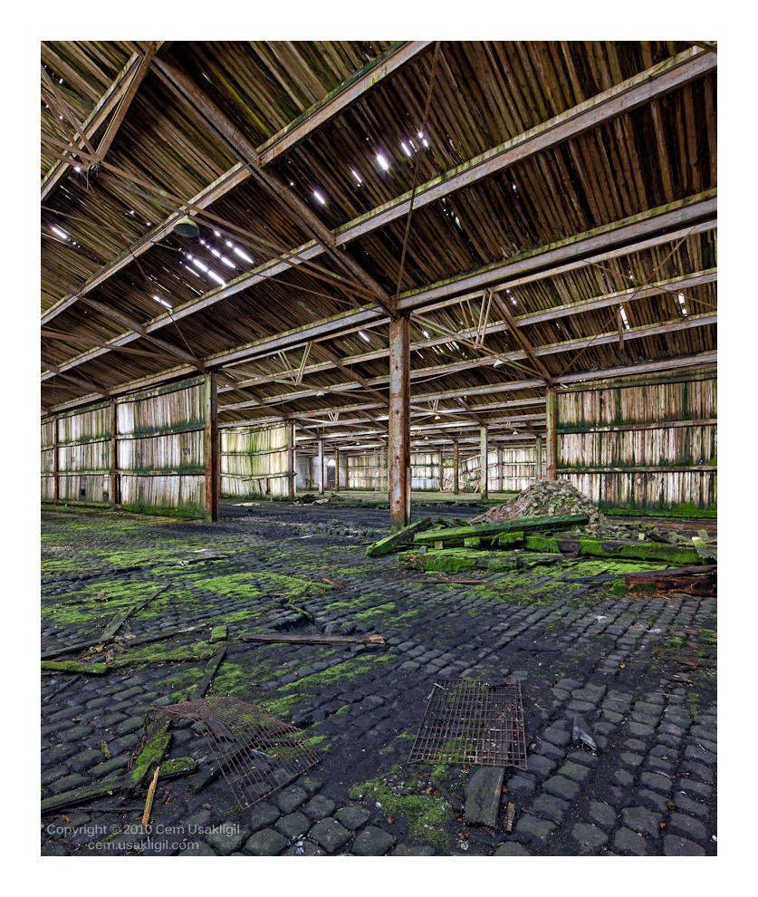
Rust & Stone: Simple Compositions

Asher Kelman

OPF Owner/Editor-in-Chief
IMG_1053_Gray.jpg


IMG_1053_Gray.jpg
 
Last edited:

Asher Kelman

OPF Owner/Editor-in-Chief
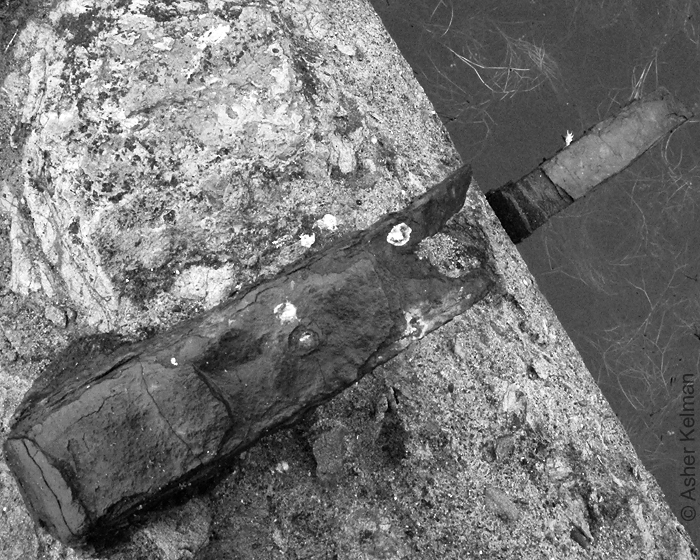
Ruben, Michael, Bart and Sandrine,

Your diverse pictures go further than I had imagined and bring together so much about our lives and our vulnerability. Your work is so impressive together. I wonder whether showing the forms just in B&W can also really do them justice. Do you think that rust can be adequately and equally shown in B&W too and be so impressive?

Asher
 
Do you think that rust can be adequately and equally shown in B&W too and be so impressive?

Hi Asher,

My position on the use of Black and White is probably known. I only use B&W when the color takes away from the composition, and since I compose in color, that will rarely be the case. In my book B&W rarely improves a picture (e.g. make a bad picture good), but color can be counterproductive (e.g. distract).

B&W also requires a different use of light, creating either a rich tonescale where the nuances of bright and dark make a nice composition, or a harsh contrast to simplify or even create shapes.

In my image my intention was to show that white isn't white, and use simple shapes that are easily overlooked. I used the limited DOF (using a tilted lens on my Rollei SL-66) to get the focus where needed, thus trying to float/isolate the subject from its surroundings. The 'white isn't white' requires color.

Cheers,
Bart
 

Michael Nagel

Well-known member
Do you think that rust can be adequately and equally shown in B&W too and be so impressive?

Asher,

for me rust is color and texture. Taking color away would mean, that the texture must be extraordinary to be shown alone.
I have not seen that until now, but this does not mean that it does not exist ;)

Best regards
Michael

PS: Time for a rust challenge?
 

Ruben Alfu

New member
I wonder whether showing the forms just in B&W can also really do them justice.
Asher

Hi Ahser,

Thanks for your kind words. Color is an important visual key to recognize rust, but IMO that doesn't exclude the possibility of exploiting successfully other qualities in BW, I think your photo proves that:


IMG_1053_Gray.jpg


Do you think that rust can be adequately and equally shown in B&W too and be so impressive?

Asher

Yes I think so, however that impressive factor depends largely on personal appreciation, that's one thing that we cannot "put in black and white".
 

Cem_Usakligil

Well-known member
Hi Bart,

This one almost didn't qualify, yet ...

Hook_S.jpg
It is always a pleasure to see one of your pictures, especially when it is a 6x6 film one. I really like how the tilting of the lens (or was it the Rollei back which, if I understood correctly, can be tilted for a few degrees?) focuses our attention vertically. Very nice indeed.


Hi Asher,

My position on the use of Black and White is probably known. I only use B&W when the color takes away from the composition, and since I compose in color, that will rarely be the case. In my book B&W rarely improves a picture (e.g. make a bad picture good), but color can be counterproductive (e.g. distract).

B&W also requires a different use of light, creating either a rich tonescale where the nuances of bright and dark make a nice composition, or a harsh contrast to simplify or even create shapes.

In my image my intention was to show that white isn't white, and use simple shapes that are easily overlooked. I used the limited DOF (using a tilted lens on my Rollei SL-66) to get the focus where needed, thus trying to float/isolate the subject from its surroundings. The 'white isn't white' requires color.
As usual, I am in full agreement. The warm yellow tone of the whites really set the scene for my imagination. I think of a house near the sea at around dusk, a salty breeze blowing and the air is alive with the calls of the seagulls. One can open the garden gate (which is normally secured by this very link) and get to the beach across the dunes. It would not work that way if it was BW.
 
Hi Bart,


It is always a pleasure to see one of your pictures, especially when it is a 6x6 film one. I really like how the tilting of the lens (or was it the Rollei back which, if I understood correctly, can be tilted for a few degrees?) focuses our attention vertically. Very nice indeed.

Hi Cem,

Thanks for your comments. The SL-66 was/is a very special camera that has a built in bellows for close-up photography, allows to reverse mount the lenses for 1.6x macro magnification with the standard lens, and has a built-in +/- 8 degree tilt capability of any lens:
sl66_scheimpflug_down_s.jpg
sl66_scheimpflug_up_s.jpg

Images of the camera, copyright of this website.​

For the shot I posted, I rotated the camera on its side, chose position for the right perspective, and used a bit of tilt to line up the plane of focus the way I liked it. It must have been shot somewhere in the late 70's, but I didn't have the possibility to scan the color negative until the '90s.

Cheers,
Bart
 
Mark, I love it, honestly... to me it's kind of perfect... simple, neat...
Cem, I prefer the second one, the composition is brilliant.


Here one I nearly forgot (you already seen it maybe)


publicResource.php


in this one, there is no stone, sorry

publicResource.php

OT, then....
 
Top