• Please use real names.

    Greetings to all who have registered to OPF and those guests taking a look around. Please use real names. Registrations with fictitious names will not be processed. REAL NAMES ONLY will be processed

    Firstname Lastname

    Register

    We are a courteous and supportive community. No need to hide behind an alia. If you have a genuine need for privacy/secrecy then let me know!
  • Welcome to the new site. Here's a thread about the update where you can post your feedback, ask questions or spot those nasty bugs!

My World: Underground Stations have their own beauty

Michael Nagel

Well-known member
Winston,

thank you. The days are getting shorter and the weather is no longer as good, there will be more frequent updates.

Best regards,
Michael
 

Michael Nagel

Well-known member
Platform level

Most stations follow a clear line for the design of the platform level. There are seats lined up in groups of 5 or 6 per line, mirrored to both sides, centered between the two platform borders and oriented on a way that you look straight into the direction where the train will stop in front of you.
This picture shows it better than my words can describe it.

Here is a different approach:


The circle is used as design element for the elevator:


The staircase invited me to try alterations, here is one:


As the Oktoberfest has just begun, I will most likely continue after its end, public transport will be just too crowded...

Best regards,
Michael
 

Michael Nagel

Well-known member
Jake,

thank you. I think that there are some good architects in Minnesota, they just need someone who is ready to spend a little more on the infrastructure with an open mind for new designs. The cost for a nice interior is not that high when you look at the cost for excavation and the tunnel structure.

Hope someone who is taking decisions will see this as well.

Best regards,
Michael
 

Michael Nagel

Well-known member
Just a snapshot

This station is pretty crowded this week and was the same last week: Theresienwiese, the place where the Oktoberfest takes place. The layout is intended to provide a lot of space for the crowds that arrive (a train every 2 minutes each direction during peak times). The design imitates the structure inside a tent.

This is a snapshot from passing there in June.


The best way to arrive is - from y point of view - to walk down from the Bavaria statue. you get immediately an overview.

Best regards,
Michael
 

Michael Nagel

Well-known member
Winston - thank you. The geometry of these places reduces the freedom in composition somehow as far I see it.
I have the impression that diverging from the pattern exposed while providing a good view of the environment and maintaining a consistent style is more difficult. There is still a lot of room for experiments.

Now a step away from the stations towards the tunnel - the place where the transport happens.
Unfortunately I did not have the occasion to go in that part of the network, I was limited by the reach of the lens(es). This part is not beautiful - still it is tidy.

This is what most people see - the vast majority of the travelers is concentrated on the end point, if they arrive in time and some are occupied by something during the transit.


Come a little closer and look:


Sometimes you can see further than this:


Best regards,
Michael
 

Asher Kelman

OPF Owner/Editor-in-Chief
These were taken when I was on the way back home yesterday night.

Down to the platform:


Michael,


Look at all those materials that go so well together; so clean and what a unique vision! The angle reveals the condensed repeats of the lighting, complementing the steps in a dramatic fashion.

Asher
 
Hi Michael,

Just to share a 'thank you for sharing' of this great series (keep them coming). I like your compositional choices, which lift the subject to a higher level of abstraction (and beauty). I could imagine that the architect(s) would be pleased with your interpretation of their works ...

Cheers,
Bart
 

Asher Kelman

OPF Owner/Editor-in-Chief
Hi Michael,

Just to share a 'thank you for sharing' of this great series (keep them coming). I like your compositional choices, which lift the subject to a higher level of abstraction (and beauty). I could imagine that the architect(s) would be pleased with your interpretation of their works ...

Cheers,
Bart

In truth, some are so precise that they could almost pass for computer renderings.


There's such a sense of knife-edge architectural planning to them! These are the renderings that get the project approved! To see them built as imagined is always fabulous and almost beyond belief. Now we see the process in reverse and imagine these are constructions from the mind of a designer to be proposed, argued for and defended!


Asher
 

Michael Nagel

Well-known member
Bart - Thank you. What I try is to honor the vision of the architects.

Asher - Thanks, maybe I found the viewpoints of some of the initial renderings imagined by the architects.


The following station is named after the Bohemian Forest.


Best regards,
Michael
 

Michael Nagel

Well-known member
The Underground is a space of transition - you don't stay there long, you are there because you want to get from one place to another.

This is currently the best view I found to express this:


Best regards,
Michael
 

Asher Kelman

OPF Owner/Editor-in-Chief
This station has the colors white and blue as dominating colors. Unsurprisingly this is the station next to the Landtag of Bavaria.


The large pillar shows bits of the history of this part of Munich.


This blue structure is rather unique. It's surface is flat and the figures and historical buildings are just printed two dimensionally on a smooth surface. I wonder about the origin of this work? Is there a catalog one can get more information from. Perhaps, this is the only way that artist works on a large scale.


See the old tramway of Munich (before electricity):
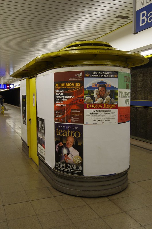


Michael,

I enjoy the experience you provide by choosing your angle of approach to best convey the idea of storing and exhibiting history in such an effective way. BTW, in contrast to the smooth structure of the first massive column work, this tram has a very detailed dimensional surface. But, still, I admit, the blue color connects them well!

Asher
 

Michael Nagel

Well-known member
Asher,

Thanks. There are only two names I can offer for this work as leads for further research: Volker Sander and Hermann Wilhelm (taken from muenchnerubahn.de).

I like the juxtaposition of old and new in this station.


Next station from last sunday:


Hiding place for the elevator machinery:


The new image limit came quite handy here - thanks.

Best regards,
Michael
 

Michael Nagel

Well-known member
Winston - thank you! I hope you will like the next station too.


Shooting is still an exercise - is missed the ideal spot by a few centimeters, but maybe the slight deviation from the ideal symmetry is not so bad..

There is one observation I made during shooting:
When I started it was like 'Wow, this is a nice station!', but when I progressed from station to station the feeling went more and more towards 'What the hell I am doing here, there are so many things repeating, time to get home.' Maybe I should not do too many stations in a row.
I do not take much time per station, mostly the 10 minutes between two trains are sufficient, sometimes I take another 10 minutes before I move to the next station. There is still a lot of exercise ahead...

Best regards,
Michael
 

Chris Calohan

Well-known member
I have no connection to "tubes" underground rails, etc because where I live if you dig more than two feet down, you have a swimming pool. That said, almost every scene I've seen of said places, the black & whites stand out the most. Part of this, for me is the flourescent lighting which I just deplore.
 
Top