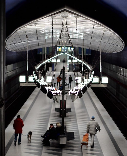
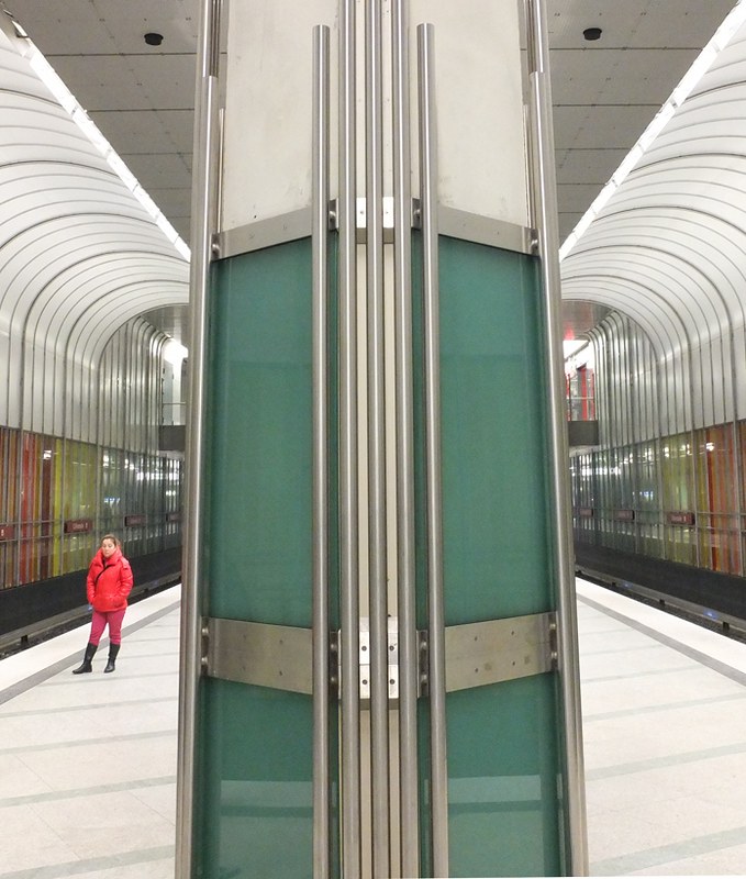
I wonder if I can be so bold as to suggest an "abnormality" I notice when viewing your images. The AB-Normal condition, I believe is cultural in nature or I'm nuts, or both.
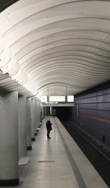
Below I am demonstrating how removing the cultural use of certain color combinations strengthens the image by removing the colors and replacing them in a monochromatic scale.
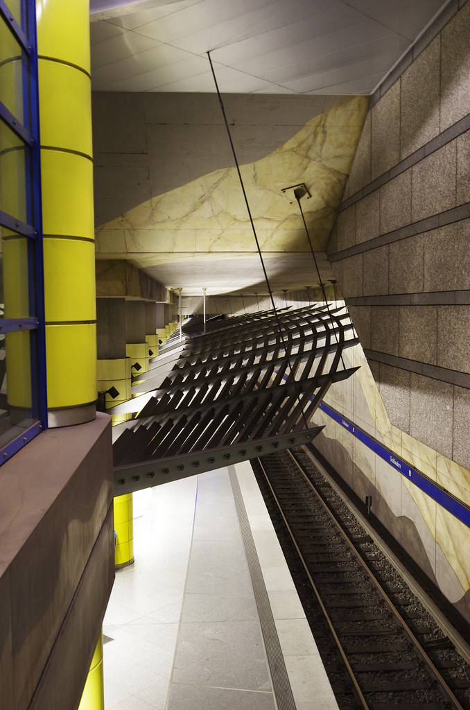
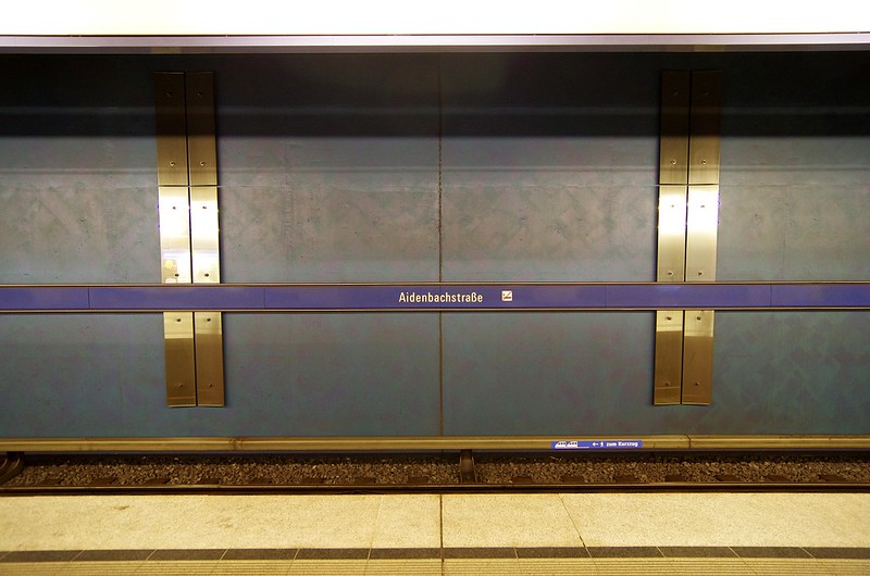
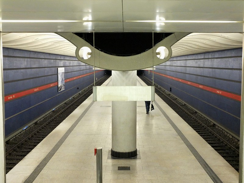
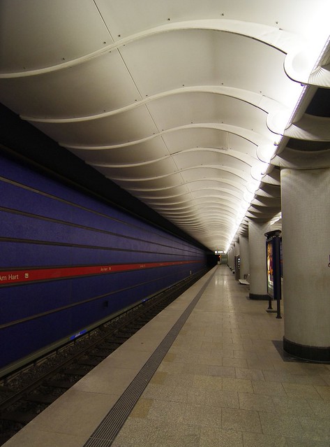
So much of signwork (as my memmory permits) in Germany is strong on Dark Reds and Dark Greens and very Light Blues. Combined with the white flourescents and copius amounts of marble and stainless and someone from across the pond is immediate visually challenged (well, a rather harsh term, but less than visually assaulted) to colors, textures and reflections.
So, I removed the colors in a few, but as much I think because I like B&W in dark places: If these offend, please note and I shall imediately remove them. I do not wish to disaprage your fine work and in many cases as with the yellow blue combinations, I am quite facinated.
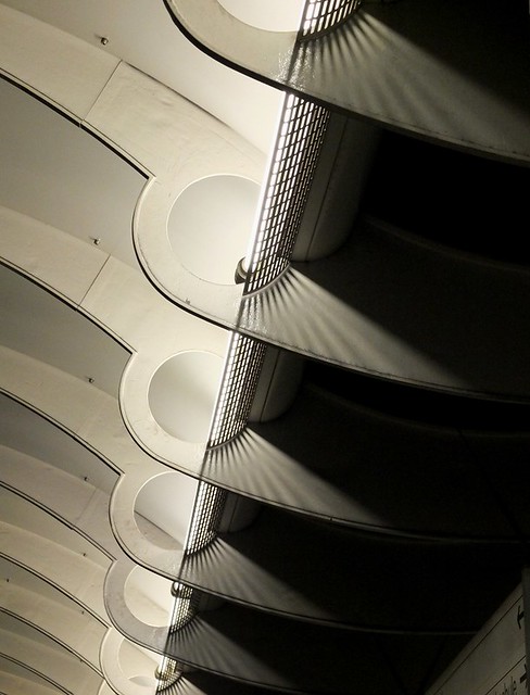
The nice thing about converting is the geometry of the lines , shapes and negative space is not at all lost.
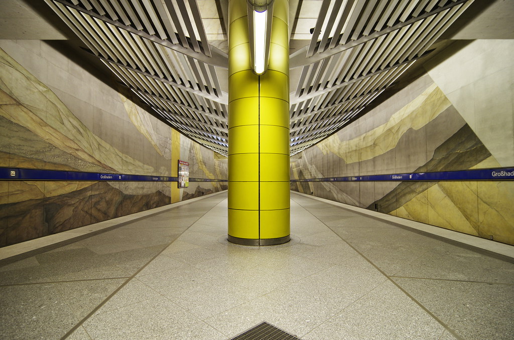
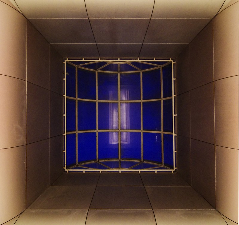
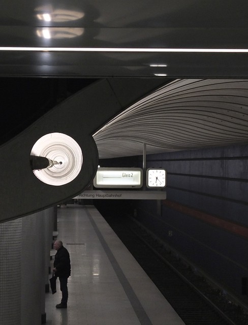
And, I really enjoy this one in both configurations.


")