Don't want to sound rude, but you know, written words are very susceptible to misunderstoods due the lack of phonetic and accents, so the reader puts that in relation to how it feels.
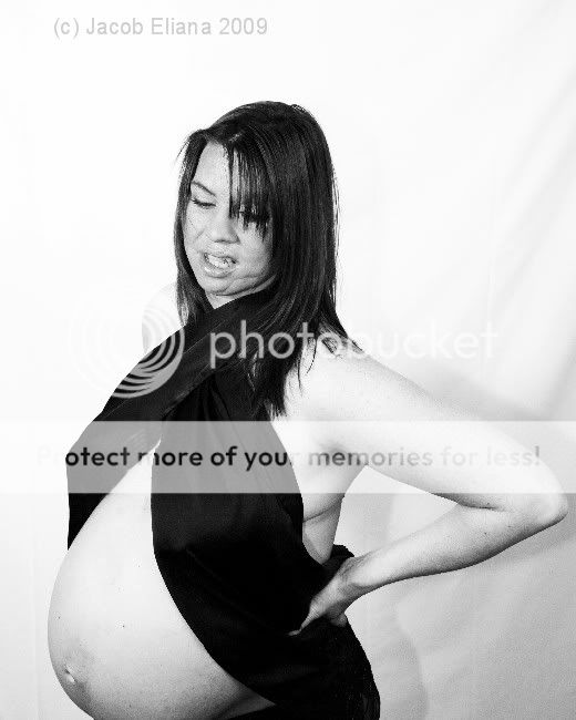
I think the image is too obvious. It shows too much. The black ribbon seems having no more function than covering her teets. The ribbon looks like it was put to add something more to the image, but it doesn't achieve the goal of that. In counterpart, it feeds the feeling of a bad thought and then taken picture.
I think you should think a bit more what you want to represent in order to enrich the image. Add more stuff related to what you want to say. When I see the picture, I see a mother with a black ribbon. That's all what I see. Of course, I know what's your intention with this image, but the concept needs to be more obvious, not the image.
Also, the light is quite straight foward. It's your pen and your best friend, it needs to be handled with care.
Ø3


") Maybe it's that background that caused you and I to differ so much in our appreciation of the photo of Jean Harlow in another thread...you really must get out in the world more
Maybe it's that background that caused you and I to differ so much in our appreciation of the photo of Jean Harlow in another thread...you really must get out in the world more