Asher Kelman
OPF Owner/Editor-in-Chief
What I say about borders is just my preferences based on many years of looking at pictures in galleries and on the web and talking to artists who get to see, (and sometimes with horror), how their art is framed.
Mostly Avoid Messing About With Borders:
Some have developed recognizable styles and work in narrow fields of interests or with unique motifs that the use of a particular border becomes just another component of their successful product "branding"
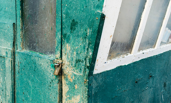
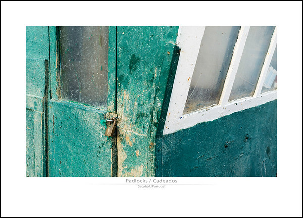
In general most of us, can't and shouldn't do that as we often vary our subjects all over the place and have much less thematic consistency and color palettes. A border, like the smudgy black one used on B&W pics to emulate old fashioned contact prints is dated but still good looking. OK for a series of related prints in an exhibition, but otherwise best avoided. Borders that just fiddle around near the borders and don't pretend to be an actual matte or picture frame, generally draw too much attention to themselves. Not good. Worse, almost always, (but not always) if one uses bold black borders, the picture risks appearing constrained or, worse seemingly imprisoned! However, if you are sufficiently expert you might choose such a bold frame in black or any other color to creatively enhance the essence of your picture, don't hesitate. But that's a level of presentation for a mature artist and not something routine for most of our routine work. There should be some quality that the spacial bold frame resonates with that helps to bring out the feelings to be evoked by the art. It's not just like the standard carton/container one gets when shopping for groceries!
White space: We actually want a picture to rule over the surrounding white space, like a prince in a castle had dominion over the surrounding countryside and serfs how do we do that? Just consider a gallery selling expensive pictures. They place each one on a well let white wall. !Pictures need to have white space around them and be spaced away from text and centered, unless there is something creative that you want to express by bunching them together/ Sideline on the left, like some fellow using the wall for support, does not show the art has a living independent work worth giving one's attention to.
Illumination distribution: The picture should have illumination spread out in one's composition according to the needs of the composition and subject and the rankings one gives various elements. Then, the picture, if placed in a white or charcoal or other space as needed, should work without some frame decoration.
If You have a Consistent Style and Substantial Series: Of course, if you can, approach, emulate or exceed the quality of framing and consistency seen in Antonio Correia's portraits or in Maggie Terlecki's pastel hued creative assemblies then go ahead. For myself, it's very rare that I will dare to add a border. Rather, I will invest in vignetting as we did that to good effect in the wet darkroom and naturally the picture sits well with no need for gimmicks to trap the eye!
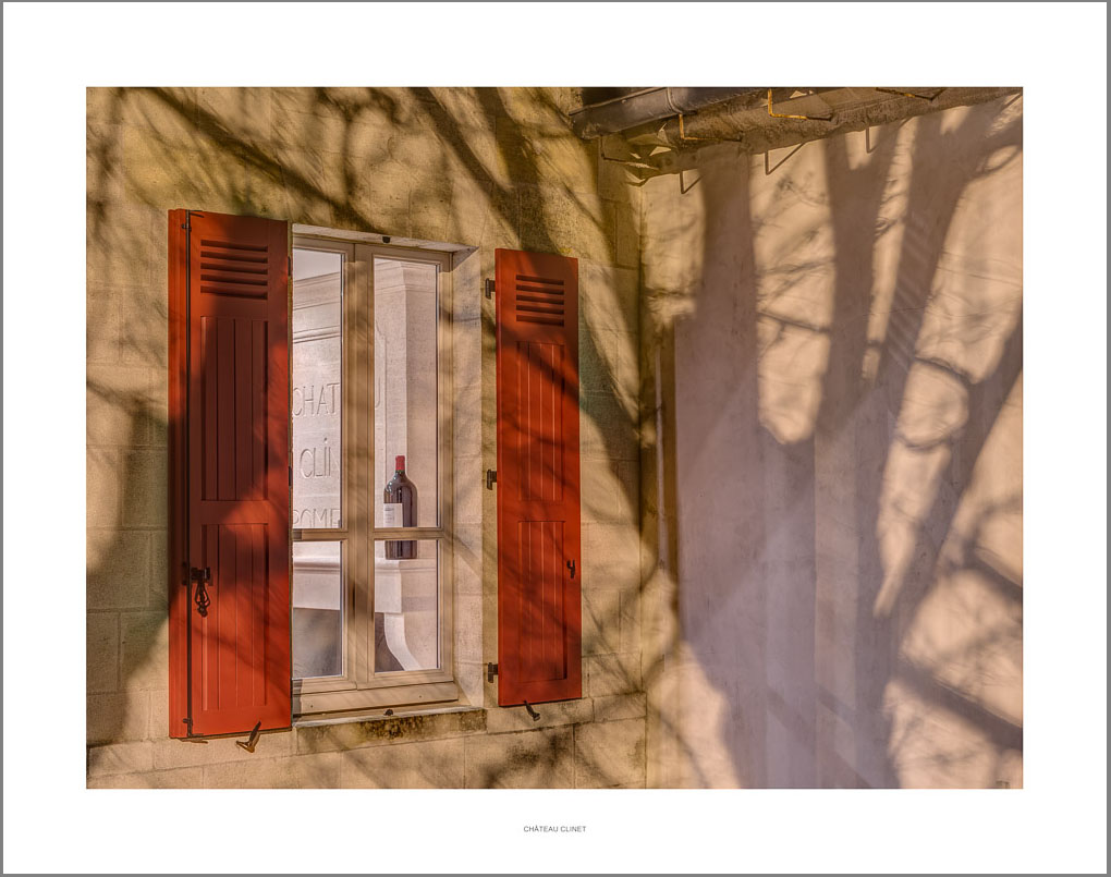
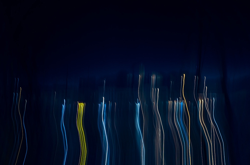
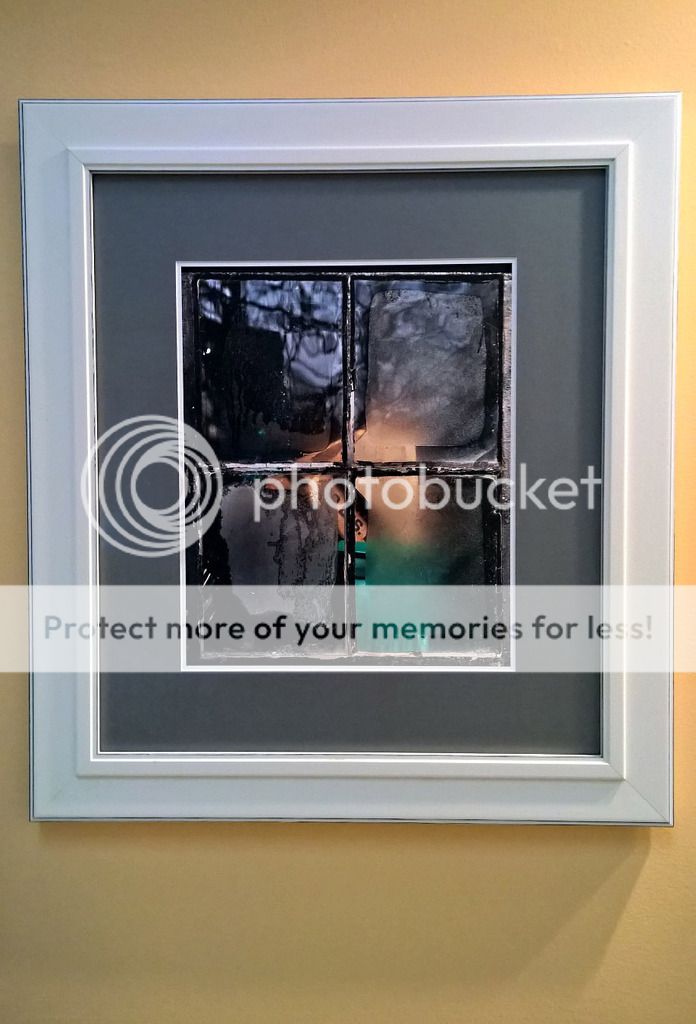
Adding a Window Frame, Arch, Doorway or tunnel: Now if one wants to add a very useful effect, adding an image overlay of a realistic window or doorway, allows one to be looking out and adds a personal involvement of the viewer in the work and thought associated with looking at a scene and being present at the same time.
Caveat: Again, this is merely my own experience and opinion and is not some revelation from the mountain. I would love to hear differing points of view where framing is not so risky and recommended.
Asher
Mostly Avoid Messing About With Borders:
Some have developed recognizable styles and work in narrow fields of interests or with unique motifs that the use of a particular border becomes just another component of their successful product "branding"
In general most of us, can't and shouldn't do that as we often vary our subjects all over the place and have much less thematic consistency and color palettes. A border, like the smudgy black one used on B&W pics to emulate old fashioned contact prints is dated but still good looking. OK for a series of related prints in an exhibition, but otherwise best avoided. Borders that just fiddle around near the borders and don't pretend to be an actual matte or picture frame, generally draw too much attention to themselves. Not good. Worse, almost always, (but not always) if one uses bold black borders, the picture risks appearing constrained or, worse seemingly imprisoned! However, if you are sufficiently expert you might choose such a bold frame in black or any other color to creatively enhance the essence of your picture, don't hesitate. But that's a level of presentation for a mature artist and not something routine for most of our routine work. There should be some quality that the spacial bold frame resonates with that helps to bring out the feelings to be evoked by the art. It's not just like the standard carton/container one gets when shopping for groceries!
White space: We actually want a picture to rule over the surrounding white space, like a prince in a castle had dominion over the surrounding countryside and serfs how do we do that? Just consider a gallery selling expensive pictures. They place each one on a well let white wall. !Pictures need to have white space around them and be spaced away from text and centered, unless there is something creative that you want to express by bunching them together/ Sideline on the left, like some fellow using the wall for support, does not show the art has a living independent work worth giving one's attention to.
Illumination distribution: The picture should have illumination spread out in one's composition according to the needs of the composition and subject and the rankings one gives various elements. Then, the picture, if placed in a white or charcoal or other space as needed, should work without some frame decoration.
If You have a Consistent Style and Substantial Series: Of course, if you can, approach, emulate or exceed the quality of framing and consistency seen in Antonio Correia's portraits or in Maggie Terlecki's pastel hued creative assemblies then go ahead. For myself, it's very rare that I will dare to add a border. Rather, I will invest in vignetting as we did that to good effect in the wet darkroom and naturally the picture sits well with no need for gimmicks to trap the eye!
Adding a Window Frame, Arch, Doorway or tunnel: Now if one wants to add a very useful effect, adding an image overlay of a realistic window or doorway, allows one to be looking out and adds a personal involvement of the viewer in the work and thought associated with looking at a scene and being present at the same time.
Caveat: Again, this is merely my own experience and opinion and is not some revelation from the mountain. I would love to hear differing points of view where framing is not so risky and recommended.
Asher
Last edited:


") than it really is. As if we were looking at an image larger than it really is.
than it really is. As if we were looking at an image larger than it really is.