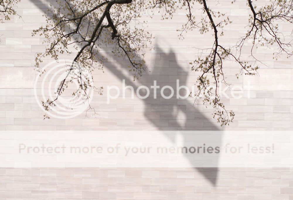
I really like the contrast between the wall/tree/bricks, it's very nicely balanced and really enjoyable to see the different elements overlaid like that. I like that you've left the bottom 'empty' because if there were anything else there you wouldn't focus on the wall as an integral element of the composition.
You might want to pull that bottom left corner down a little more in correcting the perspective; the line of bricks isn't horizontal there and gets cut off. I think it would improve the contrast between the geometry of the wall and the other elements if you straighten that up. (at least for me, I don't think a lot of people would necessarily notice....)
Sam

")