• Please use real names.

    Greetings to all who have registered to OPF and those guests taking a look around. Please use real names. Registrations with fictitious names will not be processed. REAL NAMES ONLY will be processed

    Firstname Lastname

    Register

    We are a courteous and supportive community. No need to hide behind an alia. If you have a genuine need for privacy/secrecy then let me know!
  • Welcome to the new site. Here's a thread about the update where you can post your feedback, ask questions or spot those nasty bugs!

Asher Kelman

OPF Owner/Editor-in-Chief
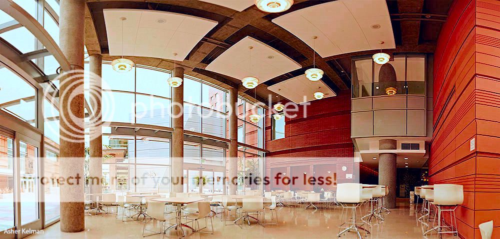
I though I'd share architectural images I'm preparing for The Colburn School of Music, a wonderful school that occupies a privileged space of real estate between The Walt Disney Concert Hall across the street and The Museum of Contemporary Art, next door. The design has been considered to be restrained like a fine European home on a great avenue but inside the architecture is splendid. The pictures here are taken with the 24 mm T/S but without movements, just using the great optics.

These are sketches to get an idea of position and perspective choices and so I'll be continuing to evolve where I stand. These are generally but not always taken on a tripod, but no exact adjustments have been made to avoid parallax. The main idea for me is to discover the nature of the spaces for various imaging purposes from populating with musicians or dancers to showing empty for rental for some grand event.

[Group 8]-_MG_8831__MG_8858-28 images0000 copy copy.jpg


Asher Kelman: The Café at The Colburn School, Grand Avenue, Los Angeles

Canon 5DII 24mm T/S II Stitched 28 images w/o any special head

Feel free to give feedback.

Asher
 

John Angulat

pro member
Hi Asher,
I have some questions and although I realize they're probably pretty stupid, I know your patience will prevail - why stitched from 28 images?
The space does not seem so overly large to require that to create a single image.
Or was it due rather, to the space being actually small and you could not capture it all from your vantage point?
Thanks!...and it's a beautiful image!
 

Rachel Foster

New member
Asher, it's nice but doesn't "grab" me. That's about me, though, not the image. I need people or something evocative of people. Again, that's me, not the image.
 

Ken Tanaka

pro member
The "28 images" stat has be a bit bewildered, too. It seems excessive for this scene.

But, that aside, offhand there are three changes that you should consider making in future images.

First, de-clutter! Although the tables and chairs seem neat they're a bit of a distractive nightmare in this shot. Rearrange the furniture so that it doesn't create such a visual tangle.

Second, shoot at twilight or early evening. Let the space's lighting create more interesting pools for the eye. The bright daylight is a real buzz-kill here; it's created a dead, flat image.

Third, consider shooting with the camera higher.

Also, crop much more carefully. For example, get rid of that ugly door on the left. And try not to crop so close to a strong vertical change of plane as you've done on the right.

Just my opinions, for what they're worth.

Chris Barrett is an excellent architectural photographer here in Chicago. Walking through his site should give you some ideas.
 

Ruben Alfu

New member
Hi Asher,

This is a sleek, elegant angle, it provides a good sense of the space and the design of the area. Any other optional angles to compare? Like Ken, I imagine the outside under dim light, but perhaps the landscape would become distracting?

In any case, I visualize the whole scene as the result of blending different exposures to capture the best of both, natural and artificial light.

I'm puzzled too by the 28 images.
 

Asher Kelman

OPF Owner/Editor-in-Chief
Hi Asher,
I have some questions and although I realize they're probably pretty stupid, I know your patience will prevail - why stitched from 28 images?
The space does not seem so overly large to require that to create a single image.
Or was it due rather, to the space being actually small and you could not capture it all from your vantage point?
Thanks!...and it's a beautiful image!

Hi John,

This is a sketch to get an idea of the spaces and not for anything more although I may ended up being used for want of something else. The space if overly large and does need multiple images. I have a bout 20% to 35% overlap sometimes much more. That way, in spite of a quick set up, autp pano giga zips through the stitching fast. With careful setup I could do this in perhaps 20 images. The space is very large.
 

Asher Kelman

OPF Owner/Editor-in-Chief
Asher, it's nice but doesn't "grab" me. That's about me, though, not the image. I need people or something evocative of people. Again, that's me, not the image.


Rachel,

This is not art, just a sketch of the space to see how the walls and ceiling will behave and then I can draw where I might want things. The interesting thing about the lens is that it's pretty flare resistant and did well in the bright light.

Asher
 

Asher Kelman

OPF Owner/Editor-in-Chief
there are three changes that you should consider making in future images.

First, de-clutter! Although the tables and chairs seem neat they're a bit of a distractive nightmare in this shot. Rearrange the furniture so that it doesn't create such a visual tangle.

Second, shoot at twilight or early evening. Let the space's lighting create more interesting pools for the eye. The bright daylight is a real buzz-kill here; it's created a dead, flat image.

Third, consider shooting with the camera higher.


Well for now, I ignore the tables and chairs as I'm just doing a sketch to try to imagine how I'll shoot the space for showing of the architecture, for it as a resource for students and neighbors and then as a rental location for high class events.

So "only as an eating place" we do need such tables and then likely even better with folk eating.

However for something celebratory, the setting in the evening will, as you suggest, be much more attractive, as the plaza paving stones have some spaces replaced by glass with colored, mostly green lights. Also the steel building behind, the Thayer Music Performance Auditorium, is bathed in green light at night. So this is beautiful.

Before getting the furniture removed, I have to come up with a design to cover the various needs I mentioned. To show the students the grand space, this sketch could be fine cropped a little tighter as suggested. I actually may move back away from that wall to be able to get more of the courtyard as it wraps around the glass walls, so well llt at night.

[/quote] And try not to crop so close to a strong vertical change of plane as you've done on the right.[/quote]

Why? I'm thinking about it but not yet convinced, even after looking at a closer crop. I may try to go further to the right. I wanted a large mass to balance the second floor balcony structure

Chris Barrett is an excellent architectural photographer here in Chicago. Walking through his site should give you some ideas.

As always, Ken, I value your input and especially your references to other work that's instructive! I'll report back my impressions and how it might impact my project

Asher
 

Ken Tanaka

pro member
These are sketches to get an idea of position and perspective choices and so I'll be continuing to evolve where I stand.
Sorry, I overlooked that declaration, Asher. I think the 28 shot stitch grabbed me and I assumed this was in near final form. I mean who else would stitch 28 images together for a "sketch"? ;-)
 

Asher Kelman

OPF Owner/Editor-in-Chief
Sorry, I overlooked that declaration, Asher. I think the 28 shot stitch grabbed me and I assumed this was in near final form. I mean who else would stitch 28 images together for a "sketch"? ;-)

Thanks Ken for re-reading! You remarks are still prescient to my eventual needs. So I'd ask about your idea for elevating the position of the camera. Would this apply to a shot populated by people in evening dress for an event as well as architecture. I generally am a little lower than the heads of the subjects but I can understand the idea of looking at the space itself differently.

Concerning the bother to stitch spaces for placing people, it's been my custom to do two things for photographing impressive sights.

One I use my hands to make a frame and walk around like a hunter to find the view I might like best, including and excluding. Other times, when the view is far to wide and especially where I would want to place people, I make a model by stitching, print and have 20 copies in B&W to develop on possible designs. I then have something concrete to show the participants. Also, I myself then can know what props cast and lights are needed.

This way I can recruit the cooperation of staff for moving stuff around for a particular defined result. I have to know at the beginning that the final composition will work and respect Peter Brueghel the elder more and more as I struggle with this! I'd love to see his working diagrams and the views he rejected. Come to think of it, he often chose a rather high point of view to look down on the myriad of people. I have done that before with this space and will find such examples.

Asher
 

Arun Gaur

New member
Asher
I have not used that particular lens so I cannot study the picture from itstechnical perspective.
However, I can give my general impression. That may be helpful.

First impression: Cursory glance nice. Smooth, good wood colors and details.
Revisited Impression:
I think the things are suddenly cut off. The base of chairs. Also too much back of the chair-though the furniture, as you mentioned, would be re-arranged. So that can be taken care off.
More worrisome cut off things for me that won't be easy to rectify are: The ceiling. I expect those curvilinear forms more expansive. I must if they can be projected more overhead towards you.
Similarly the flooring. Foreground flooring, if it can be projected more towards you, it would be better.
Different wall alignments--of course, you would be aligning in the final image.
Most Distracting Feature for me: The pillars with blotches. They mar the entire scene. Perhaps something can be done to them. May be painted afresh in mild cream.
Lights: Can they be (on the ceiling) a little more striking?

These are some of the points that come to my mind.
(Aside: When I tried to reply, I was being asked to log in afresh with the password that was rejected again and again and pnly after many attempts I could make this reply. )

Arun Gaur
http://tripolia-indianlandscapeimages.com
 

Asher Kelman

OPF Owner/Editor-in-Chief
Asher
I have not used that particular lens so I cannot study the picture from itstechnical perspective.
However, I can give my general impression. That may be helpful.

First impression: Cursory glance nice. Smooth, good wood colors and details.
Revisited Impression:
I think the things are suddenly cut off. The base of chairs. Also too much back of the chair-though the furniture, as you mentioned, would be re-arranged. So that can be taken care off.
More worrisome cut off things for me that won't be easy to rectify are: The ceiling. I expect those curvilinear forms more expansive. I must if they can be projected more overhead towards you.
Similarly the flooring. Foreground flooring, if it can be projected more towards you, it would be better.
Different wall alignments--of course, you would be aligning in the final image.
Most Distracting Feature for me: The pillars with blotches. They mar the entire scene. Perhaps something can be done to them. May be painted afresh in mild cream.
Lights: Can they be (on the ceiling) a little more striking?

These are some of the points that come to my mind.
(Aside: When I tried to reply, I was being asked to log in afresh with the password that was rejected again and again and pnly after many attempts I could make this reply. )

Arun Gaur
http://tripolia-indianlandscapeimages.com

Thanks Arun,

The sketch merely provides the positions of things and the projection possibilities. So your point about the ceiling is then relevant. That is an effect of the wide angel compression for that volume and perspective. I like it but one could investigate changing the center for which different projections are possible. Nevertheless, if one wants the columns vertical, the ceiling must be curved. As to the patina on the columns that is something to be considered in a final image, of course. Thanks for pointing that out.

Asher
 

Arun Gaur

New member
Thanks Arun,

The sketch merely provides the positions of things and the projection possibilities. So your point about the ceiling is then relevant. That is an effect of the wide angel compression for that volume and perspective. I like it but one could investigate changing the center for which different projections are possible. Nevertheless, if one wants the columns vertical, the ceiling must be curved. As to the patina on the columns that is something to be considered in a final image, of course. Thanks for pointing that out.

Asher
Asher I don't find any problem in the curvilnear configuration. It's fine.I would only suggest the picture would have a better appeal if more of the portion of the ceiling and the floor is shown towards the viewer that is the photographer.

Arun
 

Asher Kelman

OPF Owner/Editor-in-Chief
Asher I don't find any problem in the curvilnear configuration. It's fine.I would only suggest the picture would have a better appeal if more of the portion of the ceiling and the floor is shown towards the viewer that is the photographer.

Arun,

I'm consider that!
 

Arun Gaur

New member
Asher

Better expression of mine should have been--more of the ceiling and the floor "extended" towards the camera.

Also pillars: Pillars are some of the most beautiful elements of any architecture. Here in this case, I know it is easy to give them smooth tones in Photoshop. However, personally speaking, I would be of the opinion that a genuine scenario should be presented. It means that the only option would be to paint the pillars.

The rest depends upon the requirements and desires of yourself and the client.

Lights are fine. Just I wanted them to stand from the ceiling a little apart. Maybe through contast--but not much only a little. That is to say, they should be a little more distinguishable from the ceiling.

The light coming through the glass from the exterior--I don't mind it so much. In fact that adds to the feeling of openness which is very important here.

If I have other ideas on revisiting, I will post.


Arun Gaur
http://tripolia-indianlandscapeimages.com
 

fahim mohammed

Well-known member
Asher, what is behind you? And to you right, next to the waste basket?

The strong exterior lighting is distracting. But the outside building at the further left has possibilities.
At a different time there could be a very good reflection in the glass creating an illusion of expansiveness.

The door to the left has to be lost. What is in the upper right dark corner?

The cropping just above you at head height is bothersome and catches my eye.

Some random, disjointed thoughts. How would it look from various sides of the room? from the entrance door but angled inwards?

The furniture shall of course be rearranged.
 

Asher Kelman

OPF Owner/Editor-in-Chief
Asher, what is behind you? And to you right, next to the waste basket?
That's part of a chair, actually. The glass wall, a continuation of the plane of that door you don't like. It's back by one table width.

The strong exterior lighting is distracting. But the outside building at the further left has possibilities. At a different time there could be a very good reflection in the glass creating an illusion of expansiveness.

Yes, one can get different effects depending on the outside light. I like the glare of the outside light. But one can have a series of effects at different times of the day.

The door to the left has to be lost. What is in the upper right dark corner?
The projecting room is now an office. Was my studio. Now I have a larger one.

The cropping just above you at head height is bothersome and catches my eye.

That cropping is above 35feet, LOL!

Some random, disjointed thoughts. How would it look from various sides of the room? from the entrance door but angled inwards?

For a sketch, I pick a likely perspective that might work, ignore the furniture and build my pano freehand with lots of overlap. Totally non-obsessional and relaxed. I'll repeat this several times and then plan to do it with the furniture as needed and the light as decided. I might even fix my vantage point exactly and so have pictures that can be blended for outside light if needed be.

The interesting thing I have discovered in this feedback is the dislike for the door on the left!

Thanks for being generous in your ideas.

Asher
 

Asher Kelman

OPF Owner/Editor-in-Chief
Below street level, there's a giant lounge flanked by classrooms treated for producing great sound, yet insulated, one from another. This lounge s open and generous.

Here's a photographic sketch for a possible collage of students of all heights and ethnic type you can imagine, chilling, chatting, waiting for lessons. It's really like a musical Grand Central Station. In this case you can see compression of the space with curves in across the foreground floor and ceiling to create a milieu of attention in this part of the giant space.

2cd fl lounge.jpg


Asher Kelman: The Colburn School 2cd Floor Lounge: Sketch for Composite


The idea is to print this in B&W and then draw on it the figures of the students to compose the composite photograph. These students then will be photographed in my studio or come from my existing collection of studio images.

The same image will be delvered with a number of alternate projections and these will be added to our library of architectural images for planning brochures, reports and for the website http://colburnschool.edu The actual image to be used for a major brochure or campaign will be rephotographed and at that time might also include some of the students who can be assembled for a live shot. The others will be added extracted carefully with their shadows.

I thought I'd share how I work and develop my ideas. Ignore the bright yellow, LOL, I have to actually check the walls again! The object here is to see the shape and allow for a space in which to create, or "direct" a scene, packed with students musicians. You might guess my inspiration!

Your comments are welcome.

Asher
 
Hi! as always I get into the conversation without any background in Architecture photography, but I'd like to tell you what I see as a viewer (not as a photographer).
It's comment not critique as I don't have any skills for that kind of work...

What I see its: strangely the difference in heights from the chairs and the bar stools, make an invisible line that uneven the "horizon", this unbalancing line is reinforced by the one that goes through the little interior porch and one that run along the "balcony" (I attached a picture, because I'm lacking words in English). They all seem to converge in a exact same point outside the image, a bit like perspective line, and seems to be there on purpose (which is probably the case?). Also near the point of meeting you have that great hole of dark space that puts a focus on this area (with the big pillar etc). So that make the sight run first on the hole, the big pillar then run through the line to the light from right to left which is an unusual way of travelling. That what make this image different from the ones I see usually.


group8-Sandrine.jpg


Ps: I tried my best to center the thing!
 

Asher Kelman

OPF Owner/Editor-in-Chief
Hi! as always I get into the conversation without any background in Architecture photography, but I'd like to tell you what I see as a viewer (not as a photographer).
It's comment not critique as I don't have any skills for that kind of work...

What I see its: strangely the difference in heights from the chairs and the bar stools, make an invisible line that uneven the "horizon", this unbalancing line is reinforced by the one that goes through the little interior porch and one that run along the "balcony" (I attached a picture, because I'm lacking words in English). They all seem to converge in a exact same point outside the image, a bit like perspective line, and seems to be there on purpose (which is probably the case?). Also near the point of meeting you have that great hole of dark space that puts a focus on this area (with the big pillar etc). So that make the sight run first on the hole, the big pillar then run through the line to the light from right to left which is an unusual way of travelling. That what make this image different from the ones I see usually.

Ps: I tried my best to center the thing!


group8-Sandrine.jpg


Sandrine,

You have a great eye! Yes, I was positioned all the way to the left and low down to exaggerate the changes as the stitched compressed mage s projected over a modulated sphere, a mercator version. So if you now follow the curved roof lines downwards, they will cut through pretty close to where the camera saw all this! That's how it seems to work. This center is on the darkest point and it is chosen so the eyes will sweep to all the way above and to the left from there.

I like the artificial compression as it can add a dynamic power to an image.

Asher
 

Kevin Stecyk

New member
Overall, I like the image.

I am not bothered by the dark holes of space. I have always been curious what lies beyond, so open, unanswered spaces don't bother me. I understand, however, that some others prefer a more defined capture.

One earlier comments, by Ken Tanaka, that I did agree with is the flat lighting.

One of the things I tried to do to counteract the flat lighting was make the interior more vivid. Of course, that might be in direct violation of what you are attempting to portray. I was attempting to capture the feeling of grandeur more than the true imagery.

I played with some channels and did some channel blending. I don't even remember exactly what I did. If you look at the lights, for example, you'll see that I have more detail.

Of course, if any alteration to the color is in direct violation of what you are trying to accomplish, then my efforts were wasted. If, however, you're open to change, then have a look. If you find the colors are too strong, you might want to put my version on top, with a reduced opacity, of your original version in Photoshop.

You might find it helpful to put the two images in a layer stack and just toggle between them. See if there is any benefit.

Asher.jpg
 

Asher Kelman

OPF Owner/Editor-in-Chief
Overall, I like the image.

I am not bothered by the dark holes of space. I have always been curious what lies beyond, so open, unanswered spaces don't bother me. I understand, however, that some others prefer a more defined capture.

Kevin,

I appreciate you spending time on my photograph. Your comments will be minded fully as I go further an build a definitive set of pictures of the same architectural space.

Unanswered spaces? If ever we can leave mystery, we also add beauty. Defining absolutely everything might be the death of art.

One earlier comments, by Ken Tanaka, that I did agree with is the flat lighting.

One of the things I tried to do to counteract the flat lighting was make the interior more vivid. Of course, that might be in direct violation of what you are attempting to portray. I was attempting to capture the feeling of grandeur more than the true imagery.

Yes, Ken and you both remark on an important aspect. I have to examine this and also consider what reliance I should place on the actual house lights as opposed to natural light at a particular time of the day.

I played with some channels and did some channel blending. I don't even remember exactly what I did. If you look at the lights, for example, you'll see that I have more detail.
[/quote]

I'm totally open to change. This is why I post sketches.

You might find it helpful to put the two images in a layer stack and just toggle between them. See if there is any benefit.[/quote[

I'll do that.


[Group 8]-_MG_8831__MG_8858-28 images0000 copy copy.jpg


Asher Kelman: The Café at The Colburn School, Grand Avenue, Los Angeles

Original


Asher.jpg


Asher Kelman: The Café at The Colburn School, Grand Avenue, Los Angeles

Edited: Kevin Stecyk


Your version will be put to test shortly as you suggest. Then I'll comment. right now, the saturation of the brick might be over the top, but that does not matter. I'm more interested in the directions that you could suggest rather then successful implementation. Pointing to a path is, after all , already something to be appreciated.

Asher
 

Asher Kelman

OPF Owner/Editor-in-Chief
Kevin,

The main signal that I see here that is ambiguous is the shading of the bold concrete columns. Because the building and projection is so dramatic, this missing feature might be overlooked. However it's a real but important subtle loss. This is true in both my original and your edited version. While the columns on the right are shaded on the right side, as we go to the left side, the lighting is indeed "flat". That is the accidental balancing of the sunlight sides with the combined light of the entire space from the large artificial lights. To this end, one could, of course, simple shade by hand the right side of the columns, adding an horizontal gradient light to dark, one each column on the left side of the picture. However, I plan to repeat the image with more control of lighting to bring out the solid forms in space more effectively. I'm considering taking the next picture with the large glass door on the left behind me!

Thanks again for giving your thoughtful feedback and spending time trying to help better the original!

Asher
 

Kevin Stecyk

New member
Asher,

Architectural photography is not something that I practice. So I just relied upon gut instinct in reacting to your photograph.

I like strong colors--everywhere. Hence, the strong colors in my revision. You might find that even after you reshoot with better lighting conditions, some subtle channel blending enhances the overall effect.

In looking at your photograph, I am reminded of a recent NY Times article. Let me see if I can find it.

I found it: http://nyti.ms/99V9s4

It's an article from back in June, To Sell a Luxe Apartment, No Ordinary Snapshot Will Do. Look at the before and after. I suspect that was done with HDR, or by compositing two images, one for outdoors and one for indoors. The interior looks brighter and you can see outside.

This is something you might wish to consider as well

Kevin
 
the article reminds me that: from John Warner (john warner photography)


ch7_kitchenexteroir.jpg


ch7_kitcheninterior.jpg


ch7_kitchenstove.jpg

Unfortunately I don't have the final image. No HDR, apparently "just" maskings and color corrections.


From Katrin Eisman Book
 

Kevin Stecyk

New member
the article reminds me that: from John Warner (john warner photography)

[Edit: images removed to save space.]

Unfortunately I don't have the final image. No HDR, apparently "just" maskings and color corrections.

From Katrin Eisman Book

Although I have Katrin's Eisman's book, I haven't read it yet. Just thinking out loud, an always dangerous activity, this shouldn't be too hard. The outdoors are typically much brighter. So if you go into LAB mode, you can take advantage of the increased brightness using the L channel. Perhaps use some blend-ifs along with some layer masks. And, although color correction can be challenging, given time and effort, one can usually wrestle this beast into submission.

Anyway, seeing Asher's photography reminded me of the NY Times article. I recall agreeing how much better the professional image looked.

At first, I thought it was just better lighting. If you use that assumption, then the photographer needed to flash the interior to bring its light level up to the outdoor level. I didn't see any signs of a strong flash. The light appeared to be soft and even.

A longer aperture time would not work because both interior and exterior would become brighter. Thus additional light would have been required.

Then, the other two obvious choices were HDR and separate photographs composited. While it doesn't look like typical HDR, some HDR is very good now and doesn't have the usual tell-tale signs. Or, perhaps as Sandrine alludes to, it was a composite.

However it was created, the professional version looks much better with it bright and airy interior and visible exterior. The photograph gives the viewer an impression of an apartment that is lighter and happier with more depth.
 

Asher Kelman

OPF Owner/Editor-in-Chief
At first, I thought it was just better lighting. If you use that assumption, then the photographer needed to flash the interior to bring its light level up to the outdoor level. I didn't see any signs of a strong flash. The light appeared to be soft and even.


There's no problem with large light sources. Christine the articles author says that often they do use flash!

Asher
 

Kevin Stecyk

New member
There's no problem with large light sources. Christine the articles author says that often they do use flash!
Asher

Oh, I understand that you can use big flashes. And you can use softboxes. But it is hard within a confined apartment to have it well lit up and look completely natural, or at least that my initial set of assumptions. If you flash into a corner and use the walls as reflectors, then you can view the shadows. Look at NY Times picture. The light is even everywhere.

In looking at the apartment photograph, the ceilings aren't that high either, which again, I think, would limit your abilities to flash the entire apartment and keep the light even everywhere.

An unaltered shot of a 23rd-floor apartment at 111 West 67th Street and a photograph of the same apartment with added touches and more sunlight edited in.

Perhaps this was just one photograph with the outside darkened and the inside lightened in Photoshop?
 

Asher Kelman

OPF Owner/Editor-in-Chief
Oh, I understand that you can use big flashes. And you can use softboxes. But it is hard within a confined apartment to have it well lit up and look completely natural, or at least that my initial set of assumptions. If you flash into a corner and use the walls as reflectors, then you can view the shadows. Look at NY Times picture. The light is even everywhere.

In looking at the apartment photograph, the ceilings aren't that high either, which again, I think, would limit your abilities to flash the entire apartment and keep the light even everywhere.


Perhaps this was just one photograph with the outside darkened and the inside lightened in Photoshop?

Kevin,

I doubt she really knows. Likely as not, the photographer bracketed the shots at least! That's what I'd do. but it's so easy to bring lights! After all, this is for high paying clients.

Asher
 
Top