• Please use real names.

    Greetings to all who have registered to OPF and those guests taking a look around. Please use real names. Registrations with fictitious names will not be processed. REAL NAMES ONLY will be processed

    Firstname Lastname

    Register

    We are a courteous and supportive community. No need to hide behind an alia. If you have a genuine need for privacy/secrecy then let me know!
  • Welcome to the new site. Here's a thread about the update where you can post your feedback, ask questions or spot those nasty bugs!
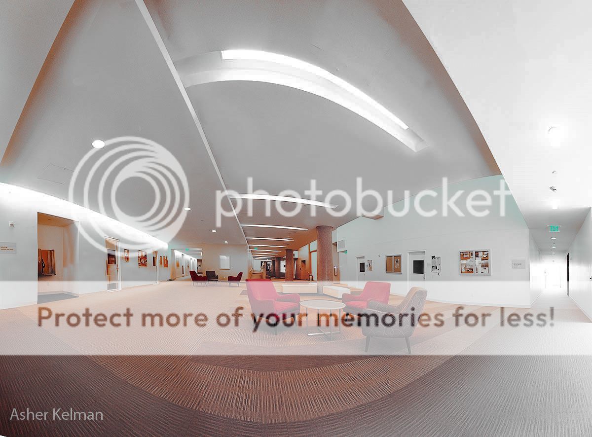
I made an attempt to make it like I'd like the image to be. Basically by attracting the eye more on the center (armchairs) and less on the light on the left...Just my thoughts. I also found that the bold pattern on the carpet was a bit distracting so I toned it down...


2cd-fl-loungeccorrection.jpg
 

Asher Kelman

OPF Owner/Editor-in-Chief
2cd fl lounge.jpg


Asher Kelman: The Colburn School 2cd Floor Lounge: Sketch for Composite


Thanks for the try, Sandrine, You lightened everything except the center. However that lack of strength in the foreground rug, removes a strong attention getter to the foreground and our eyes sweep past the center chair setup following the converging lines to the far end of the space.

In actual use, as the background for a large composite tableau, the placement of students waiting for class or just hanging out with friends or passing by with instruments will solve this issue naturally.

Asher
 

Kevin Stecyk

New member
I began reworking your picture and made considerable progress. I had white walls and generally reasonably colors. And then I looked at my "Exit" signs. They were turquoise/teal in color. That didn't make sense to me. So I scrapped my work and was about to begin again. Then, I looked at your source image again. I notice your "Exit" signs have some funky colors too. I *suspect* that the Exit signs are red. I wouldn't be surprised if some fire code specifies that Exit signs must be red and be lit. People need to have familiarity, especially during an emergency where people may be groping they way through a smoke filled room.

I wouldn't be surprised that you have cross lighting with the fluorescent lights giving a green cast (I think that's correct) and pot lights which might give a yellow cast. An interesting challenge.
 

Doug Kerr

Well-known member
Hi, Kevin,

I wouldn't be surprised if some fire code specifies that Exit signs must be red and be lit.

In most parts of the world outside the U.S. (where "logic" is a common factor in public policy and practice), exit signs must be green; red is reserved for signs that mean "don't go here" or prohibit some other activity .

Building and fire codes in the US vary in this regard from state to state, city to city. Some require red; some require green; some allow any color but red.

OSHA does not prescribe a color. "Any color, or color combinations, that is readily visible or distinctive in appearance on exit signs is acceptable to OSHA."

Best regards,

Doug
 

Kevin Stecyk

New member
In most parts of the world outside the U.S. (where "logic" is a common factor in public policy and practice), exit signs must be green; red is reserved for signs that mean "don't go here" or prohibit some other activity .

Building and fire codes in the US vary in this regard from state to state, city to city. Some require red; some require green; some allow any color but red.

OSHA does not prescribe a color. "Any color, or color combinations, that is readily visible or distinctive in appearance on exit signs is acceptable to OSHA."

That's interesting. I don't ever recall seeing a non-red exit. I should have Googled before commenting.

Okay, so perhaps I wasn't that far off earlier.

Thank you Doug for your helpful comment.
 

Kevin Stecyk

New member
Here's another interpretation for you to consider:


AsherKelman2a.jpg

I tried to remove the yellow from the walls and I tried to tone down the bright lights to make them less overpowering.

Again, not really sure what I did. As I recall, I started off in RGB, and blended the blue channel into red and green using apply image with the blue channel as a mask. Then, I went into Lab mode and forced the yellow to neutral using blend-ifs. The walls had a greenish color to them. So I used the green for the blend if to target the walls only. Perhaps it is more accurate to say that I targeted the walls mostly. Perhaps there was something else that was yellowish green too.

This whole process took me about five minutes.

Edit:I replaced the original picture with another version. In the original, the walls still had a slight greenish tint. I removed most of that greenish tint in the revised version. That took only a few seconds to do.
 
Last edited:

Asher Kelman

OPF Owner/Editor-in-Chief
Thanks Kevin for your Herculean effort. When making a final set of pictures for this, I'll take graycard shots for each surface. Here, I am most interested in the shapes, for example the forced curve in the seam of the rug and the light fixture which I like.

Asher
 

Kevin Stecyk

New member
Thanks Kevin for your Herculean effort. When making a final set of pictures for this, I'll take graycard shots for each surface. Here, I am most interested in the shapes, for example the forced curve in the seam of the rug and the light fixture which I like.

If it were me, I'd ask the custodian if he or she could temporarily turn off the pot lights. Then, I would have just the flourescents turned on. You only have one color cast. Or one general cast. I suspect that the ages and brands will affect the color casts.

Then, I'd see if I could work with just the pot lights turned on.

And, last, I work with everything on. You might find your lighting conditions better using one general source of lighting. It's when you mix and match that you have lots of troubles.

If you're mixing and matching light sources, I am not sure gray cards will help much. Yes, will you know the true colors of various objects, but it will be challenging to get everything working harmoniously together.

If you have one light source, then you can correct for its cast. If you have two diffrent photos using two separate light sources, you might find that you can blend the two color corrected photographs for maximum effect.

Anyway, this stuff is beyond me. Intuitively and not knowing more or better, this is how I would approach your indoor shot.
 

Asher Kelman

OPF Owner/Editor-in-Chief
If you're mixing and matching light sources, I am not sure gray cards will help much. Yes, will you know the true colors of various objects, but it will be challenging to get everything working harmoniously together.

If you have one light source, then you can correct for its cast. If you have two diffrent photos using two separate light sources, you might find that you can blend the two color corrected photographs for maximum effect.

Kevin,

Thanks for being so very thoughtful. I was thinking of taking the picture with my strobes! Problem is hiding them all. However, I might be able to move them for each shot. I have enough lights but getting an even distribution with strobes is the challenge. Your idea id better. Using just the fluorescent lights is likely the easiest approach. Each picture of a pano has to be color corrected individually with it's own gray card. Not perfect, but with enough segments, the blending functions of the Autopano Giga software should do the rest.

I can also rent more fluorescent sources for the left side of the space and then add the "lights" in the ceiling pots in Photoshop.

Ideally, I should replace all the fluorescent lights with tubes of the same lot, at least for the front. If needed, I'lll do just that!

Thanks so much!

Asher
 

Kevin Stecyk

New member
Asher, this channel blending and blend-if stuff interests you, here's excellent resources you might wish to use:

1) Professional Photoshop: The Classic Guide to Color Correction (5th Edition) [Paperback]

2) Photoshop LAB Color: The Canyon Conundrum and Other Adventures in the Most Powerful Colorspace [Paperback]

3) Dan Margulis Videos on KelbyTraining.com.

Please note, I used my Amazon affiliate links for the first two books, items one and two. Dan Margulis wrote the first two books. With regard to Kelby Training, you can join for one month to determine if the site is appropriate for your interests. And during that time, you can watch many of Margulis's videos. I found that I needed to watch them several times. I should rewatch them again to brush up.
 

Asher Kelman

OPF Owner/Editor-in-Chief
Heres a sketch for a picture I'm making for several purposes: my artwork, as a b.g. for a composite and for renting out space for events.

This is just the center of the area of a larger image. 24mm TS lens used with no shift and stitched in portrait position.


S.Plaza_HDR2 copy_01 cropped with sky800pxl_01.jpg


Asher Kelman: Hidden Sunset at South Plaza ,

The Colburn School, Grand Avenue,
Los Angeles, August 29th 2010
Not for Copying/Editing


Just thought I'd share what I'm up to!

Asher
 

Jeremy Waller

New member
Hi Asher,

Re: Hidden Sunset at South Plaza

Now your'e "cooking with gas".

The colours and the form all come together for me. This is the sought of picture that draws me in and demand I take a second look.

I really like it.

Jeremy.
 
Top