• Please use real names.

    Greetings to all who have registered to OPF and those guests taking a look around. Please use real names. Registrations with fictitious names will not be processed. REAL NAMES ONLY will be processed

    Firstname Lastname

    Register

    We are a courteous and supportive community. No need to hide behind an alia. If you have a genuine need for privacy/secrecy then let me know!
  • Welcome to the new site. Here's a thread about the update where you can post your feedback, ask questions or spot those nasty bugs!

My World: Exploring commercial filters in post processing an image of flowers.

Asher Kelman

OPF Owner/Editor-in-Chief
In the recent debate as to what constitutes a photograph today, we first have to spin the truth and call digital images with a focal plane of silica instead of film as making photographs and not something by some other name. Once we take the liberty of assigning the name photograph to images from digital photography, some might have qualms about using that designation for anything that is substantially altered in the facts of the matter: what objects and kind of objects are in the resulting delivered image, be it print or screen file.

I will take a shortcut here, for the sake of brevity and define all images derived from a camera to be photographs, even when subjected to filters, edits or fusion with other images. If you can't tolerate this, then stop reading here, as I am going to show how I have at times processed images to the extent that the final result might be considered a new form or perhaps a pantograph, LOL! Still, it's my work and I call it my photograph, even to the end.

Here's a start. I first provide resized out-of the-camera jpg images, as for some folk, this is the starting point. I however, will switch immediately to RAW processed images once you give your feedback, as to what's there or not there one might like in a "Work of art". I will not follow your instructions, LOL, just would like to see how different our respective "to do lists" might be!


A_DSC03491_out of camera_jpg_1000.jpg


Asher Kelman: Flowers in A water Glass

1000 pixels reduced file, uncropped, from out-of-the-camera jpg with no other processing


and a monochrome version,


A_DSC03491_out of camera_jpg_1000_dasat to greyscale.jpg


Asher Kelman: Flowers in A water Glass

Monochrome derived by merely desaturation.

1000 pixels reduced file from uncropped out-of-the-camera jpg with no other processing


Comment on each stage as to what works as an art piece and what it lacks. You are stuck with my work, I'm afraid. I believe it has the "bones" for a picture that might be delightful. But how do we get there? What would you like to achieve in making a photograph ready for exhibition?

I have already made the derived images and will show them in sequence and then invite further comments at each stage of transformation.

I wonder whether any of the changes I seek to make will be predicted by your initial feedback and wishes!

Thanks for going along with my deceptive plan to develop a picture with software. I will use Photoshop CC 2014 and the Nik and Topaz plugins.

Asher
 

James Lemon

Well-known member
In the recent debate as to what constitutes a photograph today, we first have to spin the truth and call digital images with a focal plane of silica instead of film as making photographs and not something by some other name. Once we take the liberty of assigning the name photograph to images from digital photography, some might have qualms about using that designation for anything that is substantially altered in the facts of the matter: what objects and kind of objects are in the resulting delivered image, be it print or screen file.

I will take a shortcut here, for the sake of brevity and define all images derived from a camera to be photographs, even when subjected to filters, edits or fusion with other images. If you can't tolerate this, then stop reading here, as I am going to show how I have at times processed images to the extent that the final result might be considered a new form or perhaps a pantograph, LOL! Still, it's my work and I call it my photograph, even to the end.

Here's a start. I first provide resized out-of the-camera jpg images, as for some folk, this is the starting point. I however, will switch immediately to RAW processed images once you give your feedback, as to what's there or not there one might like in a "Work of art". I will not follow your instructions, LOL, just would like to see how different our respective "to do lists" might be!


A_DSC03491_out of camera_jpg_1000.jpg


Asher Kelman: Flowers in A water Glass

1000 pixels reduced file, uncropped, from out-of-the-camera jpg with no other processing


and a monochrome version,


A_DSC03491_out of camera_jpg_1000_dasat to greyscale.jpg


Asher Kelman: Flowers in A water Glass

Monochrome derived by merely desaturation.

1000 pixels reduced file from uncropped out-of-the-camera jpg with no other processing


Comment on each stage as to what works as an art piece and what it lacks. You are stuck with my work, I'm afraid. I believe it has the "bones" for a picture that might be delightful. But how do we get there? What would you like to achieve in making a photograph ready for exhibition?

I have already made the derived images and will show them in sequence and then invite further comments at each stage of transformation.

I wonder whether any of the changes I seek to make will be predicted by your initial feedback and wishes!

Thanks for going along with my deceptive plan to develop a picture with software. I will use Photoshop CC 2014 and the Nik and Topaz plugins.

Asher

Asher

I would forget the monochrom version and work with the coloured version. The arrangement deserves colour IMHO but you might want to consider some other alternative compositions as well. I don't know anything about filters and all the photoshop stuff but I think Maggie Terlecki would have some fabulous ideas for you.

James
 

Asher Kelman

OPF Owner/Editor-in-Chief
Asher

I would forget the monochrom version and work with the coloured version. The arrangement deserves colour IMHO but you might want to consider some other alternative compositions as well. I don't know anything about filters and all the photoshop stuff but I think Maggie Terlecki would have some fabulous ideas for you.

James


Thanks for coming by, Jim!

Yes, that's a valid statement that "the arrangement deserves color", but is this an either or situation? Could we have both. Another point, could a fundamentally optimized monochrome version help us making a better version with color?

But within the delivered image, are there any features you feel need being made more or less evident?

As to Maggie, of course I'd love her help here!

Asher
 

James Lemon

Well-known member
Thanks for coming by, Jim!

Yes, that's a valid statement that "the arrangement deserves color", but is this an either or situation? Could we have both. Another point, could a fundamentally optimized monochrome version help us making a better version with color?

But within the delivered image, are there any features you feel need being made more or less evident?

As to Maggie, of course I'd love her help here!

Asher

Hi Asher

Personally I don't use filters or things like nik software simply because I would not know where to stop without destroying an image by having it become too artificial looking or something just as disastrous. Flowers are from nature and should appear as such as opposed to some type of LSD hallucination just my feeling and two comparative versions might be a bit too much work. I think the colour temperature and light should be a top priority on the list. Next the composition needs some work! We would have to try a few different arrangements. Oh yeah we will need a Photoshop Wizard! Maybe if you could photograph with a colour raw file and a black and white jpg at the same time and overlay the B/W jpg with the colour version using the B&W JPG as a base layer for tones or something like that.

James
 

Asher Kelman

OPF Owner/Editor-in-Chief
Yes you're right about not making the flowers become comical! That would be disastrous. But what do you think of the hard edges of the table and the emptiness of the wall which hardly goes with the flowers! This is why I think that changes should be made in definite saved versions, so one can always return to a perfect flower.

Asher
 

James Lemon

Well-known member
Yes you're right about not making the flowers become comical! That would be disastrous. But what do you think of the hard edges of the table and the emptiness of the wall which hardly goes with the flowers! This is why I think that changes should be made in definite saved versions, so one can always return to a perfect flower.

Asher

Asher

I think we can agree that the edge of the table has to go. The strong diagonal light rays on the wall should stay but maybe tweaked a tad. I was thinking that if you turned the vase on a bit of an angle to line up the flower stems parallel the diagonal lines on the wall with the leaves perpendicular to them. That might enhance things a bit but I also think that we need to consider a different type of vase or some kind of material over it .Just my thoughts!

James
 

Lee Tracy

New member
Thanks for coming by, Jim!

Yes, that's a valid statement that "the arrangement deserves color", but is this an either or situation? Could we have both. Another point, could a fundamentally optimized monochrome version help us making a better version with color?

But within the delivered image, are there any features you feel need being made more or less evident?

As to Maggie, of course I'd love her help here!

Asher

I like both the colour and the black-and-white but if I had my druthers I would choose the black-and-white. I often find colour distracts from the architectural elements of a picture. When you remove colour from the equation I feel you get more to the bones of what a thing is - and can focus on enjoying other aspects of both composition and design of the object.
 

Lee Tracy

New member
Asher

I think we can agree that the edge of the table has to go. The strong diagonal light rays on the wall should stay but maybe tweaked a tad. I was thinking that if you turned the vase on a bit of an angle to line up the flower stems parallel the diagonal lines on the wall with the leaves perpendicular to them. That might enhance things a bit but I also think that we need to consider a different type of vase or some kind of material over it .Just my thoughts!

James

It is usually the contrasts in a picture that make it work - the softness of the flowers in opposition to the hard lines of the table / light / vase. The soft highlights within the glass vase in opposition to the hard lines of its edges. The diagonals of the light rays in opposition to the curves of the stems going the other way.
 

Asher Kelman

OPF Owner/Editor-in-Chief
It is usually the contrasts in a picture that make it work - the softness of the flowers in opposition to the hard lines of the table / light / vase. The soft highlights within the glass vase in opposition to the hard lines of its edges. The diagonals of the light rays in opposition to the curves of the stems going the other way.

But are these as needed for this picture to bring out the magic? What if anything could be changed for the better if you can't move anything but had a magic brush?

Thanks for giving your feedback,

Asher
 

Jerome Marot

Well-known member
A_DSC03491_out of camera_jpg_1000.jpg


Asher Kelman: Flowers in A water Glass


What bothers me most with that picture is that the vase and table below it appear to have been moving or vibrating horizontally when the picture was taken. I suppose that this is an effect of the lens used. I suppose that the lens renders objects behind the plane of sharpness in that way.
 

Asher Kelman

OPF Owner/Editor-in-Chief
A_DSC03491_out of camera_jpg_1000.jpg


Asher Kelman: Flowers in A water Glass


What bothers me most with that picture is that the vase and table below it appear to have been moving or vibrating horizontally when the picture was taken. I suppose that this is an effect of the lens used. I suppose that the lens renders objects behind the plane of sharpness in that way.

Thanks Jerome,

Yes the lens was wide open and at 1/1000 second at 160 ISO. Hand held no image stabization, MF,

So we agree that the lines of the table don't help the picture!

Asher
 

Michaela Taylor

New member
I like the bkack and white one better than the colour as the colours are not bright enough to be a photo on there own but do take away from the shape and texture of the flowers.

With the black and white one I would add a bit of contrast - edit the shadows darker and the highlights lighter as well as croping the image to that it is a bit like a panorama but with just the flowers - a bit like that artist who paints those stunning water lily's (can't remeber his name sorry!). I would also then possibly burn/darken the background a bit so the to shape of the flowers stand out more.
 

Asher Kelman

OPF Owner/Editor-in-Chief
I like the bkack and white one better than the colour as the colours are not bright enough to be a photo on there own but do take away from the shape and texture of the flowers.

With the black and white one I would add a bit of contrast - edit the shadows darker and the highlights lighter as well as croping the image to that it is a bit like a panorama but with just the flowers - a bit like that artist who paints those stunning water lily's (can't remeber his name sorry!). I would also then possibly burn/darken the background a bit so the to shape of the flowers stand out more.

Great, Michaela,

You've hit on my key start in such a photo. The architecture of the flowers in B&W, if one wants B&W, must be optimized - whatever it takes. Now, at last, this is where having a RAW file is going to be the only possible way of doing this without risking posterization, or sudden changes in tone) that would happen with the 1% of residual data that is contained in the merely 8 BIT JPG files "out-of-the-camera"! So this will be job# 1!

Thanks for indentifying this task!

Asher
 

Jerome Marot

Well-known member
Yes the lens was wide open and at 1/1000 second at 160 ISO. Hand held no image stabization, MF,

There is nothing inherently wrong with using a lens wide open.

So we agree that the lines of the table don't help the picture!

I did not say that. Besides, the vase appears to vibrate to my eyes, yet there are not lines on the vase.

Basically, you posted that image to discuss the difference between a "photography" (whatever that is) and a post-processed image. I am pointing out that the choice of lens influences quite strongly the rendering of that particular picture. Yet:
-the rendering of lenses is traditionally considered to be part of the "photographic process"
-the rendering of lenses is almost impossible to emulate with digital post-processing.

The minute when Nicéphore Niépce took a handsaw and a few planks to build a camera obscura he had to make choices that all influence the final result: size of sensitive material, focal length, type of lens, aperture, etc... Change any of these, and you change the final picture, sometimes considerably. Looking for an "unprocessed photograph" amounts to looking for a photograph which would be an accurate representation of reality. There is no such thing. Photographs only appear to ressemble reality to the casual viewer, because the process by which they are made is designed to mimic the human visual processes. But they are nowhere close to reality. They are not recognised as even vaguely resembling something recognisable by animals whose vision is different from human vision, for example.

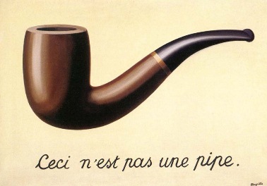
This has been illustrated by René Magritte in the painting The Treachery of Images (also called "This is not a pipe"):


MagrittePipe.jpg
 

Asher Kelman

OPF Owner/Editor-in-Chief
So now I must process the RAW version of the image. Even if we want monochrome, we first develop full color in the largest possible color space available in the Adobe CC 2014 Canera Raw processing software. Without that, we'll immediately lose colore outside of the smaller Adobe RGB color palette. I will also use the pull down menu and choose my custom color profile I made for this lens, a Leica, M Summicron 2.8 on one the Sony A7R.

I will adjust the exposure to open up the shading in the stems and leaves and make the fliers as bright as possible without clipping the highlights. Same for the darks. I will slightly apt the Clarity, (local contrast), slider and optimize the parametric curves.

This will be saved as a 16 BIT Profoto RGB and that means I have all the data, petty well, that the camera has recorded! This file now has the robustness to withstand any future "stresses" I put it through as we seek to bring it more of the potential of the file down the road!

Asher
 

Asher Kelman

OPF Owner/Editor-in-Chief
There is nothing inherently wrong with using a lens wide open.


I did not say that. Besides, the vase appears to vibrate to my eyes, yet there are not lines on the vase.

Basically, you posted that image to discuss the difference between a "photography" (whatever that is) and a post-processed image. I am pointing out that the choice of lens influences quite strongly the rendering of that particular picture. Yet:
-the rendering of lenses is traditionally considered to be part of the "photographic process"
-the rendering of lenses is almost impossible to emulate with digital post-processing.

............


MagrittePipe.jpg

Thanks for you comments! I am always humbled by the sight of such a "pipe, which it is not!

My start with the notion of "Photography" or the "Photograph" comes from trying at the outset, here, to avoid sidetracking again into the debate on what that might be today, LOL!

Asher
 

Lee Tracy

New member
I think we are venturing into 'each to their own' territory.

For me - I like the colour one for its pastel tones. I like the black and white one because it is more architectural. If I had to be nitpicky about the image I would say the front edge of the table (and therefore probably also the back edge) is not perfectly horizontal and the bit of corner showing on the right hand side is distracting.

It's an "easy" image if I can put it like that - pretty but undemanding visually. The black and white one does ask a bit more of the viewer in terms of hard vs soft, but then if I was being perfectionist, and this was my image, I would discard this one entirely and do over to get the lighting and composition of the arrangement in better juxtaposition to bring out the Yin/Yang - hard/soft contrasts better.
 

Asher Kelman

OPF Owner/Editor-in-Chief
For those who still do not avail themselves of the full set of data delivered by the camera in the RAW file, here again is the out-of-the-camera jpg and below it the data rich and more robust Profoto RGB 16BIT file from RAW.


A_DSC03491_out of camera_jpg_1000.jpg


Asher Kelman: Flowers in A water Glass

1000 pixels reduced file, uncropped, from out-of-the-camera jpg with no other processing


B_dsc03491CC_2014_Color-direct from CC.jpg


Asher Kelman: Flowers in A water Glass

Direct from Adobe Camera Raw CC 2014, cropped to 8x10 format and then resized to 800 pixels, with no other processing


I like the result! Do you? Likely as not your own taste might have guided you to choose a different result. Nevertheless, I do hope those who still use just the tiny subset of data left in an admittedly perfectly pretty sRGB file will be moved a tad this transformation.

Asher
 

Lee Tracy

New member
For those who still do not avail themselves of the full set of data delivered by the camera in the RAW file, here again is the out-of-the-camera jpg and below it the data rich and more robust Profoto RGB 16BIT file from RAW.


A_DSC03491_out of camera_jpg_1000.jpg


Asher Kelman: Flowers in A water Glass

1000 pixels reduced file, uncropped, from out-of-the-camera jpg with no other processing


B_dsc03491CC_2014_Color-direct from CC.jpg


Asher Kelman: Flowers in A water Glass

Direct from Adobe Camera Raw CC 2014, cropped to 8x10 format and then resized to 800 pixels, with no other processing


I like the result! Do you?

I do hope those who still use just the tiny subset of data left in a perfectly pretty sRGB file will be moved a tad to explore this choice further.

Asher

Oh boy ... am I allowed to say yuck? Colours are too bright. All tone has been lost on the middle of the wall behind the flowers which is what made the original one interesting. The blown highlights on the flowers on the RHS are far more evident and now distracting and the difference between light and dark on the flowers between the left and right blooms because of the light coming in from the window on the left has unbalanced the image.
 

Asher Kelman

OPF Owner/Editor-in-Chief
Oh boy ... am I allowed to say yuck? Colours are too bright. All tone has been lost on the middle of the wall behind the flowers which is what made the original one interesting. The blown highlights on the flowers on the RHS are far more evident and now distracting and the difference between light and dark on the flowers between the left and right blooms because of the light coming in from the window on the left has unbalanced the image.


Well, Lee, I'm glad you have a particular taste. Fine that you find it yucky, but there are no blown highlights on my monitors! BTW, do you have a profiled monitor? Bear with me. This is not the end, it is not the beginning of the end, just the end of the beginning! (Winston Spencer Churchill)!

It will be revealed why I sacrificed the lines on the wall to the extent I have at this stage.

Asher
 

Wolfgang Plattner

Well-known member
Oh boy ... am I allowed to say yuck? Colours are too bright. All tone has been lost on the middle of the wall behind the flowers which is what made the original one interesting. The blown highlights on the flowers on the RHS are far more evident and now distracting and the difference between light and dark on the flowers between the left and right blooms because of the light coming in from the window on the left has unbalanced the image.

even on my "freaky" windowslaptop here, I can't follow you ...
 

Lee Tracy

New member
uhh I may not have the bestest in westest monitor no. I did calibrate it as best as I could using online tools to do so.


several hours and severe eyestrain later - reset my monitor - now my white isn't so white any more ... which is unhappy making and ... not sure I improved anything. Eyes too tired now to fiddle more.
 

James Lemon

Well-known member
Well, Lee, I'm glad you have a particular taste. Fine that you find it yucky, but there are no blown highlights on my monitors! BTW, do you have a profiled monitor? Bear with me. This is not the end, it is not the beginning of the end, just the end of the beginning! (Winston Spencer Churchill)!

It will be revealed why I sacrificed the lines on the wall to the extent I have at this stage.

Asher

Yes we don't want the background to overpower the subject but the tones in the original are more appealing as mentioned by Lee. I was hoping you could bring out more yellow?

James
 

Asher Kelman

OPF Owner/Editor-in-Chief
Making more tone and texture-realted derivatives!

But the next order of business for me is to split my efforts into two paths. Why, I want to bring together the textures and feeling of the background, table and flowers under one common regimen and there are two main approaches.

  • First, use an art filter like Topaz™ Impression to create a related but adjustable set of nuanced alterations on the color image.
  • Second make customized monochrome versions to get the underlying form and texture of the image optimized to my taste.

These two sets now become the parents of whatever else I might seek to develop.


Asher
 

Asher Kelman

OPF Owner/Editor-in-Chief
Now for the global, (with local adaptive changes) transformation of the color picture.

If you HATE use of artistic filters, then skip this and go on to the two monochrome versions, to follow, which might be more to your style.


A_DSC03491_out of camera_jpg_1000.jpg


Asher Kelman: Flowers in A water Glass

1000 pixels reduced file, uncropped, from out-of-the-camera jpg with no other processing


B_dsc03491CC_2014_Color-direct from CC.jpg


Asher Kelman: Flowers in A water Glass

Direct from Adobe Camera Raw CC 2014, cropped to 8x10 format and then resized to 800 pixels, with no other processing


I_dsc03491CC_2014_Color-TiurnerStorm2


Asher Kelman: Flowers in A water Glass

Version Above Processed with Topaz Impression - Turner Storm 2.


This departs in a major way from the original form of the image. The flowers and drinking glass are now connected via a zone of commonality, like a cloth in a still life composition, so that all elements are united and should now appear to be feeding off the same "esthetic blood flow".


This is either brave and wonderful or else frighteningly destructive, depending on one's core values as to art and photography. My job here is to investigate the consequences of using this filter and although I'm testing the waters, I am pretty pleased with the result. Perhaps I'd do this by actually bringing in a colored cloth to the next shot of such flowers and even painting over with acrylics on the finished print. either way, I have, for myself at least, dealt with the gross discordance of materials and made everything connect to my satisfaction. I like attachments, that's how family and community is built. I like to see it as a possible quality and this exploration confirms my suspicion that it works for pictures too!

If this exercise pushed futurism too far, venturing into brush strokes on a photograph, then a clean monochrome version to follow should reset your clocks again!

Asher
 

Asher Kelman

OPF Owner/Editor-in-Chief
Now for monochrome.

I often remove color one way or another

  • to look at the bare "anatomy" of a picture that I want to present in color. Akin to looking under the pictures "Caitlyn" make up and clothes to see if this really has any childbearing structure for my offspring or not!

  • to see if color has led the picture astray of my intent.

  • to look for ways to sculpt the underlying tonal and microcontast "fabric" of the picture better, without having to do this with just dodging and burning or similar time intensive routes.

Asher
 

Asher Kelman

OPF Owner/Editor-in-Chief
A_DSC03491_out of camera_jpg_1000_dasat to greyscale.jpg


Asher Kelman: Flowers in A water Glass

Monochrome derived by merely desaturation.

1000 pixels reduced file from uncropped out-of-the-camera jpg with no other processing


D_dsc03491CC_2014_SilvFFXPro.jpg


Asher Kelman: Flowers in A water Glass

Monochrome Derived through Nik Silver Effex Pro adjusted to the different tonality zones of the, (Adobe
Camera RAW derived), cropped color image with no other adjustments before conversion, 800 pixels reduced file


C_dsc03491CC_2014_TPZ Laurel monochrome


Asher Kelman: Flowers in A water Glass

Monochrome Derived through Topaz Analog B&W Effects, adjusted to the different tonality zones of the, (Adobe
Camera RAW derived), cropped color image with no other adjustments before conversion. 800 pixels reduced file

I do hope that at least one of these versions will be pleasing to you! For me, these are the building blocks for more work to follow.

Asher
 

Charlotte Thompson

Well-known member
Asher
Keep at it. It does take some time to get your own voice/stlye when trying new things- For me I like the black and white however imho I would have added much more drama to the shadows to light which would make for an interesting metaphor but you know me and my shadow work!

Charlotte-
 
Top