• Please use real names.

    Greetings to all who have registered to OPF and those guests taking a look around. Please use real names. Registrations with fictitious names will not be processed. REAL NAMES ONLY will be processed

    Firstname Lastname

    Register

    We are a courteous and supportive community. No need to hide behind an alia. If you have a genuine need for privacy/secrecy then let me know!
  • Welcome to the new site. Here's a thread about the update where you can post your feedback, ask questions or spot those nasty bugs!

Before and After Travel Pic

Robert Watcher

Well-known member
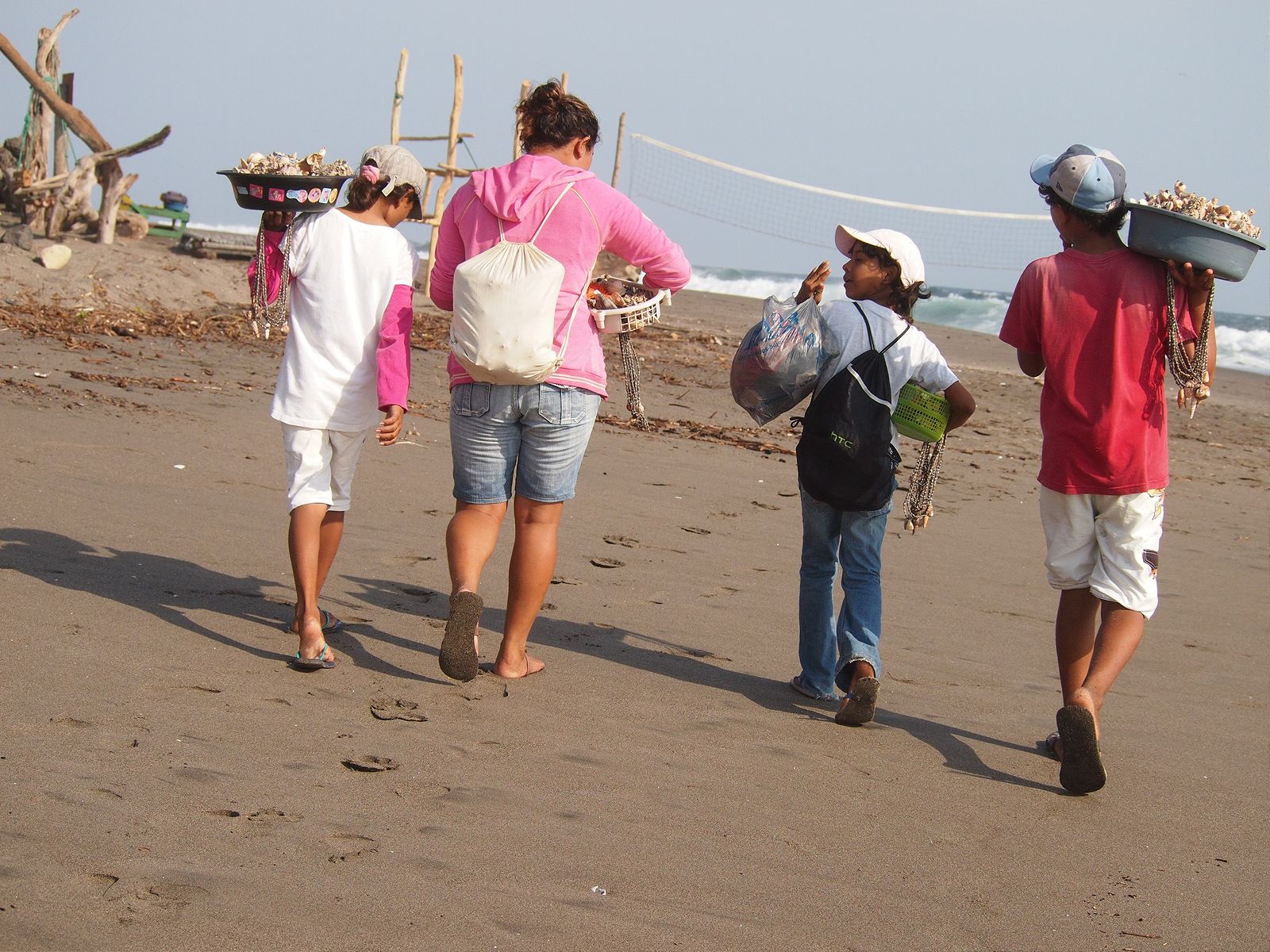
I always liked this pic I took of 4 kids who used to sell us their families handmade products on the beach in Nicaragua. It was a grab shot of them heading on to the next restaurant and included clutter on the beach that I preferred not include. As much because of posts growing out of their heads and bodies.

Now that I am working exclusively in Exposure for my content management, and can easy drop into Affinity Photo and Denoise AI —- I came across the pic again while cleaning up hard drives today, and used Photo Inpainting brush to remove the wood posts as well as the volleyball net, removed noise and sharpened in Denoise, and applied a couple of presets in Exposure X6 for this final processed image:
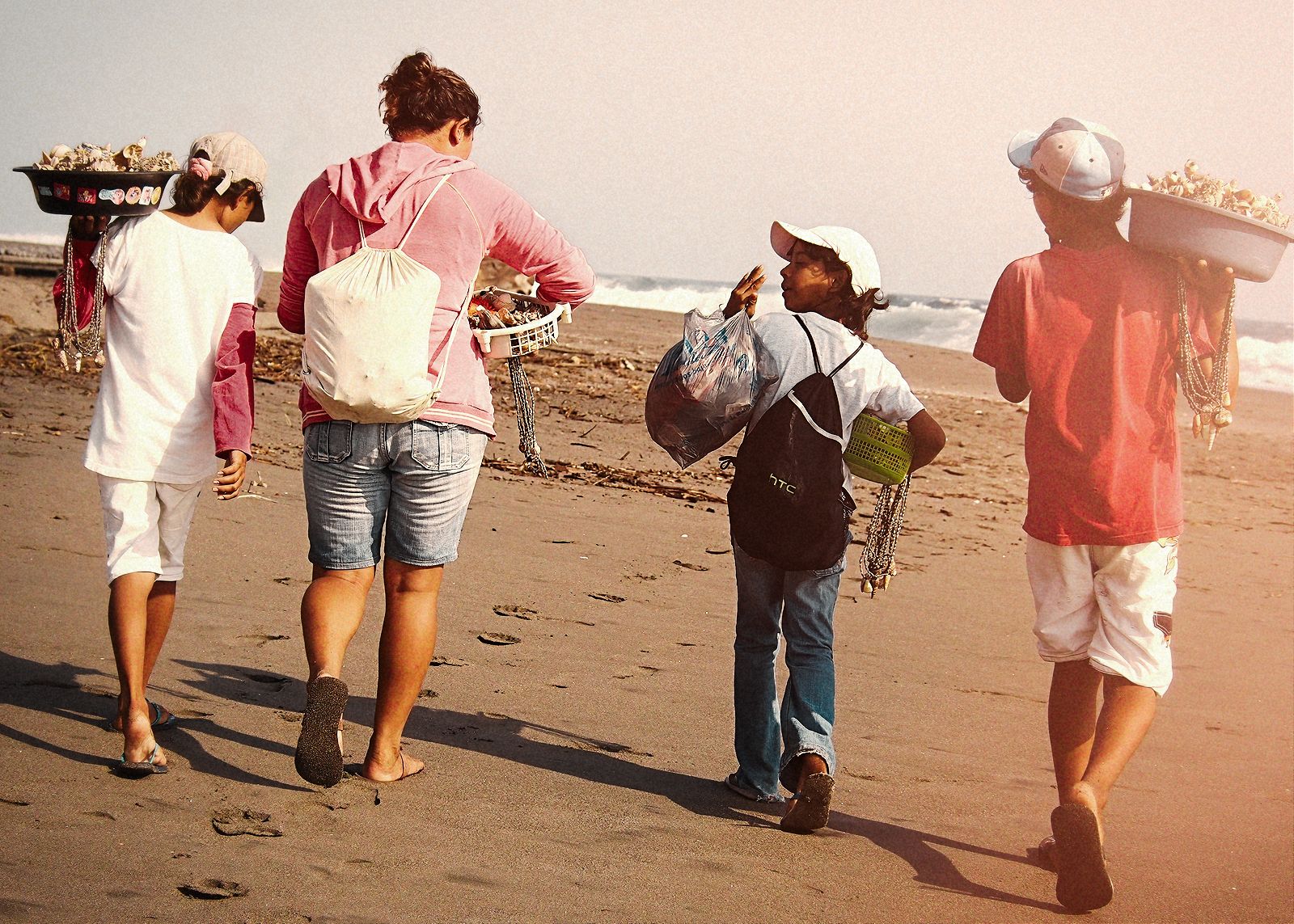

7072B57D-27FB-4A4B-AD25-B49CB397CE76.jpeg


Here is the original straight from camera
A1E579F3-47B5-4267-83A4-68448BB51D42.jpeg
 

Asher Kelman

OPF Owner/Editor-in-Chief
Robert,

I rarely disagree with you in all the years we have shared pictures

I must say, on this one rare occurrence, I differ.

I find your original to be beyond perfect. It works giving atmosphere!

That bold white line of a net is a major compositional element of value. To me it’s essential to keep! I would never have thought of this casually as your instincts are standard professional photography teaching. But in this rare particular picture I argue that it’s a unique and so valuable strongly contributing structural feature!

Yes, the sand is a far better color.

Yet all those diverse rods and nets you so expertly removed provide “depth planes“, are zero distraction and give environmental context, that does increase the value of the picture.

Also in the original we are blessed with a God-given blue sky for “heaven on earth”!

Moreover, clothes in your original are rich and well saturated. Pallor might. Refine is you were abstracting the picture as I have done myself here.

I would, in my dissenting opinion, only correct the sand if anything!

Asher
 

Asher Kelman

OPF Owner/Editor-in-Chief
At last I feel I have something to offer other than awe!

Something tells me that your instinct in original framing is so advanced and intuitive that the potential further advantages of modern editing risks invoking a mistaken quest for “perfection” at the expense of what is already inviting, sublime, rich and comfortable!

It’s an American pitfall of induces vanity by marketers, like repeated plastic surgery for women trained to stare in the mirror as opposed to just enjoying thr gifts from God!

Asher
 

Robert Watcher

Well-known member
Thanks Asher. I appreciate your thoughts. The fact is that I never felt it was a bad photograph as is. It’s just not what I want out of the image. I am definitely not a perfectionist. Not looking for something more. Just something different that appeals to my visual sense at that moment. Photography is my art, not my reality LOL. Thanks for the compliment on my skills.
 

Robert Watcher

Well-known member
You did a good job on postproduction, respect!
But don’t show the two of them together. Each of them stands for itself.

thank you

I seldom do show my originals out of camera as they are the start of my process only. I posted both for educational purposes for any who might benefit. Sometimes it’s fun to see the process.
 

Peter Dexter

Well-known member
Very well done editing and were it mine I would have been equally inspired to carry out at least some it. But what happened to the boy on the right? He looks faded as though there were some sort of sun flare over that side of the image and the woman's pink shirt isn' so pink. Some people fuss about a level horizon line but as you say it was a grab shot and has that feel about it...in a good way. And it is interesting to see the process. From the sand I'm guessing this is the Pacific coast?
 

Asher Kelman

OPF Owner/Editor-in-Chief
Robert,

I see the light!

I now realize that you created something entirely new. Yes, the raw material came from a picture I wouldn’t have imagined to alter this bonded bunch “Approaching the Net by the Waves!”

27E941C8-5C47-47DF-A6B4-592459CC91BF.jpeg

I love its original feel and composition with all its complexity. It is what it was: a wonderful excursion to the magic of that beach. Are they there to sell what they carry? Perhaps!

.....But that was then!

You however, over all this gap in time (in your “Cathedral of the Mind”), saw another vision.

That is the lesson here!


You created a novel work with such a crop (and further removal of numerous items that needed our attention), to present a fraction of the content of things originally there. Even the sky is less important.

6613FD62-F94D-4D4E-ADA8-BAB02BFA541D.jpeg


With this craft, you, present “Bonding of Companions on a Free Day” I love this too, now that I see it independently. This is “Tarsus moment”, for me!

Thanks for sharing your process of creation.

Asher
 

Robert Watcher

Well-known member
child in the center is so much more important the bonding intrigues us.

That was definitely my focus in processing, but also when I took the shot. I am about interactions and layers and intersections if possible.

Peter. I added the fade and lens flare. In most of my Central America work, I introduce an off colour, desaturated, textured and grungy look when I can. That is my preferred style. While I consider myself a storyteller with my camera, I try not to be a documentary photographer.

Nice to hear everyone’s thoughts.
 
Top