• Please use real names.

    Greetings to all who have registered to OPF and those guests taking a look around. Please use real names. Registrations with fictitious names will not be processed. REAL NAMES ONLY will be processed

    Firstname Lastname

    Register

    We are a courteous and supportive community. No need to hide behind an alia. If you have a genuine need for privacy/secrecy then let me know!
  • Welcome to the new site. Here's a thread about the update where you can post your feedback, ask questions or spot those nasty bugs!

Cem and Mike's Print Swap

Mike Shimwell

New member
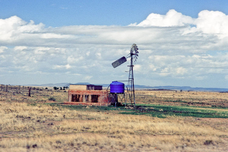
A few weeks ago Cem and I organised our first print swap. I spite of the post out of the UK taking longer than prmosed Cem has now received my print and I have received his. Hopefully Asher will have received mine as well.

We arranged to send each other a print and to each send a copy to Asher for the OPF archives. Hopefully in a few weeks we can organise another and a few more people will feel able to join in. Meanwhile, I will post my image beloe, together with the information I passed to Cem and I hope that he will then post his in the thread with some background and we can discuss the images, with additional comment on the prints themselves from those of us who have seen them.

For this round we both chose to send prints of old images from slides we had shot in the past!!

Please feel free to comment on the images as well as the process, bearing in mind that we are trying to share our work on paper in addition to the screen jpegs.

Mike
 

Mike Shimwell

New member
Borehole, Orange Free State, South Africa

3219903700_f47e4a3b9f_o.jpg


I visited South Africa in 1995 as part of a 7 month 'walkabout' in the southern and eastern parts of this wonderful, albeit challenged, continent.

A week after leaving my job I flew to Johannesburg, landing at 5.30 in the evening, and the following day was driven to Settlers by some friends. That afternoon I was taken hunting for Impala and in the evening shared a Braai (barbecue). Later on I sat alone on the porch, warmed by the embers of the fire, gazing into the clear night sky. Across the garden was the farm's wind pumped borehole with the moon behind.

From that time, these boreholes came to represent something of the very essence of South Africa to me. The structures are universally utilitarian, but perfectly suited to their purpose. In this difficult terrain there is no sense of decoration, but simply a need to get the job done. Somehow this sense was also reflected in many of the people I met, who were often fiercely independent and self reliant, yet with welcoming hearts and great generosity. I met people who after a matter of a few weeks I wept to leave, and who in some sense were shaped by the land where the boreholes stand.


Technical

Shot with a Canon AE-1 and 50 1.8 lens on Kodachrome 64. Scanned on a Nikon 5000 with some colour correction and limited opening of shadows.

Subsequently imported into Lightroom 2 and spotted, lightened, a little clarity and heavily masked sharpening (40,0.8,40,93) and colour noise reduction (14).

Printed on Ilford Gold Fibre Silk on an HP Z3100 at 1200dpi using a machine generated profile.
 

Asher Kelman

OPF Owner/Editor-in-Chief
Borehole, Orange Free State, South Africa

3219903700_f47e4a3b9f_o.jpg


From that time, these boreholes came to represent something of the very essence of South Africa to me. The structures are universally utilitarian, but perfectly suited to their purpose. In this difficult terrain there is no sense of decoration, but simply a need to get the job done. Somehow this sense was also reflected in many of the people I met, who were often fiercely independent and self reliant, yet with welcoming hearts and great generosity. I met people who after a matter of a few weeks I wept to leave, and who in some sense were shaped by the land where the boreholes stand.
Mike,

I just received my copy of your print so carefully packed between two sheets of foam core, set back in a card recess. Neat and functional. Well, I had no idea what was coming, another rendition of an iconic US National Park scene, a portrait, street photography of a butterfly. For sure I had no expectation of a scene on flatlands with a pumping station that would fly by as one drives in these parts towards Jo'burg and Krueger National Park to see the animals from the safety of a Landrover.

While the jpg image on here is good it is not as dimensional as the actual print which has stronger form. The windmill tower looks as if it may stand still as the clouds behind would move behind it fast as we pass in the car. The effect, because of parallax is what is so impressive about tall chimney stack, buildings and isolated trees in the mid distance as they are anchored and appear to wait in the spot as the world behind them moves. Well looking at the print, this realism is there. The smooth elongated cloud stretching across the image above is about to whizz by and arch behind and around the tower and vanish behind us.

I wonder if this is taken from a car window or what the diagonal lines might be in the lower edge, maybe reflections or perhaps out of focus wire of a fence. Given the slight angle of the print, I'd imagine we're in a car moving.

This sense of movement and the pump station remaining still, is exactly as one feels. One goes past them. They are not 400 year old trees taken at sunset, birds in the branches, a lion and cubs sleeping underneath. This is a structure one drives past. I really value the sight that caught this and saw it as relevant, for it is. This is the link between the settlers and the land.

The print looks fine as if it came from a studio and is professionally presented on a sheet 9.5"x13". The image, itself is 7"x10.5" has a generous lower white border for the title, "Borehole, Free State", signed in ink, Mike Shimwell.

At very close inspection, the paper seems low gloss perhaps sprayed with a protective coat. So there is a low intensity gloss which does not detract from the more pastoral country look of softer colors that one might see in water color work.

I found that the picture become real and one ignores that it was printed, at a distance of 12". Of course it's unframed as yet.

So congrats on the first print exchange. I like the idea that I get a copy too. Thanks!

Asher
 

Ken Tanaka

pro member
I appreciate your interesting personal back-story, Mike. But this image just isn't doing a thing for me.

It does not quite convey the "universally utilitarian"nature you claim to be seminal to their significance. Your camera position is either too close or too far away. The shack is darn near bulls-eye center (although just off enough to be bothersome), It's not either high or low enough in the frame to convey middle-of-nowhere well. (I'm not even sure it's level.) The apparent midday light really bleaches the scene's character and the unfocused foreground occupying a quarter of the frame is also a distraction. It just looks like you pointed and shot as if you were hunting game.

I'm sure it's a powerful recollection trigger for you, Mike. But it's hard to imagine that this looks more compelling on paper.
 

Asher Kelman

OPF Owner/Editor-in-Chief
Answer to Ken on the Glimpse of structures we pass by.

I appreciate your interesting personal back-story, Mike. But this image just isn't doing a thing for me.

It does not quite convey the "universally utilitarian"nature you claim to be seminal to their significance. Your camera position is either too close or too far away. The shack is darn near bulls-eye center (although just off enough to be bothersome), It's not either high or low enough in the frame to convey middle-of-nowhere well. (I'm not even sure it's level.) The apparent midday light really bleaches the scene's character and the unfocused foreground occupying a quarter of the frame is also a distraction. It just looks like you pointed and shot as if you were hunting game.

I'm sure it's a powerful recollection trigger for you, Mike. But it's hard to imagine that this looks more compelling on paper.
Hi Ken,

This was not chosen to be archetypical of what would be in a print exchange. It's merely at this stage just a print swop and only of film slides taken many years back. no one vetted these images. There's no
selection criteria. somehow I would have expected a Joshua Tree image of something from Big Sur that would be printed in B&W. However, this is not that, not yet at least.

So again, back to this print. Agreed, it does not look "compelling" on paper. However, to me, at least, having driven past these things many times without stopping, I saw and thought differently. I know that I, (to the abuse of my driving companions), would then try to do a U-turn, stop and take more pictures. In the end, either one has to drive alone or be satisfied with these "glimpses". If this were titled "Glimpse of a Windpump Borehole from Speeding Car" then would it still disappoint you as much. How impressive could it then be? Such holes represent the connection between the self-sufficient farming communities and their survival. So for me, being this prepared and pre-qualified, I got more out of it than you did.

Ideally I'd stop look at the light, make sure the shadows of the windmill were visible by taking out my ladder and then taking the picture before the sun set.

Asher

In starting this, we are just working out what the criteria and mechanics might be for the official OPF print exchange we are setting up. Write you opinions of how best we approach this in the new sister thread for that purpose, here.
 
Last edited:

Cem_Usakligil

Well-known member
Hi Mike, All,

Sorry for being a bit late but I have been away for more than a day. I'll write about my personal reasons as to why I have gone into this process of exchanging prints with Mike in this thread a bit later.

But first, here is the picture I have sent to Mike.
women_knit_2.jpg


As some of you will recognize, I have shown this picture earlier in this thread where we have discussed the details about it so there is not much need for me to repeat it here. The print was done on Innova FibaPrint White Gloss Baryta paper with my Epson 3800 printer. The paper was an A4, the print itself was 25 cm wide, leaving a 2cm white frame around the picture.
You may ask; why reuse the same print again? Well, the answer to this is tied into my personal motivation. You see, Mike and I have been pondering about the difference it makes evaluating an actual print which you hold in your hands versus the electronic ones we see daily on our monitors. We deliver C&C all the time on picture which we shall never see in actual print. I am pretty certain that the experience will be somewhat difference when you can hold the print in your hands, feel it, smell it, see it. So when Mike has expressed similar thoughts in a thread (I've forgotten where and when), the idea was borne to exchange some prints and see how it goes from there.

So this whole print exchange thing is in an experimental stage for me and I did not yet make up my mind whether I’ll continue it or not. But I feel I must come up to the defense of Mike in this since he has received some criticism regarding his picture. You see, I understand fully when somebody does not like a certain picture for whatever the reason, there are no obligations after all. But please consider the fact that we are looking at somewhat older pictures over here, mine is some 20 years old. It would be a bad thing if one did not improve one’s skills in such a long time. The pictures I take nowadays are better due to the personal development process I have gone through and also thanks to the better equipment at my disposal. The same thing applies equally to Mike. So what I am trying to say is that, knowing what we know today, I am certain that Mike would have tried to improve on that picture of his if he was there today re shooting as Asher suggested. Or maybe not, since he might feel that the picture is just as good as it is right now. But this is a window into our pasts, we cannot change it any longer.

To make a long story short, I want to finish by stating that my first impression of Mike picture was very positive (and it still is). I am used to scrutinizing and criticizing pictures but none of the constructive criticism given by Asher nor Ken has come to my mind immediately. I came to like the picture just as it is. And that in itself is the proof of the assumption I've made when I embarked upon this experiment. Holding a physical print in your hands leads to stronger/different emotions than looking at it analytically on a monitor.


Cheers,
 
Last edited:

Mike Shimwell

New member
Thanks for all your comments.

Asher, I am pleased that you enjoyed receiving the print and thank you for your comments. Knowing that you have travelled in south Africa I did wonder whether this would impact on your reactions to the image. As you say, the boreholes are the connection between the farmer and survival. Like you, I have experience the tension between getting the picture and stopping the car much to the irritation of my companions! The diagonal lines are indeed the wires of a fence running down accross the frame.

Ken, I do appreciate your comments, and some of the irritations were things I considered changing when preparing the print, but decided to leave on this occasion. I was also concerned that the image works for me, but may not work for others for all the reasons you state - one of my memories of southern Africa is the intensity of the midday sun - the land is often very parched, except for the green around the water holes.

Cem, Thank you for your kind comment. As you say, we have wondered about the difference between viewing on screen and holding the actual print and this exchange has been well worthwhile from that point of view as well the pleasure of sharing things that we value.

Finally on my picture, I was quite surprised seeing the screen versoin at how much it seems to me to be poorer than the print. Much of this lies in the way the brick wall by the pump is drawn in the screen version I think, as well as a slight lightening and loss of weight throughout.

Regards

Mike
 

Mike Shimwell

New member
On Cem's print

Again, i am struck by the increased solidity of the wall behind the ladies in the print version. The print gives me a real sense of an ancient way of life in a modern age - the plastic bag giving at least some time information.

Cem has clearly worked well to match the print to the original file as the colours very closely match those on my (calibrated) screen, witht he exception that the blue of the right l;aides shirt is less intense on the print. This may be due to the difference in coulour temperature between the viewing light and the screen, but actually suits the image in my view.

Cem, thanks again for taking part in this - I've enjoyed it and hope that we will do another at some point.

Incidentally, as you say equipment has sertainly improved - I printed an 18 by 12 5D print from Norway tonight for our living room and the crisp detail is stunning:)

Mike
 
Finally on my picture, I was quite surprised seeing the screen versoin at how much it seems to me to be poorer than the print.

Hi Mike,

Interesting. This apparently raises the question (for a techie like me, although not obsessive (I just like to be in control), anyway), WHY! This is interesting territory, hovering between physics and psychology. Rest assured, I also like the art part of photograpy (which is what pulled me in), although I also try to reason the what and why ... (call it the holistic approach if you like).

It also allows to ask questions like; what differences in postprocessing are needed to match (or exceed, if a medium allows) the impact of an image on different output media? There are answers, but they may not be easily converted to a general public.

BTW, I also like how OPF facilitates the getting acquainted, even gaining friendships (and I don't use that term lightly), between kindred spirits ... Asher, thanks for the platform!

Bart
 

Mike Shimwell

New member
Hi Bart

I think in this case the image doesn't benefit from the inceased contrast and backlighting that a screen can give - brighter and more immediately impactful possibly - but it does lose a lot when the detail in the wall is lost to the downres. I could probably have improved it by downressing more carefully and sharpening a bit in fairness, but the loss of tecture and sense of solidity is still there.

On the other hand I played with print sizes for this, and find that it works best as a smaller print. I think that 12 by 8 is too big. This reflects Ken's comments about the foreground I think.

I scanned and spotted a couple more since, so might put them in another thread in a day or so.

regards

Mike
 

Asher Kelman

OPF Owner/Editor-in-Chief

women_knit_2.jpg


Photo Cem Usakligil


Cem,

At long last the snail got a final spurt of energy and delivered your print today! Thanks! It seems more "correct" to my eye that the jpg shown on the screen but I'll need to compare it with the Eizo profiled monitor as the 17" Macbook Pro can be shifted. In any case, I have learned the hard way that the angle and screen itself is not up to that of the Eizo or even the iMac screen.

The print is made on a low gloss white paper that itself as a very slight amber tinge to it. The print is more golden now and so the rocks seem more natural.

I'll put it on the wall and then look at it more!

O.K. with light falling on it and not transmitted through it the women are less separated from the wall! That surprised me but shows how important it might be to judge images as prints. Part of this effect might be the more golden hues shared by the women's faces and the wall. So there's a great value in looking at prints like this.

I like the print and it's going to get framed and be above my desk with Mike's picture of the wind driven pumps in South Africa. Both are meaningful to me as I have visited both places and seen such scenes.

Thanks for including me!

Asher
 

Cem_Usakligil

Well-known member
..At long last the snail got a final spurt of energy and delivered your print today!
Finally! It took them only 1.5 months to deliver it, unbeliavable. I had given up on that already ;-).

The paper is Innova FibaPrint (Baryta) White Gloss paper, BTW.

Let me know what you think of it later. Thanks.

Cheers,
 
Top