
Asher Kelman
OPF Owner/Editor-in-Chief
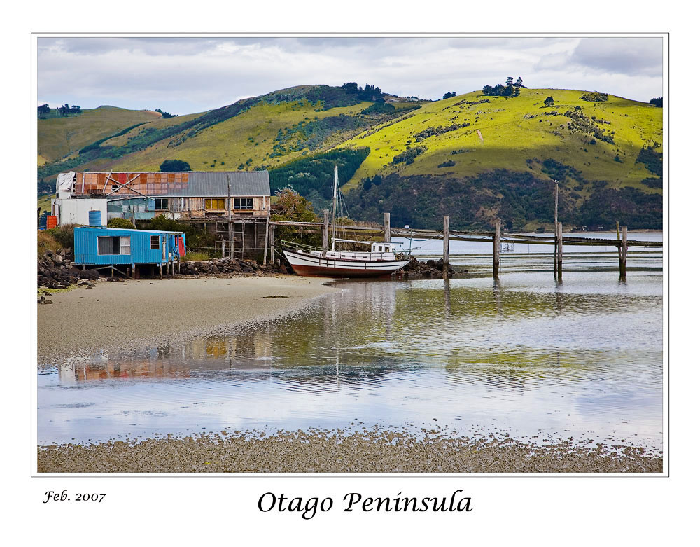
Why some landscape images give trouble: An analysis of "Otaga Penninsula".
Hi Nathaniel,
You raised a very important question as to why a scene that's so compelling to look at can leave one questioning when one looks at the resulting picture.
I have not looked to see whether you sell such pictures or whether you are an accomplished wedding photographer or actually design cameras. All I know is that I and many others have done the same thing! So it was very much worth my while working on this problem as if it were my image. To do so, I wanted to get your O.K., which you kindly provided. So now here we are!
My first approach when I looked at this was to imagine that in your picture there where a number of different separate compositions that you had seen and so it was just a matter of choosing them from the wide shot in the comfort of home. That first idea did not work. The problem was that each time I tried to get more than one image, there were unsatisfactory results except for one main image in black and white and then several derivatives of smaller crops.
In effect you were either inspired by the shapes and tones of things in shades of black gray and white or else you were taken by a composition in color. My hunch is that you did not imagine this scene in B&W. I do, so I can also show such possibilities.
Let me presenting that first picture again unaltered and then with areas marked which I'll explain.
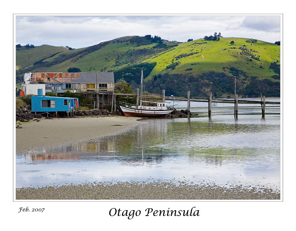
© Nathaniel Alpert 2007
Now the marked up version I have made dividing the image to three zones for our attention, A, B and C. Then there are features numbered 1 -7.
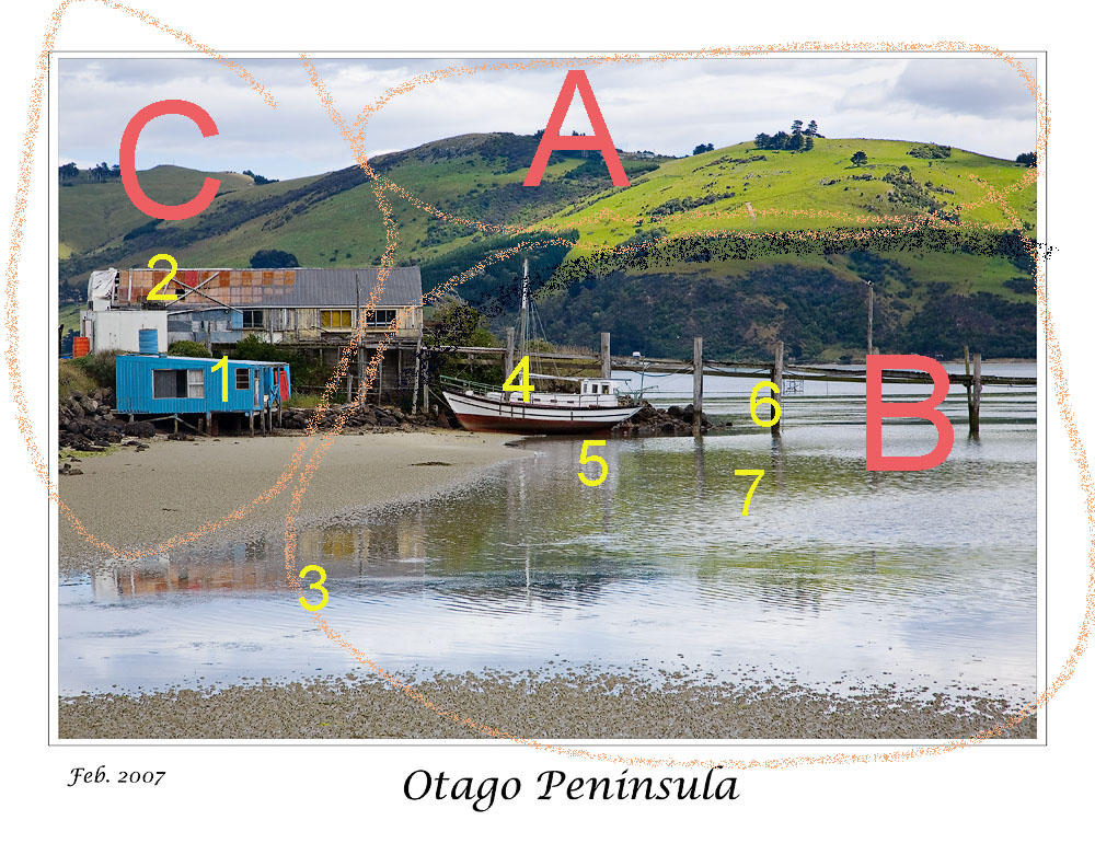
Edits by Asher Kelman 2007_03
A is the bright area of the "roof of the picture", here there's the sky and below it hillsides in the sunlight. Below that the hills are dark and appear to have rock formations and or shrubs.
B The main thrust of the image. This is where the power is likely emanating. The zone contains the docked boat, the lines of posts in the water, perhaps part of a larger dock structure in better time. This portion of the scene is likely what attracted Nathaniel's eye in the first place. So this is central to the success of the image.
C The left part of the scene. This adds some context. Without the ramshackle hut with its patched rusty roof and blue trailer, the scene might be idyllic, but these are there, so there is sense again of better times but of weathering the elements and continuing to use that boat even as nature reclaimed the materials.
So this part of the image is like a commentary on the main central focus of the picture in Zone B.
So why do things seem to not work well to have a unified picture?
The problem is that the elements separately fight for attention and the colors of the man made material are not in any harmony with the rest of the picture.
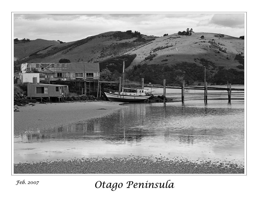
So lets come up with a solution, dismiss the color and tame the distracting clutter. So here's a B&W transformation by simply using the "Adjust", "Mode" options in Photoshop CS2 to go to Adobe Gray Scale and discarding the color information. With this we have already made the scene more harmonious and perhaps it does work better.
Edits by Asher Kelman 2007_03
However, we can do better, perhaps by not removing color information, rather assigning color information to different tones. So lets take the blue caravan trailer, for example detail # 1 and the rusty roof, detail #2, these can be assigned to lighter tones. Other hues are assigned progressively until one has a more harmonious but realistic looking scene. Adding an S curve layer in CS2 and some minimal sharpening one can achieve what to me is a more impressive picture even without cropping.
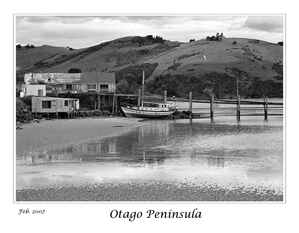
Edits by Asher Kelman 2007_03
Now what did we do? Let's do it by the numbers:
#3, #5 and #7 are important reflections that have been developed so they are clearly noticed but not overwhelming. Rather they must be there but subtle. There is now more dimensionality to the scene because the assignment of each color to tonality is made by trial and error iteratively until the image seems to have more substance and presence. Now we are doing with tonality what perhaps our mind does when we come across this scene. The brain assigns all kinds of different values to each part. We must do the same to evoke the same powerful responses when we revisit the scene.
We do not have the benefit of being able to have the picture prove it's real by it altering as we move out head. So we have to somehow embed this dimensionality and we do this by the distribution of tone. When we assign colors to tonalities we have given ourselves a huge new set of tools to regain what is lost on flat paper or a flat screen.
# 4 and 6 are the boat and posts. The latter has been enhanced to a degree. These need to be isolated and enhanced further as you will see in the next part of this discussion.
I do hope this is helpful as an approach to getting the most out of a complex shot. I feel that what was seen by Nathaniel was powerful but very challenging. While unlikely to have been imagined, I believe that the final B&W developed version is satisfying and much more interesting and would make a good print.
Now what do you think?
Asher
The next part of my discussion ideal with the core features of the image, the strongest components, but in color. Finally we'll revisit the site to retake the picture, knowing what we now know!
Hi Nathaniel,
You raised a very important question as to why a scene that's so compelling to look at can leave one questioning when one looks at the resulting picture.
I have not looked to see whether you sell such pictures or whether you are an accomplished wedding photographer or actually design cameras. All I know is that I and many others have done the same thing! So it was very much worth my while working on this problem as if it were my image. To do so, I wanted to get your O.K., which you kindly provided. So now here we are!
My first approach when I looked at this was to imagine that in your picture there where a number of different separate compositions that you had seen and so it was just a matter of choosing them from the wide shot in the comfort of home. That first idea did not work. The problem was that each time I tried to get more than one image, there were unsatisfactory results except for one main image in black and white and then several derivatives of smaller crops.
In effect you were either inspired by the shapes and tones of things in shades of black gray and white or else you were taken by a composition in color. My hunch is that you did not imagine this scene in B&W. I do, so I can also show such possibilities.
Let me presenting that first picture again unaltered and then with areas marked which I'll explain.
© Nathaniel Alpert 2007
Now the marked up version I have made dividing the image to three zones for our attention, A, B and C. Then there are features numbered 1 -7.
Edits by Asher Kelman 2007_03
A is the bright area of the "roof of the picture", here there's the sky and below it hillsides in the sunlight. Below that the hills are dark and appear to have rock formations and or shrubs.
B The main thrust of the image. This is where the power is likely emanating. The zone contains the docked boat, the lines of posts in the water, perhaps part of a larger dock structure in better time. This portion of the scene is likely what attracted Nathaniel's eye in the first place. So this is central to the success of the image.
C The left part of the scene. This adds some context. Without the ramshackle hut with its patched rusty roof and blue trailer, the scene might be idyllic, but these are there, so there is sense again of better times but of weathering the elements and continuing to use that boat even as nature reclaimed the materials.
So this part of the image is like a commentary on the main central focus of the picture in Zone B.
So why do things seem to not work well to have a unified picture?
The problem is that the elements separately fight for attention and the colors of the man made material are not in any harmony with the rest of the picture.
So lets come up with a solution, dismiss the color and tame the distracting clutter. So here's a B&W transformation by simply using the "Adjust", "Mode" options in Photoshop CS2 to go to Adobe Gray Scale and discarding the color information. With this we have already made the scene more harmonious and perhaps it does work better.
Edits by Asher Kelman 2007_03
However, we can do better, perhaps by not removing color information, rather assigning color information to different tones. So lets take the blue caravan trailer, for example detail # 1 and the rusty roof, detail #2, these can be assigned to lighter tones. Other hues are assigned progressively until one has a more harmonious but realistic looking scene. Adding an S curve layer in CS2 and some minimal sharpening one can achieve what to me is a more impressive picture even without cropping.
Edits by Asher Kelman 2007_03
Now what did we do? Let's do it by the numbers:
#3, #5 and #7 are important reflections that have been developed so they are clearly noticed but not overwhelming. Rather they must be there but subtle. There is now more dimensionality to the scene because the assignment of each color to tonality is made by trial and error iteratively until the image seems to have more substance and presence. Now we are doing with tonality what perhaps our mind does when we come across this scene. The brain assigns all kinds of different values to each part. We must do the same to evoke the same powerful responses when we revisit the scene.
We do not have the benefit of being able to have the picture prove it's real by it altering as we move out head. So we have to somehow embed this dimensionality and we do this by the distribution of tone. When we assign colors to tonalities we have given ourselves a huge new set of tools to regain what is lost on flat paper or a flat screen.
# 4 and 6 are the boat and posts. The latter has been enhanced to a degree. These need to be isolated and enhanced further as you will see in the next part of this discussion.
I do hope this is helpful as an approach to getting the most out of a complex shot. I feel that what was seen by Nathaniel was powerful but very challenging. While unlikely to have been imagined, I believe that the final B&W developed version is satisfying and much more interesting and would make a good print.
Now what do you think?
Asher
The next part of my discussion ideal with the core features of the image, the strongest components, but in color. Finally we'll revisit the site to retake the picture, knowing what we now know!
Last edited:


") .
.

