Jessica Eldredge
pro member
I haven't looked at these in B&W yet at all. I'll have to go back to those images and see what I can come up with. Thanks for the suggestion.
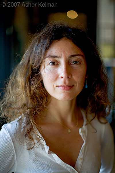
I hope you enjoy her portrait as I do!
Very nice! The frontal 'pose' immediately connects, and make the viewer wonder what her thoughts are.
The only distracting element is the highlight above her head, I'd clone it out (or tone down and blur).
Focus and DOF seem close to perfect (maybe slightly front focused), although tricky to judge at this size.
Which aperture did you use?
Bart
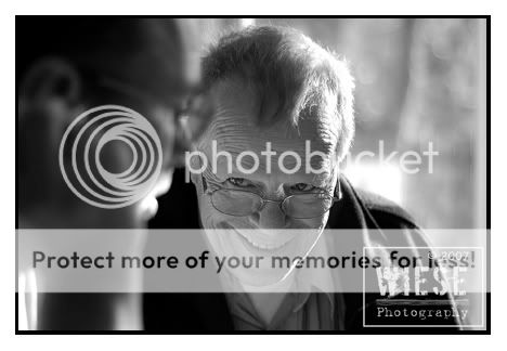
This is an image of my dad while we were playing some sort of dice game. He was talking to my husband (the blur) when I snaped this real quick.
I've been back to look at her a dozen times and am sure I will visit her again. Intriguing.
What a warm picture, Arya! You have captures the very generous smile that is not just internal but transmissive. This is a special empathetic human moment. In it there is quiet joy and bonding. I like the angle of his head and pearing over his spectacles, showing that to plat the game he had to put them forward to focus. So this says he is looking up from something he was closely following. Again a prefect detail.
I like the tonality. Here, IMHO, color likely adds nothing. However, I say that not to be contraversial, but the picture is so integrated and full of meaning just with the spread of tonalities in gray scale.
How did you do the conversion?
Asher
Hi Eric,
I'm so pleased you added your work to this collection! The first picture is archtypical of pride in achievement. Children first do that when realizing that they have formed somerthing special in the toilet and at the same time exerted independance and then said good by as it flushes away. Here there is a certain triviality in showing the plate, Look I finished the sorbet (??) ans see there's an interesting pattern to show you, at the same time realizing that it must be discarded. Still, there is some glow of pride at the same time questioning that you really believe it's worth photographing.
If not for the color in the plate, I'd wonder perhaps if it might be better in B&W since his red scalp is distracting. I postulate the color can distract from global ideas. Also, I'd consider increasing hte saturation and or contrast of the streaks on the plate. Still, unchanged the picture is impressive and transmits its message if what I have said has any bearing whatsoever on the truth!
The second image is, of course so different yet it still is actively reaching out to you, the photographer. Is that light from a window on his hair plus a box high on camera left? looks like he's a friend of yours as so comfortable with you. You have detailed his hair well. The face is well drawn except that there is a lot of detail in this rich image that is not optimally shown, IMHO. A very slight drop in an S curve will make the blacks richer and bring out detail in the face. However this adjustment, although important, to my view, is very minor. Still, there's optimizing for viewing it and it's another matter getting the print. Still, I'd think that the dynamic range of the image could be compressed a little.
Thanks, Eric for two interesting pictures!
Asher
Hi Asher,
I used a gradiant layer, adjusting it to the depth that I wanted then used the brig
Hi Arya,
Even CS 1.0 is still perfectly competant for anyone who is learning to process their photography. Now I would suggest you try to avoid jumping to brightness and contrast. Using levels is much more controlable. Then you can select the areas you want to change. Save each selection and label "top of head", "glasses" and so forth. Then each part can be modified accordingly and it' percent contribution can be fine tuned as you will have linked each adjustment layer to just one part of the image. Make sure that each selection is feathered.
In any case, what you did worked very well and I didn't notice any changes you made!! The picture works perfectly!
Asher
Asher,
I also find your analogy of the first picture a bit hilarious and also a bit off putting. If that were you in the picture would you really want people making a reference to toilet training? If I were a moderator here at OPF, I'd have to ban you for that.btw- that picture was hung in the Hotel Des Arts here in San Francisco as part of an exhibition called SF Faces. The color is accurate - if you see too much red check your monitor profile.
The second image is, of course so different yet it still is actively reaching out to you, the photographer. Is that light from a window on his hair plus a box high on camera left? looks like he's a friend of yours as so comfortable with you. You have detailed his hair well. The face is well drawn except that there is a lot of detail in this rich image that is not optimally shown, IMHO. A very slight drop in an S curve will make the blacks richer and bring out detail in the face. (underlined and emphasized in quoting). However this adjustment, although important, to my view, is very minor. Still, there's optimizing for viewing it and it's another matter getting the print. Still, I'd think that the dynamic range of the image could be compressed a little.
Thanks, Eric for two interesting pictures!
Asher
Asher,
The second picture shows well at larger resolutions and prints well - probably a bit too sharp in the web version. I converted to the toned image because I think it shows better - at iso 3200 there is a bit of noise, and I don't like to take it out with the noise removal tools because I don't like the plastic look that heavily processed images get when handled that way. The canon 135mm is one of their better lenses - very sharp at or near maximum aperture. No offense, but I'll skip your suggestion for curves - I have adjusted it to my preference already. Just FYI when you use an S curve you are increasing image contrast, not affecting dynamic range.
Hi Eric,
Now back to portraits. The man with the plate is one of my favorites!
Asher
Well just one more comment on the adjustments - I am thinking that I must be misunderstanding what you are suggesting because what I think you are saying will make a big white spot that separates itself from the rest of the image on a print. Better start a new thread and put up some screen grabs of your curves adjustments or something. I guess you could also save your curves adj and make it available. I'd rather you don't use my image as the guinea pig though.




I love the idea that one can use the apparent defects of the lens to be expressive! Today's obsession with even illumination and no distortion at the periphery robs us of the creative use of the countless lenses each with their own character.Thanks Asher and Nicolas. The lens used was an ancient Bausch & Lomb 24" (yes, 610mm) magic lantern projector lens. It is a petzval and since it was for a projector it has no place for aperture control. Petzvals of course are sharp in the center and then transition very quickly to rather lovely bokeh. With the bellows extension I estimated about f14. With this type lens you find your one sharp spot and let the chips fall where they may so to speak. I recall using the black lens on the camera as that point. Film was HP5 so exposure was only 1/4 second done with a black card in front of the lens. I scanned the neg at 360 so a fairly tight crop is still small enough to post OK
I've been going through a dry spell. My work has taken me to the desert in Tunisia, so no kids to shoot there. Am back on break in Venezuela, and found these at a roadside barbecue joint yesterday.
Click on the image to view this beautiful image larger![/URL][/IMG]
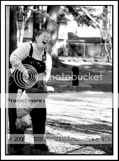
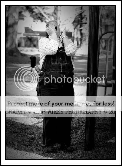
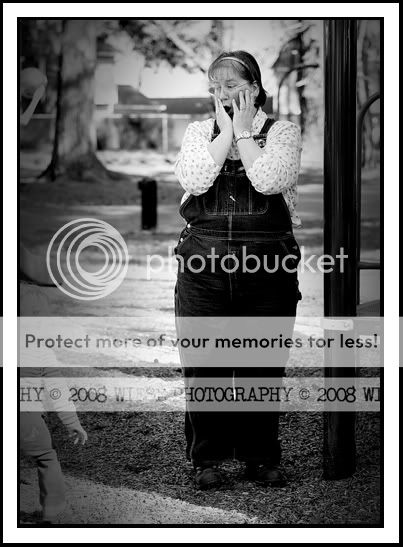
.......... my mom and my daughter during our last outting to the park. She loves to make the kids smile and laugh..

This Style, Arya, not only will be treasured by your family, but also tells of the richness of close family ties. Most "snap shots" in family shoe boxes or albums have memories. Yours are funny too and mean a lot to the rest of us, grandparents especially!
Asher
