Rachel Foster
New member
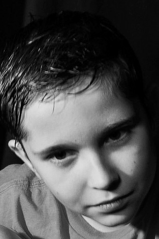
I've been trying to create portraits that focus entirely on the subject. Criticism is welcome.


")
I think you are right. The last two do look more like a snapshot but I haven't been able to identify why.
My comments refer to the first image - the best on the page - whatever my 'best' may mean.I've been trying to create portraits that focus entirely on the subject. Criticism is welcome.


I went to the park to shoot this afternoon and provided a feast for a nation of mosquitos. I have six bites on my face alone.


