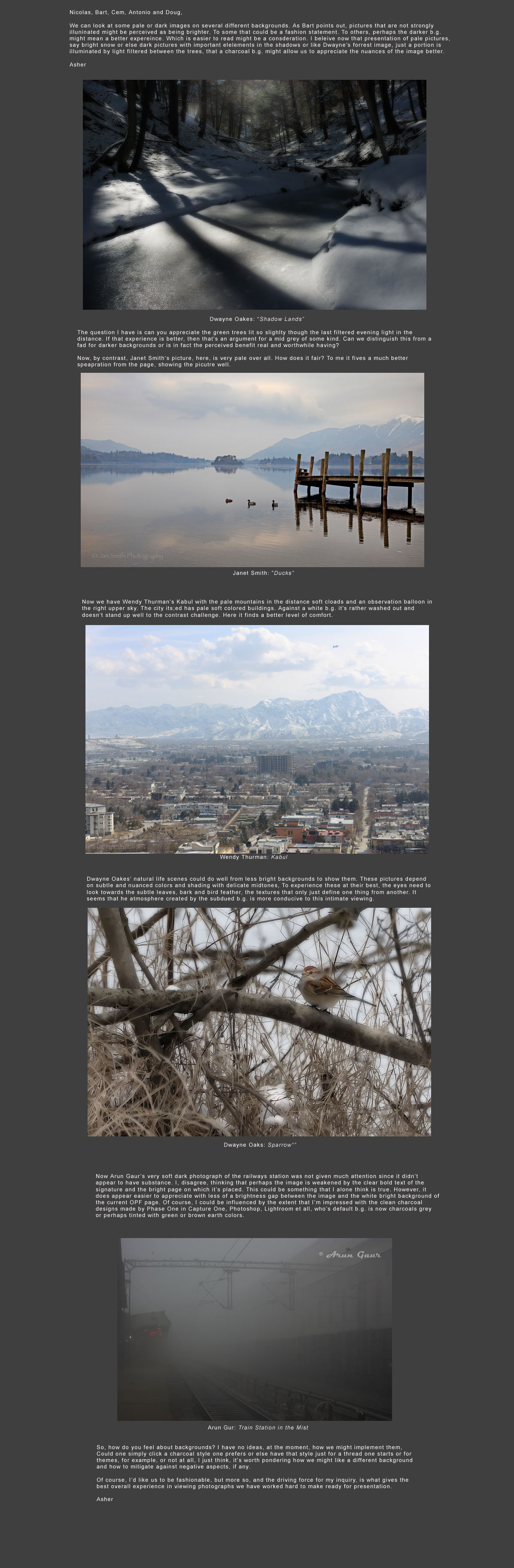
• Please use real names.

    Greetings to all who have registered to OPF and those guests taking a look around. Please use real names. Registrations with fictitious names will not be processed. REAL NAMES ONLY will be processed

    Firstname Lastname

    Register

    We are a courteous and supportive community. No need to hide behind an alia. If you have a genuine need for privacy/secrecy then let me know!
  • Welcome to the new site. Here's a thread about the update where you can post your feedback, ask questions or spot those nasty bugs!

Looking Beyond background

Asher Kelman

OPF Owner/Editor-in-Chief
I am realizing that we should make ourselves aware of the ways n which our great concept can be best presented, either on paper or on the web. We have discussed choice of the background on which a picture is placed. We did that as part of the "business" and feedback we can have in an open forum. Now let's separate that narrow purpose and look at a multitude of factors. So, yes, the first post I have cloned here does refer to background as that's an obvious factor. So we start with that. Still, there's much more as we shall see in the posts that follow.

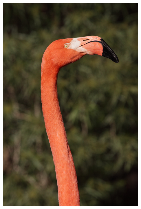
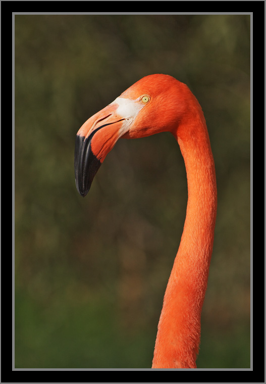
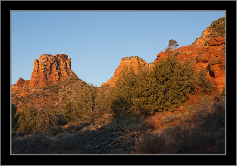
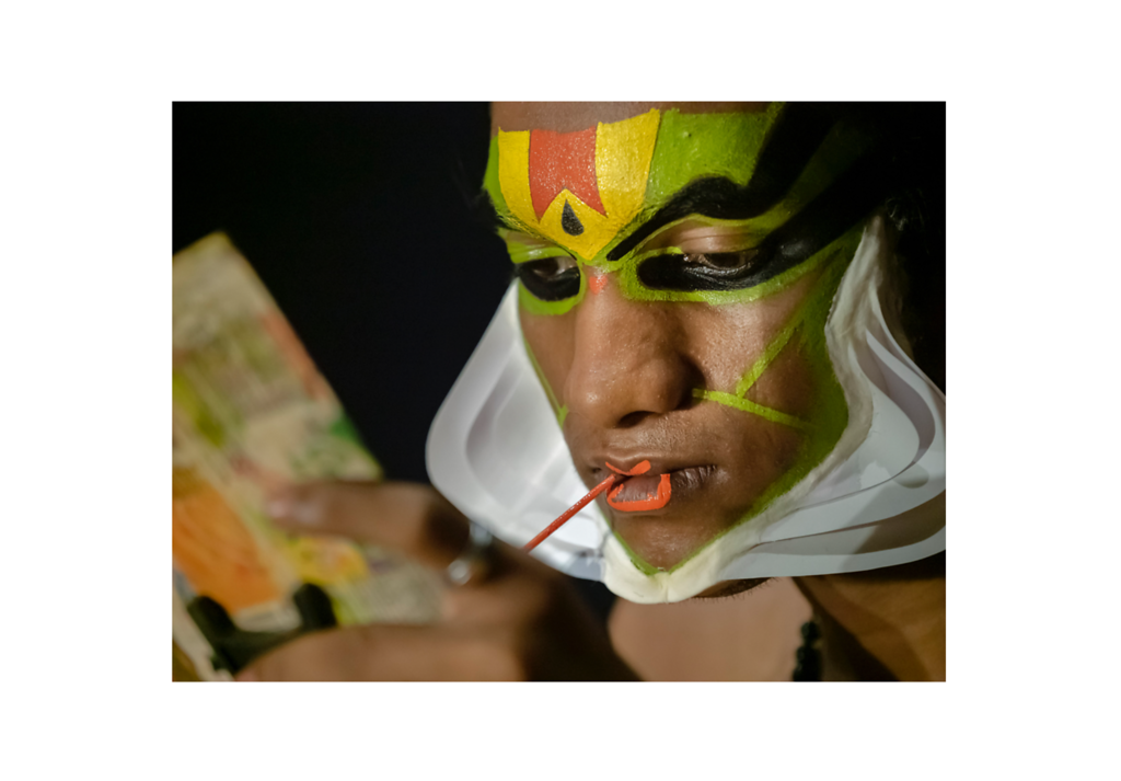
So, please post great examples where the picture carries it's own mechanism for presenting the concept of the photographer. Use any method as long as it clearly helps the subject get good attention in our busy worlds. We need examples of great Bokeh, vignetting and any other stratagems that allow a picture to survive our distractions.Asher


Compositeforgraybg.jpg
 
Last edited:

Asher Kelman

OPF Owner/Editor-in-Chief
Soft focus as a maker of a "containing world" to hold the main subject of interest!

Now that we have started to look at the milieux/matte that might influence a photograph, let's venture beyond that one important parameter.

We can learn something more from Cem's recent picture of a squirrel, here. This is a powerful demonstration of the function of some effects we have come to like in photography.


e10459.jpg


Cem Usakligil: Squirrel


I can see that the head, being surrounded by the gradient of soft focus, would look great with so many different backgrounds. So it could be that part of the inherent charm of "bokeh" and soft focus is that both define a special environment to showcase the key subject. Vignetting might be then added to this list of effects that will protect the picture from severe jumps in contrast.
 

Asher Kelman

OPF Owner/Editor-in-Chief
Here's another picture using two of the same techniques Cem employed with "Squirrel"


DaveS.jpg


Jim Galli: Dave S, in memorium


The diagonal increases the power of Jim's dear friend, Dave, coming into focus. The very special lens is designed to do just that. Ever so gently offer to us the most important part of the picture without any post processing in the darkroom. This level of soft focus is remarkable and is the legacy of great lens makers. The effect is so delicate that one has to actually look for it to realize it's being used.

So, once again, the photographer has used techniques that ensure that the concept they are building is presented in such a way as the photograph carries it's own oxygen for the picture, no matter where it s placed. That's not to say we should disrespect the picture, but it does show how much authority can be built into a picture by technique.

Asher
 

Asher Kelman

OPF Owner/Editor-in-Chief
Please post examples where the picture carries it's own mechanism for presenting the concept of the photographer. Use any method as long as it clearly helps the subject get good attention in our busy worlds. We need examples of great Bokeh, vignetting and any other stratagems that allow a picture to survive our distractions.

Asher
 

Ruben Alfu

New member
Hi Asher, I think these two photos work in the way you are looking for. Strong lines and contrast, selective focus, vigneting, all these elements are working together to put the main subject in the limelight.


20100216-IMG_9929.jpg


Ruben Alfu : Chicken on the fence


20091105-_MG_9101.jpg


Ruben Alfu : untitled​
 

Wendy Thurman

New member
This is an interesting subject. I've been assembling a website with RapidWeaver and it's rudimentary at this time- the backgrounds don't compliment the images very well. I haven't put a lot of time (or photographs) into the effort; it certainly needs some work. Suggestions welcomed!

http://wendythurman.com

Wendy
 

Asher Kelman

OPF Owner/Editor-in-Chief
Hi Asher, I think these two photos work in the way you are looking for. Strong lines and contrast, selective focus, vigneting, all these elements are working together to put the main subject in the limelight.


20100216-IMG_9929.jpg


Ruben Alfu : Chicken on the fence


20091105-_MG_9101.jpg


Ruben Alfu : untitled​

Ye, Ruben,

These are indeed the sort of thing we need to think of to make our yes go to the items in the picture in a certain sequence or level of interest and attraction.

So with these, what background might be best?

Did you look at Wendy's site? That might be helpful in dealing with presentation, both internal to the picture and how it fits in with the place it is shown to the public.

Asher
 

Asher Kelman

OPF Owner/Editor-in-Chief
This is an interesting subject. I've been assembling a website with RapidWeaver and it's rudimentary at this time- the backgrounds don't compliment the images very well. I haven't put a lot of time (or photographs) into the effort; it certainly needs some work. Suggestions welcomed!

http://wendythurman.com

Wendy

I like the green text which picks up, amazingly well the little bits of green in the overall Afghanistan gallery page. I wonder whether gray might be better as a background. It would be nic to have some clean space below your black heading above each image.

Even with a white background, your pictures show well. I'd prefer the next/previous directions on the same part of the page as the picture not above. I feel your picture might benefit from some examination of opportunities for darkening the periphery where possible or selective sharpening of your main subject.

You should post for us the entire pottery series in a new thread! I love the work of artisans.

Thanks for sharing,

Asher
 

Ruben Alfu

New member
Ye, Ruben,

These are indeed the sort of thing we need to think of to make our yes go to the items in the picture in a certain sequence or level of interest and attraction.

So with these, what background might be best?

Did you look at Wendy's site? That might be helpful in dealing with presentation, both internal to the picture and how it fits in with the place it is shown to the public.

Asher

Asher, I think these particular photos are less sensitive to the influence of the bg color, as long as it´s neutral. In general, I prefer some shade close to middle gray.


Wendy, I like the clean design in your website, browsing the gallery can be a bit confusing at first but it takes just seconds to learn how to use the navigation at the top. I would suggest adding the gallery dropdown menu to every photo page. By the way, very good photos Wendy, this one impressed me the most.
 

Wendy Thurman

New member
I posted a couple of images some time ago in the Photojournalism area but I'll go through the entire series again and perhaps post them in the Approaching Fine Photography area.

Wendy
 

Bob Sumitro

New member
This one, picture of my other nephew, has quite a busy background. To "eliminate" the busy background I used the lens at almost wide open (24mm @ f/1.6). Does this picture work? Does the background add to the picture, like additional information which tells the story of what's going on, or does it distract the attention away from the subject?

bob

4435618920_8cd4cd86ce_o.jpg
 
Last edited by a moderator:

Asher Kelman

OPF Owner/Editor-in-Chief
This one, picture of my other nephew, has quite a busy background. To "eliminate" the busy background I used the lens at almost wide open (24mm @ f/1.6). Does this picture work? Does the background add to the picture, like additional information which tells the story of what's going on, or does it distract the attention away from the subject?

bob

4435618920_8cd4cd86ce_o.jpg

Bob,

For sure one needs at least a hint of the background to provide the context to the isolation of this boy in a a large empty restaurant/classroom. However, when you select 24 mm you have increased the depth of field and so the background does not get so easily softened.


Boyrestaurant_ADK.jpg


Bob Sumito: Untitled

Edited ADK


Here, with your forbearance, I've softened the b.g. and added a curve and sharpening to the subject.


Asher
 
Background distraction versus subject matter.

Sometimes there are both internal and external background distractions that are easily overlooked because the subject is stunning ... stunning to the photographer but perhaps not necessarily to everyone.

I "guess" whenever you take a picture and eventually present it some thought should be given to how that picture might be perceived by others; the problem "I" (an amateur) often have is getting past the "wow" factor to consider what anybody else might think (the horrible truth is I probably don't care ... shame on me).

For example, here is a shot that I have a difficult time disliking because I'm taken in by the beauty of the subject. When I look at the picture objectively I see the internal background is busy (but still dwarfed by what I see as the subject's wow factor) and the external background (white border) is yet another distraction that's worse than the busy internal background. Regardless, the distraction(s) are not preventing me from liking the picture as presented, YMMV.


original.jpg


Along with the "wow" factor are the "OMG" and "gasp" factors ... for example I get these feelings a lot when looking at the Grand Canyon.

Anyway, back to the American Flamingo. In stark contrast to the picture above is almost the exact same shot shown below; this shot was taken with a much shallower DOF and framed in a manner that to "my eyes makes the subject pop out of the frame, again YMMV.


original.jpg


Regarding the presentation frame of the second Flamingo picture, IMO that sort of frame (thin gray border with a broad black frame, and please for this discussion ignore the third very thin gray border) also works well on landscapes that have very dark shadows on one side or another in the picture. To my eyes a single black (or gray) wide border doesn't work well when you get to the shadows part of a picture.

Below is an example of a landscape that IMO works better with a double border as compared to a single wide black border (trust me but feel free to modify the border as you wish).


original.jpg


So, my question is what's more important, (1) background control or (2) finding a subject that makes you forget all about the background? An answer of "both" is too easy ... if you don't mind just give me a "1" or a "2", thanks.

Regards,

Joe Kurkjian
 
Last edited by a moderator:

Asher Kelman

OPF Owner/Editor-in-Chief
Joe,

The answer must be the subject. My reasoning goes against some folks obsession with even lighting focus and clarity. We need to concentrate on allocating importance. The subject has to immediately grab attention, intrigue us so much we want to linger and experience it longer.

I'd put forward the old fashioned ideas of vignetting, regional focus to areas that are most interesting, same with contrast and if color, the most captivating or subtle.

So again, choice # 1 is for me!

Asher
 

nicolas claris

OPF Co-founder/Administrator
Well, well, well,
Theory on a monitor is one thing, when it come into reality, one can maybe have a better/different judgment/advice/opinion…

I invite you to look at this short video (click on the image below) you will visit our last exhibition NOIRS with images hung on stone walls, black walls and some on white walls…

 
Last edited:

Asher Kelman

OPF Owner/Editor-in-Chief
I have advocated dark background a looong time ago. I still prefer it !

i-QVFhhDj-XL.png


i-XMQtxGB-XL.png

Antonio,

Without a doubt, when the two pictures are together, your dark grey frame wins.

However on an entire wall, either white of dark, the white wall wins.

In the last 4 international Art Exhibitions in Los Angeles there were no dark walls. All were white.

In the Frieze show, a few were decorated by stripes, lights or other tricks.

Asher
 

Asher Kelman

OPF Owner/Editor-in-Chief
Antonio,

Reduce each picture to 35% size on either a white or dark grey background.

1. Place a thick dark blue

Then

2. Place a thick Yellow

between them

........and let’s see which is the biggest eye-magnet!

Asher
 

Asher Kelman

OPF Owner/Editor-in-Chief
Well, well, well,
Theory on a monitor is one thing, when it come into reality, one can maybe have a better/different judgment/advice/opinion…

I invite you to look at this short video (click on the image below) you will visit our last exhibition NOIRS with images hung on stone walls, black walls and some on white walls…


Nicolas,

I am going back to the ALAC exhibition by UBER to join Wendy for a MOCA lunch and then we will look at the video!

Asher
 
Last edited by a moderator:

Doug Kerr

Well-known member
Hi, Asher,

Bump for fascination and nostalgia!

Interesting what we discussed 9 years ago!

Indeed!

But that thread was very interesting, and valuable.

What is fascinating to me is that I will look at a certain image presented with a white surround, and then with a grey surround, and think that both are very nice.

And that is not at all to say that there was "no difference to me" between the two. There was a great difference, but I can't characterize it! This is one of the mysteries of art.

Best regards,

Doug
 

nicolas claris

OPF Co-founder/Administrator
Hi, Asher,


Indeed!

But that thread was very interesting, and valuable.

What is fascinating to me is that I will look at a certain image presented with a white surround, and then with a grey surround, and think that both are very nice.

And that is not at all to say that there was "no difference to me" between the two. There was a great difference, but I can't characterize it! This is one of the mysteries of art.

Best regards,

Doug

Hi Doug
Like it!
That may means that the content (what is sown) is primordial!
I fully agree with that, this what I secretly wished to mean with my post :)
 

Doug Kerr

Well-known member
Hi, Nicolas,

Hi Doug
Like it!
That may means that the content (what is sown) is primordial!
I fully agree with that, this what I secretly wished to mean with my post :)

Thanks.

Just following that old consulting engineers' maxim, "Call it what it is".

Best regard,

Doug
 
Top