• Please use real names.

    Greetings to all who have registered to OPF and those guests taking a look around. Please use real names. Registrations with fictitious names will not be processed. REAL NAMES ONLY will be processed

    Firstname Lastname

    Register

    We are a courteous and supportive community. No need to hide behind an alia. If you have a genuine need for privacy/secrecy then let me know!
  • Welcome to the new site. Here's a thread about the update where you can post your feedback, ask questions or spot those nasty bugs!

"Exhibition" Pictures for Discussion and Questions Michael A. Smith and Paula Chamlee, Guest Artist Photographers

Asher Kelman

OPF Owner/Editor-in-Chief
"Is this below an example of structurized image ? Or is it a well composed image ?

Where does structure ends and starts composition or vice versa or do they live together in straight dynamic relationship ?"

Yosemite Valley, Clearing Winterstorm (1942).jpg


Another test which I often apply when viewing photographs and always when composing my own is to remove an element in my mind's eye. Does that improve or detract from the image? In the case of Clearing Winter Storm, imagine the picture without the two trees in the right foreground. In my opinion doing that would greatly improve the image. Visually incoherent.

Jim,

Consider the picture from an alternative point of view, a stage. The massive trees in the foreground provides a base from which the scene is viewed. Removing it might please you, but the entire view then loses some of its drama, from the obvious reference "jump-off mass" that Adams purposely included. He chose something definitive and didn't want the eye to just meander into the image but rather have a sudden transition. This, I believe is a dynamic feature, much like someone introducing and cheering a ballerina as she comes on the stage.

Asher
 
Last edited:

Mark Hampton

New member
I've always thought that this one lacks visual coherence. To me it is not art, but hastily done illustration.

Jim, that was a bad link (mushy compressed image / although for me some of the over compressed version were beautiful but that's irony or too much whisky) - here is a better representation of the work -

It was interesting to look at the different compressions used on this image and how they change it but leave the bones of the image in place - is that worth pointing out?


MOONRISE3.jpg


AA - MOH - from WC site


as photography deals with measuring reflected light surely we can come up with a way that measures coherence that is outside of the subjective view - if it is truly worth defining ?

as for moonrise not the type of image that I find interesting to look at but then most of that type of work (american LF photography) leaves me cold - but whatever floats people boats..

anyway - welcome !

cheers
 

Asher Kelman

OPF Owner/Editor-in-Chief
syntax

Jim, that was a bad link (mushy compressed image / although for me some of the over compressed version were beautiful but that's irony or too much whisky) - here is a better representation of the work -

It was interesting to look at the different compressions used on this image and how they change it but leave the bones of the image in place - is that worth pointing out?


MOONRISE3.jpg


AA - MOH - from WC site


Had Adams wished to produce a clean well made landscape, the lower I/3 was not needed. Ask why he added a;ll that untidiness of human habitation? To me he's using these elements to show some contrast or comparison. He might even have been making some comment of social value. but, for sure, this composition had a purpose beyond composition and structure. The content is important too. what it means I so not know. Perhaps someone has read of his thoughts on this famous picture.

Asher
 
Last edited:

Jim Shanesy

New member
Had Adams wished to produce a clean well made landscape, the lower I/3 was not needed. Ask why he added a;ll that untidiness of human habitation? To me he's using these elements to show some contrast or comparison. He might even have been making some comment of social value. but, for sure, this composition had a purpose beyond composition and structure. The content is important too. what it means I so not know. Perhaps someone has read of his thoughts on this famous picture.

Asher


Hsd

Reading his account of how he made that image in The Making of 40 Photographs brings you to the realization that he didn't compose it at all. There wasn't time for that. He couldn't find his meter and had to compute the correct exposure using the luminance of the moon which he knew to be 250 c/sq. ft. and adjusting for the aperture he used and filter factor. As soon as he put the slide back into the holder the clouds were gone.

It's also interesting to note the various interpretations of this image that he made over the years. At the AIPAD show last week I saw a Moonrise with a very light sky made (apparently) before he augmented the foreground by dipping the negative in selenium toner. The sky around the moon in that print was neutral gray. It wasn't black until the very top. I have to wonder about the artistic intentions of someone who can't decide how he wants an image to look from print to print or from year to year.

Perhaps I should have selected another image to demonstrate what I feel is visual incoherence. I've certainly made plenty of them, but I don't have any of them scanned. Moonrise and Clearing Winter Storm as such sacred cows that objective discussions of them become almost impossible.
 

Mark Hampton

New member
It's also interesting to note the various interpretations of this image that he made over the years. At the AIPAD show last week I saw a Moonrise with a very light sky made (apparently) before he augmented the foreground by dipping the negative in selenium toner. The sky around the moon in that print was neutral gray. It wasn't black until the very top. I have to wonder about the artistic intentions of someone who can't decide how he wants an image to look from print to print or from year to year.

Jim, Sounds like an idea for another thread start one and we will follow you on your path !

Perhaps I should have selected another image to demonstrate what I feel is visual incoherence. I've certainly made plenty of them, but I don't have any of them scanned. Moonrise and Clearing Winter Storm as such sacred cows that objective discussions of them become almost impossible.

Jim, Could the visual incoherence be your reading of the image informed by your life/understandin g/experience / prejudice etc.

the image is neither coherent or incoherent - it is after all an image - the reader on the other hand brings all his/heer baggage to bear (grrrrr / that's a joke / love that word)....

a just and intuitive thought i thought i think.

cheers
 

Tom dinning

Registrant*
Reading his account of how he made that image in The Making of 40 Photographs brings you to the realization that he didn't compose it at all. There wasn't time for that. He couldn't find his meter and had to compute the correct exposure using the luminance of the moon which he knew to be 250 c/sq. ft. and adjusting for the aperture he used and filter factor. As soon as he put the slide back into the holder the clouds were gone.

It's also interesting to note the various interpretations of this image that he made over the years. At the AIPAD show last week I saw a Moonrise with a very light sky made (apparently) before he augmented the foreground by dipping the negative in selenium toner. The sky around the moon in that print was neutral gray. It wasn't black until the very top. I have to wonder about the artistic intentions of someone who can't decide how he wants an image to look from print to print or from year to year.

Perhaps I should have selected another image to demonstrate what I feel is visual incoherence. I've certainly made plenty of them, but I don't have any of them scanned. Moonrise and Clearing Winter Storm as such sacred cows that objective discussions of them become almost impossible.

I'm scratching my head here a bit, Jim. I was wondering if you wanted an objective discussion to replace yours or you wanted to start one and didn't know how.
and was it you or someone else who is suggesting Moonrise over Hernandez would be better without Hernandez or was that someone else's objective discussion?
Is it at all possible that it may be your thinking is the thing that lacks coherency and not the photo?
Your comments and those of others reminds me of comments I often here in galleries where the 'objective' commentator might criticize a Titian because the red sash doesn't match the curtains.
Irrespective of sacred coweez can we not send the milk from which we feed, sour with comments
requiring the alteration of recognized art by anyone with a camera and a pair of scissors.
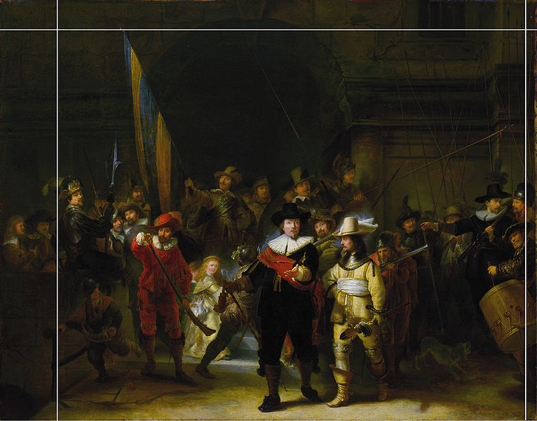
This does remind me of the painting commonly called 'Nightwatch' which was trimmed by its commissioner to fit between the doorways on the wall where it was hung. In doing this we lost 2 m of a recognized masterpiece, even in anyone's mind. I hope it improved its coherency.
I know there is a constitution were you live that advocates, in fact demands, freedom of speech. But next time can you get someone to listen to you before you post it here just in case it lacks coherency or isn't murderously subjective.
Cheers
Tom
 

Tom dinning

Registrant*
Another test which I often apply when viewing photographs and always when composing my own is to remove an element in my mind's eye. Does that improve or detract from the image? In the case of Clearing Winter Storm, imagine the picture without the two trees in the right foreground. In my opinion doing that would greatly improve the image. Visually incoherent.

Try removing any element in this one. The leaf in the upper left corner, for example. To do that would ruin the image. It's very visually coherent.

I'm frightened to track back any further for fear of finding a few bits trimmed from my shots, Jim.
I think it's a fine thing you do with your own shots but how arrogant of you to even contemplate doing it to someone else's. Let me guess. I reckon you also check people's fridges to see if the cheese is separate from the milk, look distainly at passers by if they are wearing brown shoes with blue trousers and consider it beneath yourself to attend a charity art show run by the local Women's Auxiliary fund raisers.
I'm just wondering what I can trim to greatly improve the high opinion of yourself you obviously hold.
 

Asher Kelman

OPF Owner/Editor-in-Chief
I'm frightened to track back any further for fear of finding a few bits trimmed from my shots, Jim.
I think it's a fine thing you do with your own shots but how arrogant of you to even contemplate doing it to someone else's. Let me guess. I reckon you also check people's fridges to see if the cheese is separate from the milk, look

Tom,

Yes, it does seem like arrogance. However, I'd offer that there was, perhaps, no arrogance here at all. At least none intended. The object has been, if I understand it right, to try to find rulers by which to measure or at least grasp the concept of coherency of images. So if we take Ansel Adams' photographs as examples of excellent work, then do we understand more of what coherency might be. That's the goal we are focused on here, not any wish to cut up any work of art that stands as a recognized and iconic treasure.

Michael and Paula are generously giving us examples of work that are, in each case meticulously made from the very first judgement, whether every element required is in the picture as mass the ground glass image maximized in its structural integrity, balance, interest and originality and all the way to the final presentation print. From these examples we want to have take home lessons on how to better build our pictures ourselves. Since there's no objective definition of coherence in photography that we've come across so far, looking at other outstanding pictures (that might not have such coherence), could help us understand at least the gestalt of coherence operating or not.,

It may be that coherence is a term like, "Beauty" which depends on us building cultural libraries or examples and also on innate proclivities of the human mind.

Asher
 

Jerome Marot

Well-known member
I'd offer that there was, perhaps, no arrogance here at all. At least none intended. The object has been, if I understand it right, to try to find rulers by which to measure or at least grasp the concept of coherency of images.

Exactly. In my opinion, there is no arrogance at all in trying to understand what makes a masterpiece work, but humility. And in doing so, I feel that anything goes, even deconstructing that masterpiece, as long as it helps me understand and feel.
 

Jerome Marot

Well-known member
This does remind me of the painting commonly called 'Nightwatch' which was trimmed by its commissioner to fit between the doorways on the wall where it was hung. In doing this we lost 2 m of a recognized masterpiece, even in anyone's mind.

Not quite. A 17th century copy of the original by Gerrit Lundens at the National Gallery, London. Here, showing what was removed from the crop:

766px-Nachtwacht-kopie-van-voor-1712.jpg
 

Jim Shanesy

New member
Not quite. A 17th century copy of the original by Gerrit Lundens at the National Gallery, London. Here, showing what was removed from the crop:

I think the crop in this case detracts from the image. It's masterfully composed and is a superb example of just what I was talking about.

For the record, there are many works by AA which I think are masterpieces. One in particular nearly brought tears to my eyes when I saw it in the flesh. I was transfixed before it for about 1/2 hour before I could take my eyes away. However, Moonrise is not one of them. I like Clearing Winter Storm a lot more than Moonrise but it too is to me not as good a photograph as his best, almost all of which were made before the early 1940's.

I was making a sincere effort to respond to Mark's request for an example of an incoherent photograph. I felt that Michael might be reluctant to point to any one photograph as an example for fear of offending anyone. I can't recall ever having seen one of his or Paula's that wasn't beautifully structured.

I apologize for any offense my opinion may have caused, but I believe that Ansel Adams is way overhyped. I won't refer to him again.
 

Asher Kelman

OPF Owner/Editor-in-Chief
hamleeCatavina2003.jpg


Paula Chamlee: Cataviñia, Baja, California, 2003


Paula,

It's so hard to remove the instant recognition of the female shape. I wonder whether such content can subconsciously creep into feelings of coherence, even though you had not the slightest thought of anything but composition and the plant.

Asher
 

Mark Hampton

New member
Of course. My life experience informs my reading of anything, be it music, art or literature. What else can the mind draw upon?

Jim,

that is the point that I am making here.

a picture cannot be coherent or incoherent - only the reading of it can be and that is the subjective view of the reader.

as makers (as has been pointed out in the thread) we are responsable for providing a platform that the viewer enters - the structure of a work is grain or pixels everything rests on these foundations.

I guess here the artists make work that they feel gives a visual sense in relation to their search for truth or beauty of the photograph especially in relation to the silver / platinum print.

It's always interesting to find out about people's approaches to making work - and refreshing to cut through the bullshit of the mythos that get subscribed to art by markets / dealers and listen directly to other makers.

cheers
 

Jim Shanesy

New member
hamleeCatavina2003.jpg


Paula Chamlee: Cataviñia, Baja, California, 2003


Paula,

It's so hard to remove the instant recognition of the female shape. I wonder whether such content can subconsciously creep into feelings of coherence, even though you had not the slightest thought of anything but composition and the plant.

Asher

In her introductory essay to Paula's book Natural Connections Estelle Justim touches on this very point, noting that Paula is "unafraid of sensuality".

Nevertheless, I don't see any female form in Paula's cactus picture. This would certainly seem to validate Mark's point that photographic meaning is to be found in the eye of the beholder.
 

Tom dinning

Registrant*
In toms basement, with cem and ken :)

There are readings of off-line comments each evening in the basement between 10 and 11 pm. Tea is served. Bookings are essential.
Tonight's comments will cover such topics as 'the implications of fare rises on the Stockport-Buxton bus route on juxtupositioning in current trend in Middle Eastern photography' and 'Recipes for diabetics who own large format cameras.' our guest reader will be Alf Fraser, garage attendant at the recently opened fuel stop on University Drive.

I look forward to a great evening of discussion with my newly found friends.
Cheers
Tom.
 

Mark Hampton

New member
There are readings of off-line comments each evening in the basement between 10 and 11 pm. Tea is served. Bookings are essential.
Tonight's comments will cover such topics as 'the implications of fare rises on the Stockport-Buxton bus route on juxtupositioning in current trend in Middle Eastern photography' and 'Recipes for diabetics who own large format cameras.' our guest reader will be Alf Fraser, garage attendant at the recently opened fuel stop on University Drive.

I look forward to a great evening of discussion with my newly found friends.
Cheers
Tom.

Tom,

'Recipes for diabetics who own large format cameras.' sounds like a stunning book - have you read them 'Every sunset is different - photography in the jelly mold tradition' - honestly the people under my house can't get enough of it !

how may places are on your ehh shall we call them worky shops ?
 
]Paula’s photograph, made in Iceland, is an excellent example of the tones creating energetic eye movement throughout the entire picture space.


P_Grindivik_Iceland_2004.jpg


Paul Chamlee: Grindivík, Iceland, 2004


What is the subject here? It is not any one thing, but the relationship of all of the black marks to each other. That is the hallmark of a coherent, unified photograph. There are no “dead” areas and if any of the marks are removed the photograph falls apart. Cover with your finger, for example, the dark mark in the upper right-hand corner. See how the entire upper right side of the photograph dies—meaning, you eye doesn’t want to go there.

The movement of the eyes is inherently a pleasurable thing. If, in our photographs we can impel the eyes of the viewer to move we are giving visual pleasure. Visual pleasure must be something very deep and meaningful. Otherwise, why would art museums and their contents be such an important part of our culture? They exist for one reason only—to give visual pleasure.


Michael's Photograph: Washington, DC, 1984: I never talk about the act of making any of my photographs except for this one. I do so in the hope that the story will lead others to consider the making of their photographs just as carefully.


Washington_DC_1984.jpg


Michael A. Smith: Washington, DC, 1984


I was driving along the Potomac River in Washington, DC, and this scene caught my eye. I could not park my truck until I had driven another quarter mile. I walked back, without my 35-pound camera, lenses, holders, and tripod and asked the couple in the foreground if they planned to stay there for a while. When they said, “Yes,” I went back to get my equipment.

I made a couple of photographs and then I saw the figure at the right edge put his hand on his hip. I immediately saw the relationship of triangles created by his arm, the knee of the man in the foreground, and the arm of the woman lying down on the left side of the photograph. I quickly swung the camera around (I had been pointing it in a different direction) and focused. I was using a 24” lens, and as you know, the longer the lens the harder they are to focus, so focusing quickly was a challenge. I was more anxious while making this exposure than I have ever been before or since. Would the figure on the right keep his hand on his hip? If he moved his arm, I had no photograph. I focused the image on the ground glass and then I realized that the figures standing up, and the boats, were not in the right place. After a few very anxious moments I felt that the standing figures and the boats were in the right place and I made the exposure.

This photograph is an example of using a 35-pound camera like a 35-millimeter camera. It is never the camera that limits one’s choice of subject matter.
 

Antonio Correia

Well-known member
In my very humble opinion - you are going to beat me - Paula's image means nothing to me.
Sorry. I shouldn't have told this I know.
It doesn't give me any pleasure to look at. It is a trivial image.
Perhaps I am nothing but a stupid Portuguese who doesn't understand these subjects. I do accept that point of view. Just me and my way of saying things which I shouldn't.
-
Michael's image: Fantastic. Great. An image with meaning, composition, a pleasure to look at.
I didn't see the triagles until I read about them. What stroke me at once were the bicycles and the couple on the grass.
The blurred (moving) objets like the boats or the arm of the guy at left and the apparent non-horizontal orientation of the picture doesn't bother me at all.
It is very nice, well composed and a pleasure to look at (again)
It reminds me "Le déjeuner sur l'herbe". How the hell could I associate these two images I ask myself.
 

Antonio Correia

Well-known member
Just to add that the choice of the crop is essencial.
I mean the ratio of the crop.
Well done.
Do you change the ratio all the time or are you "glued" to one - two or three - in particular ?
 

Asher Kelman

OPF Owner/Editor-in-Chief
]Paula’s photograph, made in Iceland, is an excellent example of the tones creating energetic eye movement throughout the entire picture space.

What is the subject here? It is not any one thing, but the relationship of all of the black marks to each other. That is the hallmark of a coherent, unified photograph. There are no “dead” areas and if any of the marks are removed the photograph falls apart. Cover with your finger, for example, the dark mark in the upper right-hand corner. See how the entire upper right side of the photograph dies—meaning, you eye doesn’t want to go there.

The movement of the eyes is inherently a pleasurable thing. If, in our photographs we can impel the eyes of the viewer to move we are giving visual pleasure. Visual pleasure must be something very deep and meaningful. Otherwise, why would art museums and their contents be such an important part of our culture? They exist for one reason only—to give visual pleasure.


P_Grindivik_Iceland_2004.jpg


Paul Chamlee: Grindivík, Iceland, 2004


Antonio,

This picture by Paula is indeed very different from that of Michael. The latter is an obvious bucolic pleasant and relaxing community scene that we feel an affinity to. We aspire to have such times for ourselves and our children. It's, after all, the very best of times. So pleasure is there by the bucketful! That's just the content. The fitting composition you've already noted.

And then Paula's picture, what do I see in it? Well it's a different kind of art. Humans also like patterns, even stochastic, irregular arrangements of marks like this which either give a feeling of some appealing texture, rhythm or beat. But what's special here?

Well, it all depends what you bring to it. I believe that such pictures can act as muse aids. Look at it and see forms appear and allow your mind to imagine what's there and what might be there too, between and behind what's visible. To me this is like a Japanese ink drawing that I don't understand just yet. Each time I visit, I see new figures.

Now pictures of real things are a sure bet for getting us involved. So yes, Michael's picture content get's our emotional strings twanged and we're all going to be drawn in by empathy. Paula's picture, OTOH, is, I believe something of a gift to those who would stop and just meditate. It's a different kind of art experience. One presents human feelings defined and cooked, ready to enjoy and the other requires one to stop erase other distractions and allow and trust your own brain to populate the image with something of worth to you. If nothing happens then truly it's not art for you.

Tom,

I do hope that you don't find my reaction to Paula's photograph too "artsyfartsy", but I just wanted to express how I experience such images. I'd be interested in your own reactions here.

Asher
 

Jerome Marot

Well-known member
In my very humble opinion - you are going to beat me - Paula's image means nothing to me.

See how things are different: for me, the opposite is true. I find genius in Paula's image, while Michael's does not talk to me. Interestingly, I tried the exercise of covering elements to see wether they are important (I learned about that exercise long ago, actually) and indeed I can't remove any of the elements of Paula's image, except -maybe- a few mm of the left (the image is not better, but still works). On the other hand, on Michael's image I have the confusing feeling that there is one bicycle too much, which may simply mean that I don't understand the picture.

But what I find really interesting is how two people can have different opinions on a picture. And you should not be ashamed of not being moved by Paula's picture: there's not much one can do, either this picture talks to you or it does not. Not being moved is a perfectly valid opinion. However, I really wonder why people's response can be so different. I have the feeling that if we had the answer to that question, we would make real progresses in the visual arts.
 

Antonio Correia

Well-known member
Jerome I am not ashamed of not being moved by this or any other image/art object. :)

I am self confident enough not to :) :)

The appreciation of an Art work depends on the cultural and social background of the person and every individual - even having the same cultural basis - may have different points of view.

:)
 
All of Paula's and my photographs are based on abstraction. Some, like Paula's here, is obviously "abstract," while in my photograph the abstract structure is not so obvious.

We do not set up our cameras unless we have an emotional response to something. But once the camera is set up we have one task: to make the best picture we can, whether or not it has anything to do with what first compelled us to set up our cumbersome cameras.

When we look at our mounted and overmatted photographs for the first time, we do so from about 8 to 10 feet away. In keeping that distance we are not involved with the specifics of the subject, but with the structure of the photograph--the abstract structure that underpins the content.

Without that structure there is not one photograph either of us has ever made that would hold even the slightest interest for us, no matter how deeply we felt when exposing the negative.

To the person who gets nothing from Paula's photograph. Just fine with us as we make our photographs for ourselves and as I believe I wrote earlier, everyone will bring their own life experiences to the viewing of any work of art. But I suspect you are looking at photographs for their content--for what the subject is. That's fine, as far as it goes, but your viewing experience, if you allowed it, could go much further.

When Paula and I teach our workshops we never discuss content of the photographs of our students as we assume that everyone will make photographs of things that move them emotionally, and so the content aspect is well taken care of. It is making photographs that are visually coherent--ones that have an abstract structural coherence that aspiring photographers need help with.

Many, many years ago I had a student who brought in a photograph of his cat. He told the class that it was a great photograph. (The photograph was terrible.) When I asked him why, he responded that he loved his cat. I explained to him that what he had to do was make a photograph of the cat in such a way that people who did not know his cat and even people who hated cats would look at his photograph of his cat and be moved by it. And the only way that is ever possible is if there is that abstract structure underpinning the content.

All we have in any black and white photograph are tones. The point is to make a photograph so that the rhythm of the tones give visual pleasure.

Michael A. Smith
 
To answer the question about format. Paula's photographs are silver chloride contact prints made from 8x10-inch negatives. My photographs here are silver chloride contact prints made from 8x20-inch negatives. Neither Paula nor I have ever cropped a photograph, hence the aspect ratio always stays the same, except in a very few instances when, before the negative has been exposed, we realize that it does not fit the 8x10 or 8x20 aspect ratio. We do not consider that cropping.

We consider cropping to be a decision made in the darkroom when one realizes that one did not "get it right" when exposing the negative.

When all is said and done and a photograph is hanging on the wall, no one, including ourselves, cares if it was cropped or not. So why not crop you may ask? The answer it that the greatest pleasure for us, and we would assume, for everyone else, in making photographs is "getting it right" on the ground glass or viewing screen. It is also easier and much quicker later as no further decisions need to be made regarding where to put the edges of the photograph. That decision is made in the field.

Michael A. Smith
 

Asher Kelman

OPF Owner/Editor-in-Chief
To answer the question about format. Paula's photographs are silver chloride contact prints made from 8x10-inch negatives. My photographs here are silver chloride contact prints made from 8x20-inch negatives. Neither Paula nor I have ever cropped a photograph, hence the aspect ratio always stays the same, except in a very few instances when, before the negative has been exposed, we realize that it does not fit the 8x10 or 8x20 aspect ratio. We do not consider that cropping.

We consider cropping to be a decision made in the darkroom when one realizes that one did not "get it right" when exposing the negative.

When all is said and done and a photograph is hanging on the wall, no one, including ourselves, cares if it was cropped or not. So why not crop you may ask? The answer it that the greatest pleasure for us, and we would assume, for everyone else, in making photographs is "getting it right" on the ground glass or viewing screen. It is also easier and much quicker later as no further decisions need to be made regarding where to put the edges of the photograph. That decision is made in the field.

Michael A. Smith


I admire the discipline of photographing exactly as one plans to print. Nicolas Claris tries to do that with his pictures of great boats and architecture. With LF, it goes with the territory and the mode of working. The ground glass is the arbiter of what's in and what's excluded.

For much of my work, however, I'm using the camera to gather together an image that no lenses I possess could capture in one take. So there must be an allowance in the photograph, the final print that is, for something to be going on in ones's mind as the different portions of the image are assembled.

Asher
 
So why not crop you may ask? The answer it that the greatest pleasure for us, and we would assume, for everyone else, in making photographs is "getting it right" on the ground glass or viewing screen. It is also easier and much quicker later as no further decisions need to be made regarding where to put the edges of the photograph. That decision is made in the field.

Hi Michael,

While I agree with getting it as much right as feasible at the moment of capture, following your strict cropping approach suggests that you only photograph subjects that happen to have a composition that exactly fits your film. That doesn't make sense to me, unless one only shoots still lifes which can be rearranged to fit the fixed frame.

To me, composition is important, but then some subjects dictate a different aspect ratio than what my camera happens to offer. I'll adjust my crop to improve the composition if needed. What's more, I largely compose without a camera by choosing my vantage point. The image/composition is in my vison, before I set up the camera. In that scenario I enjoy the freedom of stitching which allows to add enough of the scene to improve the composition within it's 'natural frame', not my camera's frame. Sometimes it's more square, sometimes it's narrower and high, or wide.

Another way of looking at aspect ratios could be to aim for a pleasing proportions, rather than some historical shape of 8x10. For instance 8x13 inch would be considered much more pleasing by most humans, because it's closer to a golden ratio. But again, in my view, restricting oneself to that particular ratio doesn't make sense either (although it's more sensible than 8x10) for the same reasons, natural scenes do not always follow a frame one happens to use because the camera dictates that.

Cheers,
Bart
 
Top