Cem_Usakligil
Well-known member


I'm impressed but would like to see this small also so as to be able to get it in one go without scrolling my MacbookPro's limited screen height!
I was just about to write that myself, lol. Thanks for taking your time, appreciated.If using Safari, press Command and the minus sign (or, if two "A" are present left on your toolbar, click the smallest one). You may also want to explore the "view" item of the Safari menu, it is useful.
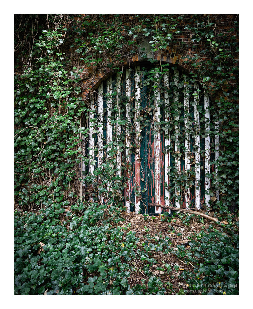
Precisely. That is also why I chose to leave this one untitled as well as the number VII.This is as thought provoking as Untitled VII, Cem. The pale blue reflected from the panes of glass suggest eyes, and the overgrowth of vines suggest increasingly impaired vision both from within and without. That's my impression, anyway. There is much room for interpretation, however, and thoughtful viewers will likely conjure up universes of their own from this sparse image.
Asher your humor is priceless. Perhaps you should run and not walk backwards, lol.Cem,
I'm impressed but would like to see this small also so as to be able to get it in one go without scrolling my MacbookPro's limited screen height! How this image rules its environs is so important in this instance. I can't experience that right now and walking backwards didn't help either, LOL!
Asher
Alas, we suffer from the same urges my friend. I too would do exactly as you suggest. But this is a second floor window and I was standing on a platform to the left of it. There was no way to take this frontally or I would have to go downstairs and shoot up. I am sure that the result would be less effective in that case. I have considered correcting the perspective here but decided eventually that it was better as presented. There you go, I am really obsessed with getting the perfect composition and it causes many of my pictures to disappear in the DAM system because of that. How can I learn to loosen up? Or is it just moot?This is very nice. I especially like the contrast between the plant and the rigid composition of the window and the water chute.
But I have a question. I notice that you chose to present the composition slightly angled to the right (you were standing on the left of the window, whereas, would I take a similar picture, I would take great care to present it flat up, standing right in front of the window. I would even straighten the perspective afterwards if must be (e.g. if the window is higher up). I would probably not straighten the perspective here, however.
I am not really sure why I always take care to have a straight perspective for this kind of pictures. Do you know why you did not?
How can I learn to loosen up?
Fair enough!Why would you?
")

I know you did not ask for it, but here is the perspective corrected version
My thoughts exactly!Thank you, it is an interesting experiment. I am not sure which one I like better, maybe the original is a bit more "open". And, of course, you can correct for the shape of the window, but not for the perspective in the window and I find that a bit unsettling.
It's interesting. I find a psychological difference between the two I wasn't expecting.
With the corrected one, I find that the window frame takes my main attention. With the initial version, because the perspective pulls your eye out to the right slightly and then it comes back, I find all the elements of the image better integrated. The vines and the drainpipe are more prominent without detracting from the window. Also, the reflection appears more mysterious, because it is now displaced and perhaps makes me wonder how far displaced it is, how different from the view behind the photographer and what the reflected view all around (the implicit reflect window panorama) might be.
I would probably have corrected it without a moment's thought and persuaded myself that had to be the best version. It just goes to show we should never take our aesthetic perceptions for granted.
Very nice image, by the way, Cem.
This photo is so rich conceptually, there is hope and distress, spontaneity and premeditation, excess and austerity. The art object is stimulating, beautiful as prescribed by the always subjective simplicity. I find that fascinating.
Of course there's no right or wrong perspective in a work of art, as long as it responds to some intent. However, because of my interpretation of this photo, I do favor, at least slightly, the "corrected" version presented by Cem because it stress an inverse relationship between simplicity and beauty, and surely meaning as this version is less concerned with the sense of physical point of view.
Regards,
Ruben