
Ruben Alfu
New member
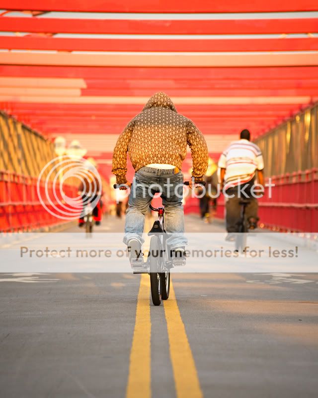
Williamsburg Bridge connects two of the most trendy and eclectic neighborhoods in New York City: the Lower East Side in Manhattan, and Williamsburg in Brooklyn. During a nice spring afternoon, thousands cross this bridge walking, jogging, skating, or biking, in what becomes a thrilling track for many.
Ruben Alfu : Williamsburg Bridge
Ruben Alfu : Williamsburg Bridge


