• Please use real names.

    Greetings to all who have registered to OPF and those guests taking a look around. Please use real names. Registrations with fictitious names will not be processed. REAL NAMES ONLY will be processed

    Firstname Lastname

    Register

    We are a courteous and supportive community. No need to hide behind an alia. If you have a genuine need for privacy/secrecy then let me know!
  • Welcome to the new site. Here's a thread about the update where you can post your feedback, ask questions or spot those nasty bugs!

A Lovely Young Model in H&S

Angel Navarro

New member
Hello Folks,

Hope everyone reading on is well...
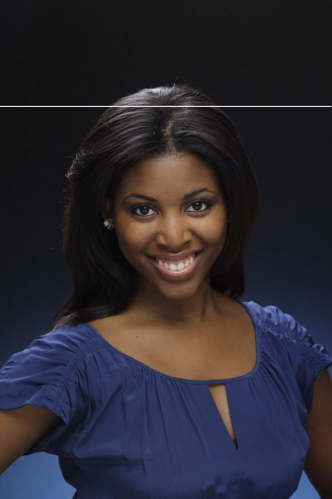
I captured this image while attempting to light the model with butterfly lighting. She is a very pretty gal with great cheek bones which I felt would benefit from this lighting pattern.

What are your opinions?

br01.jpg
 

Asher Kelman

OPF Owner/Editor-in-Chief
Hello Folks,

Hope everyone reading on is well...
I captured this image while attempting to light the model with butterfly lighting. She is a very pretty gal with great cheek bones which I felt would benefit from this lighting pattern.

What are your opinions?

br01.jpg

Angel,

She is indeed a pretty lady and charming too. The shot does reveal and convey a likable person! To me the lighting is not something I'd worry about as the first order of business. It's fine in the upper portion of her face. What do you think about how it lights her chin and neck?I wonder about the hair. Still, I'd like to put the lighting aside, for the moment.

I wonder why there's a blur in the front of her face. Is this post processing or else is the that you have used an aperture that gives a very limited DOF? My guess is the former.

Was the hair sharpened or is the effect, just hair spray?

Do you happen to have the unaltered mage out of the camera to share?

Asher
 

Angel Navarro

New member
Angel,

She is indeed a pretty lady and charming too. The shot does reveal and convey a likable person! To me the lighting is not something I'd worry about as the first order of business. It's fine in the upper portion of her face. What do you think about how it lights her chin and neck?I wonder about the hair. Still, I'd like to put the lighting aside, for the moment.

I wonder why there's a blur in the front of her face. Is this post processing or else is the that you have used an aperture that gives a very limited DOF? My guess is the former.

Was the hair sharpened or is the effect, just hair spray?

Do you happen to have the unaltered mage out of the camera to share?

Asher
Hi Asher,

Here is the original RAW image converted as is to JPG format.
_H9I8694.JPG
 

Asher Kelman

OPF Owner/Editor-in-Chief
Hi Asher,

Here is the original RAW image converted as is to JPG format.
_H9I8694.JPG

Angel,

I'd crop of the top 0.5 cm to stop that highlight pulling us out of the picture. Then I'd pack myself on the back for a splendid picture! Only you can say which color is truer to life!

Asher
 

Doug Kerr

Well-known member
Hi, Asher,

I'd crop of the top 0.5 cm to stop that highlight pulling us out of the picture.

You know it always troubles me when you talk about cropping so many cm or so many inches off an image.

Now on this one, either:

• 0.5 cm has no meaning, or,

• if we must speak of distances in cm, 0.5 cm from the top would be where I show the line here:

_H9I8694A.jpg

I assume that is what you have in mind.

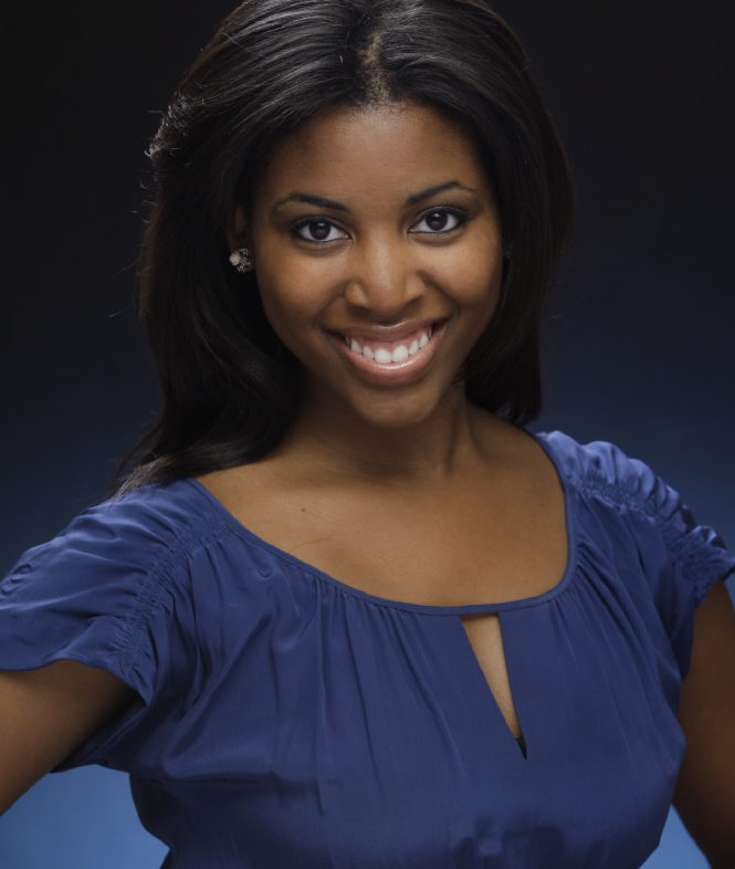
Or did you mean from the hairline?

The the crop line would be about here:

_H9I8694B.jpg

That might look pretty good, like this:

_H9I8694C.jpg

Best regards,

Doug
 

Asher Kelman

OPF Owner/Editor-in-Chief
Or did you mean from the hairline? I assume that is what you have in mind.

_H9I8694C.jpg

Yes you hit it! This shows that even old toads can figure out the desirable esthetics once they work through the options@! 0.5 cm from highlight in the hair!

Asher
 
Top