• Please use real names.

    Greetings to all who have registered to OPF and those guests taking a look around. Please use real names. Registrations with fictitious names will not be processed. REAL NAMES ONLY will be processed

    Firstname Lastname

    Register

    We are a courteous and supportive community. No need to hide behind an alia. If you have a genuine need for privacy/secrecy then let me know!
  • Welcome to the new site. Here's a thread about the update where you can post your feedback, ask questions or spot those nasty bugs!

Nude by the ocean

EMO_4104-1080.jpg
 

Asher Kelman

OPF Owner/Editor-in-Chief

A.K.,

What a pleasant surprise. I was wondering when you would visit again! This is a complete image that does not demand any changes, although retouchers could go bananas with any such picture, it would not be better. The very matters some might impulsively correct are what makes the picture so different from fashion and other staged pictures where everything is some deceit about how an ideal woman should look. I do appreciate that you have not coiffed and painted her and so destroyed the natural beauty she has. I wish we could have a smaller version too with so that the image can bee seen on my screen with white space all around her as in a gallery.

A sole suggestion I'd offer would be to perhaps consider not show anything above the "Rembrandt" shadow below her nose. That would mystique and increase the power of the image.

Asher
 

Chris Calohan

Well-known member
It's hard for me to know what the cause is, but on my monitor and its calibrated regularly, there are parts of her that seem rather overcooked. I see this mostly in her fingers and also up her left arm and left side of her face. Shooting redheads and she appears to be a natural, is always hard in getting the skin tones to work out across the board.
Also, wonder if you have done some piecing together of a model on another background...as the shadows in the foliage doesn't seem to be in the same aspect as on her body...again hard to tell.

Nice model, either or.
 
Yes, she is quite beautiful but as Chris says, I also think this has been pieced together from at least 3 images. I feel like the grass and the sea/sky are 2 elements and then the girl. I have nothing against this, but there are some telltale masking issues with the foliage against the water and her hair against the sky especially. i think a bit of edge refinement might take care of it all.
 

Jerome Marot

Well-known member
Yes, she is quite beautiful but as Chris says, I also think this has been pieced together from at least 3 images. I feel like the grass and the sea/sky are 2 elements and then the girl. I have nothing against this, but there are some telltale masking issues with the foliage against the water and her hair against the sky especially. i think a bit of edge refinement might take care of it all.

If this is true, it would be worth thinking about choosing something else than the plants. We have a nice contrast between the blue of the sea and sky and the color of the girl, green does not add to it. Maybe an image of white or beige rocks would be better.

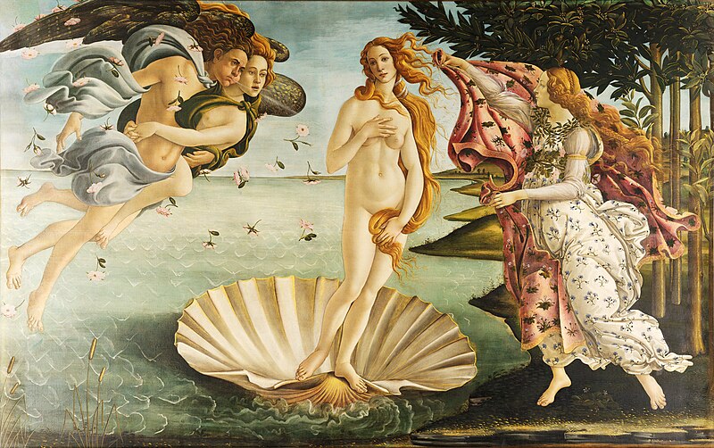
The picture reminds me of Botticelli:

800px-Sandro_Botticelli_-_La_nascita_di_Venere_-_Google_Art_Project_-_edited.jpg
 

Asher Kelman

OPF Owner/Editor-in-Chief
Damn!

I have to find a model like that. Botticelli was very fortunate! ......so was she to have such conveniently long hair! :)

Asher
 

Paul Abbott

New member
I think that there is a total disconnect between her and the environment. If you are to use a model/ nude in a setting like this I would have liked to have seen some sort of relevance or interaction, or to use the environment more. I'm no expert though...I don't really like the cutting off of her legs either.

You could learn a thing or two from Norman Parkinson...:)
 

Asher Kelman

OPF Owner/Editor-in-Chief
I don't really like the cutting off of her legs either.


It works also when the head is cut off just above the "rembrandt shadow below her nose. We don't need the rest of her to have a perfect picture. The b.g. being real or not is not very important, IMHO, as it just needs some careful touch up with "Blend If" tools and the like. I can be done better, but the image is still impressive as it is. If I saw this in a gallery, I'd personally notice halos but wouldn't mention anything, as folk will buy the work if they like it anyway. It just has to be that the photographer is believable enough.

Asher
 

Tom dinning

Registrant*
It all seems a bit odd. Not the sort of picture I'd see in a gallery, more like one of those men's mags from the sixties. It's all about the eyes, tits and fanny. The rest is just there because we needed to do this shot out of the public eye. It always baffles me why blokes need to do this. At least Asher is forthright and ladder bound. The shot does nothing more than tittilate. Unless your dead.
Certainly not in the same room as The Bot.
 

Asher Kelman

OPF Owner/Editor-in-Chief
It's all about the eyes, tits and fanny.


The only noun I use here is the word, eyes. The others to me are pretty dreary terms. Why not breast, it rhymes with zest, quest and that's nice and elegant. It's an organ that feeds infants and provides comfort and visual allure for men. In fact it's part of the ancient and adaptive allure that brings us together since we became upright and could no longer focus on ready-to-grab ancestral bottoms of receptive females. So I find nothing wrong with showing the breasts. But I do find it disappointing to use the word tits which is flippant.

As to the picture, it's a beautiful pose and I wouldn't sweat the details. If someone who makes girly magazines, wants to include this, it would increase their quality so not a bad thing. I just like the fact that there's a sense of self confidence and self worth and no demeaning of womanhood.

Please stop worrying about perfection. This is a wonderful female and no doubt a lady to boot. Get over the imperfections and the fact the men might like this. It's still is a picture that works.

I see humanity and that's enough for me. Botticelli? I love the guy and adore his work. Of course he's on a different scale and he was not limited with the woman before him. He had skill to cheat on a great scale, that's all!

Asher
 

Tom dinning

Registrant*
Asher. No lectures on my language please. My mother used to do that and she got no-where as you can see. Besides, we were commenting on the picture, not my response. I don't need to defend my choice of words or my point of view (except to what's his name). In the company I mix tits and fanny are OK and well accepted descriptive terms, even nouns as you call them. I could have used **** instead of fanny but I know that wont come up on the screen.
Anyway, she's a good looking woman and got my hormones moving. Nothing wrong with that. Tell me there wasn't a bit of that on her mind when she posed and I know you'd be lying. A good looking woman, (which is all the women I have ever seen,) who is willing to pose naked ( and that's not enough of them as far as I'm concerned) would have in the back of their mind that their beauty might just appeal to another human being. If that appeal rises to flights of fancy, well and good, otherwise there would be no point really.

Now, for all the freedom fighters out there who think I'm a sexist pig, you're probably right. I hope it never fades. This attitude colours my approach to nudity in photography. So sue me.
 
Yes, she is quite beautiful but as Chris says, I also think this has been pieced together from at least 3 images. I feel like the grass and the sea/sky are 2 elements and then the girl. I have nothing against this, but there are some telltale masking issues with the foliage against the water and her hair against the sky especially. i think a bit of edge refinement might take care of it all.

It was pieced together, but not in the places you noted. The hair is added from other photos from the same session and the fingernails are from another model (hers were dark blue). I did darken the water via luminance control of some colors quite a bit, which leads to the embossed effect that people have noted. If I continue to work on this piece it may be to make it look a little less like a photo.

AK
 

Doug Kerr

Well-known member
The model does have nice mammae, to use the correct anatomical term, as our host here strongly encourages us to do.

Best regards,

Doug
 
It was pieced together, but not in the places you noted. The hair is added from other photos from the same session and the fingernails are from another model (hers were dark blue). I did darken the water via luminance control of some colors quite a bit, which leads to the embossed effect that people have noted. If I continue to work on this piece it may be to make it look a little less like a photo.

AK

AK, I didn't mean to disrespect your wok. The reason I thought she was added to the background was the hair. since it doesn't look entirely natural. Furthermore, and as you mentioned, the effect of the water/sky against the foliage created a very distinct halo. I actually noticed the darker thumbnail but didn't mention it, she could have slammed it in a door. I do think that if you want it not to look like a photo, then you will have to push the elements more strongly so we can get that as your intention. When the effect is too subtle, it can come across more like a mistake. I'm not a pixel peeper, but these things jumped out at me immediately. I also have an affliction about slanted horizons (not here! ;-) ) unless they look intentional, they just drive me a little bonkers. Like paintings on a wall, if they are tilted, I feel like I have to straighten them.

The reason I mentioned anything at all, was so you could take a good image and make it better. I know sometimes I get so into something I'm doing, that I can't see little things that others can. A little of the "can't see the forest for the trees" effect. It was not meant to be mean, and if you took it that way, I apologize.
 

doug anderson

New member
Did you use fill flash? If so how much and from what? (for my own education).

This is a lovely photograph of a lovely woman. Redheads are from another solar system.
 

Asher Kelman

OPF Owner/Editor-in-Chief
i also need a good model to paint and any body can recommend?


Marlen,

You need a good model to paint? Do you want to actually apply the paint to the model or you wish to make paintings. And what do you mean by "good"? good figure our well behaved or experienced?

Still, I'm happy to see this thread boosted!

Asher
 
Top