fahim mohammed
Well-known member
Quote:
Warning, not the truth here, just a venture.....
Unquote.
Sound familiar Asher.
Warning, not the truth here, just a venture.....
Unquote.
Sound familiar Asher.

")
By the looks of it, the one thing HCB never cared about was sharpness...in the image of course.
Tom,
The major point is not just whether one can indeed draw these lines to fit so well, as they do in these particular pictures, but whether or not the photographer was guided by such imaginary lines before the picture was taken.
The next point might be a study of the relevence of such fit to the success of the picture to whatever measure you might consider worthwhile.
You might be correct that this connection to ideal ratios turns out to be a flight of fancy, but mere dismissal, based on your dear wife's persistent delusions, is not going to get traction and be persuasive of anything!
Asher
It is reminiscent of Christine still maintaining she's a size 8 when she tries a dress on.
As to rigorous studies conducted on such matters..there have been many. And there have been as many proponents of such as their are opponents.
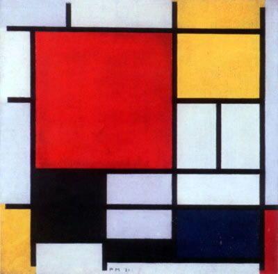
An example is a study conducted of the works of a painter mentioned here, Piet Mondrian. And the drip America painter Jackson Pollock.
Here

Now a confession. Because I use large view cameras I physically can't just wave them about hoping that a fetching composition will eventually land on the ground glass. I search my surroundings with a framing card which sometimes has strings across it measuring out the "Rule of Thirds". No, not to be bound by the rule of thirds, but to give it a fair look just in case it's perfect. If thirds don't work I'll try fifths, Golden Ratios, symmetries, repoussoirs, diagonals, leading lines, all the tricks, whatever works. Because I've memorised a lot of "rules" I can scan them mentally and discard the ones that don't work in a few seconds. Without a systematic way of approaching picture composition I fear I'm only rolling the optical dice in the service of hope and wishful thinking.
Since no one has mentioned it so far I will.
There is a vast art discipline called Formal Analysis in which a picture is evaluated as a set of forms, tones, masses, lines, proportions, balances and imbalances. Identification of subject matter is irrelevant. People draw salary expounding the principles of formal analysis. Others pay money to be taught how to do it and what conclusions to draw. Maybe there really is something to it. Perhaps a picture can appeal to the eye on the basis of how it is laid out rather than what's it of.
Now a confession. Because I use large view cameras I physically can't just wave them about hoping that a fetching composition will eventually land on the ground glass. I search my surroundings with a framing card which sometimes has strings across it measuring out the "Rule of Thirds". No, not to be bound by the rule of thirds, but to give it a fair look just in case it's perfect. If thirds don't work I'll try fifths, Golden Ratios, symmetries, repoussoirs, diagonals, leading lines, all the tricks, whatever works. Because I've memorised a lot of "rules" I can scan them mentally and discard the ones that don't work in a few seconds. Without a systematic way of approaching picture composition I fear I'm only rolling the optical dice in the service of hope and wishful thinking.
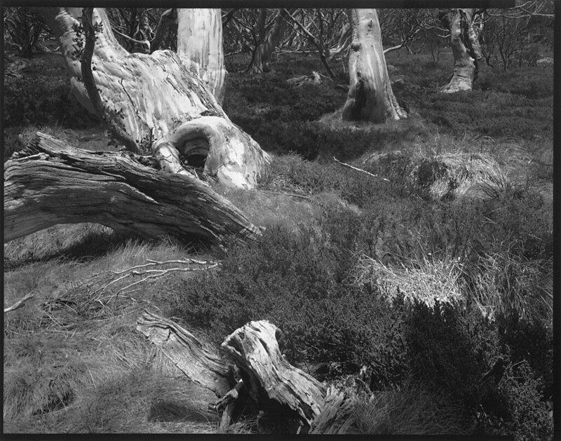
Here is a picture of a nondescript stretch of woodland. But by striving to place components on thirds and fifths I think I got a coherent composition even though there's nothing in the middle. I could be mistaken.
Gelatin-silver photograph on Freestyle Private Reserve VC FB photographic paper, image size 19.6cm X 24.5cm, from a 8x10 Fomapan 200 negative exposed in a Tachihara 810HD triple extension field view camera fitted with a Fujinon-W 300mm f5.6 lens. Titled, signed, and stamped verso.
Views of Snow Gums, number 3
=Asher Kelman;166036]Maris,
In your 8 x 10 picture, are you willing to dodge and burn to bring out the weights and contrast of elements in the composition to better follow your esthetic taste, or must you settle on what light nature let into the camera?
As in this picture, there are a lot of possible paths for lines and especially potential diagonals. Do you just take what nature gives you and only work on the contrast and exposure of the paper?
Asher
I'll burn and dodge at the stage of making the paper positive so the relative brightness of tones on it are reminiscent of the original subject luminances. The light-sensitive materials used in photography don't exhibit a linear response to light and the final product, a piece of paper with visually decipherable markings on it, has a very limited range of reflectances from max black to max white.
Yes, that's the deal. Either nature delivers the elegant or evocative arrangement required or the film doesn't get exposed. There can be a lot of effort expended in placing the camera in the exact position where all visual elements "come together". If it's in the photograph it's in the scene; and vice versa. That's why photographs claim an authority to describe subject matter that paintings or drawings can't.
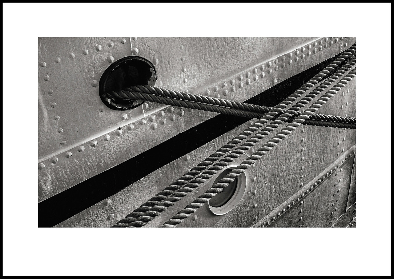 )
)My (humble) contribution to this thread.
For a while I've tried to follow the discussion but I eventually gave up. I agree that this is a great picture by Antonio indeed.Hi, Antonio,
I'm sure if I had actually read all the palaver in this thread (I really can't bear to), I would know just exactly all the reasons this is a wonderful picture.
But I don't know why. I just know it is a wonderful picture.
My (humble) contribution to this thread.
My (humble) contribution to this thread.
Why do you feel that way James?Almost but not quite. I hate to ruin the party but this feels like a bit of a miss.
